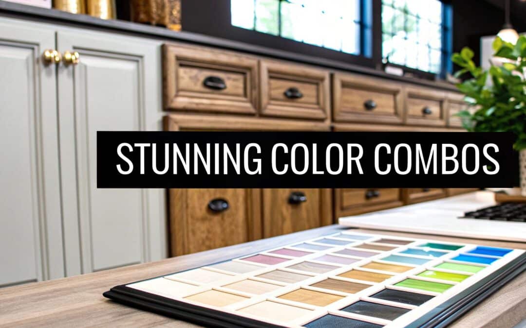
Choosing the right kitchen cabinet color combinations can dramatically transform your home's most vital space from merely functional to truly extraordinary. While classic white kitchens have their timeless charm, a world of color awaits to express your personal style, create a specific mood, and enhance your home's unique architecture. A well-chosen palette can make a small kitchen feel larger, a dark room feel brighter, and a simple layout feel sophisticated and custom. This guide moves beyond fleeting trends to focus on nine sophisticated and practical pairings that offer timeless appeal and achievable results.
We will delve into the specific psychology behind each combination, from calming sage green and cream to dramatic black and brass. You will find actionable tips for implementation, including how to balance light and dark tones and which finishes work best for each look. Whether you're planning a full renovation or a simple cabinet refresh, these ideas will provide the inspiration you need. Understanding color is a powerful tool, and applying it to your cabinetry is one of many exciting DIY home decor projects that can help you personalize your entire living space. Let's explore the palettes that will create a kitchen that is both beautiful and uniquely yours.
1. Navy Blue and White Two-Tone
A quintessential classic, the navy blue and white two-tone combination offers a sophisticated and timeless look. This kitchen cabinet color combination typically features deep navy blue lower cabinets, which ground the space with rich color, paired with crisp white upper cabinets that create an open, airy feel. This contrast prevents the dark navy from overwhelming the room while adding significant visual depth and interest.
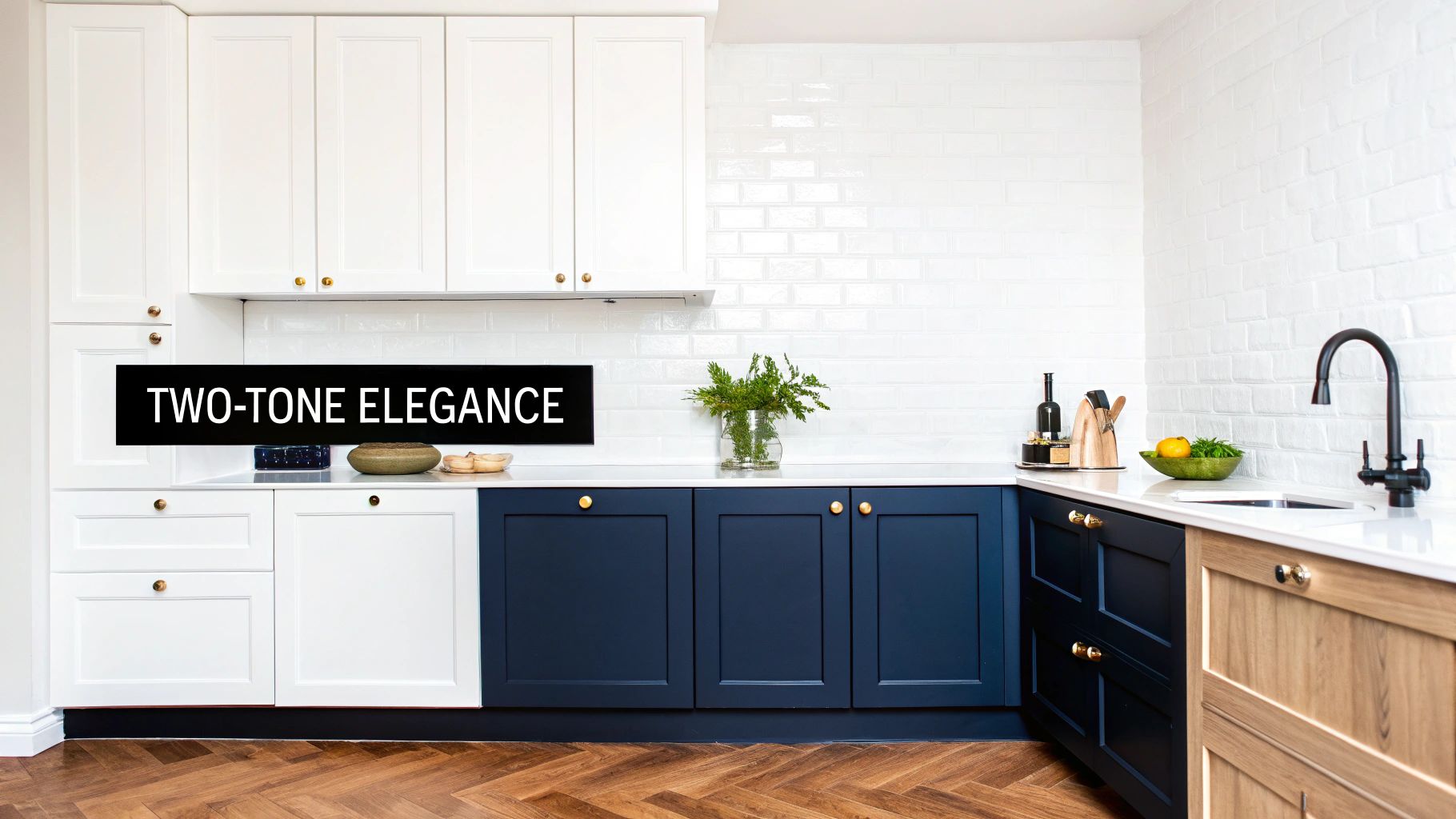
This pairing is incredibly versatile, fitting seamlessly into various design aesthetics from coastal Hamptons-style homes to modern farmhouse renovations. The dramatic yet balanced look has been a consistent favorite in design publications and home renovation shows for good reason: it’s both elegant and approachable. For more insights on enduring color choices, you can explore the latest in kitchen cabinet color trends.
How to Achieve This Look
To successfully implement this style, focus on creating a harmonious balance between the two dominant colors. The key is in the details that tie the upper and lower halves of your kitchen together.
- Hardware Selection: Opt for warm metals like brass or polished gold handles and pulls. These finishes pop against the deep navy and add a touch of luxury and warmth, preventing the scheme from feeling too cool.
- Backsplash Choice: A classic white subway tile backsplash is an excellent choice to bridge the gap between the navy lowers and white uppers. For a more modern twist, consider a white marble slab or a geometric patterned tile with hints of blue.
- Lighting is Key: Ensure your kitchen has ample natural and artificial light. Good lighting is crucial to bring out the rich undertones of the navy paint; poor lighting can make it appear black or dull.
- Alternative Layout: Consider a navy blue kitchen island as the focal point, surrounded by all-white perimeter cabinets. This approach provides a powerful pop of color without committing to a full two-tone wall.
2. Sage Green and Cream
A soothing and nature-inspired choice, the sage green and cream kitchen cabinet color combination brings an organic, calming warmth into the heart of the home. This earthy palette pairs muted, dusty green cabinets with warm cream or soft off-white walls and accents. The result is a kitchen that feels both sophisticated and grounding, offering a gentle alternative to stark white while maintaining a light and airy atmosphere.
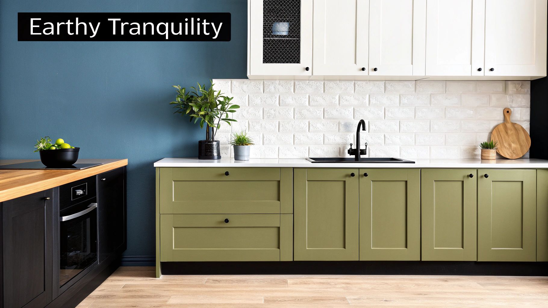
This pairing is exceptionally versatile, fitting beautifully into design schemes ranging from English cottage and modern farmhouse to Scandinavian and wellness-focused interiors. Popularized by design influencers like Studio McGee and iconic paint brands such as Farrow & Ball, this combination creates a serene backdrop that connects the indoor space with the tranquility of nature. It’s an ideal choice for those seeking a timeless look that feels both fresh and comforting.
How to Achieve This Look
To master this look, the focus should be on layering natural textures and materials that complement the soft, earthy tones of the sage and cream. Harmony is achieved by enhancing the organic feel of the color palette.
- Hardware Selection: Choose hardware that enhances the natural aesthetic. Natural brass or aged bronze pulls add a touch of warmth and vintage charm, while matte black iron hardware provides a more rustic, modern farmhouse contrast.
- Countertops and Backsplash: Warm wood countertops, such as a butcher block island, beautifully complement the sage green. For a backsplash, consider materials with natural texture like Zellige tiles or a subtly veined stone to add depth without overpowering the soft colors.
- Incorporate Natural Elements: Lean into the biophilic design trend by incorporating live plants, fresh herbs in terracotta pots, and wooden accessories. These elements will amplify the connection to nature that this color scheme initiates.
- Layout Variations: For a subtler approach, use sage green for a statement kitchen island or just the lower cabinets, paired with cream perimeter cabinets. This maintains the color story while creating a gentle focal point.
3. Charcoal Gray and Light Gray
For a look that is undeniably modern and effortlessly chic, the charcoal gray and light gray combination delivers a sophisticated monochromatic scheme. This popular kitchen cabinet color combination pairs deep, moody charcoal on the lower cabinets with a softer, lighter gray on the uppers. This tonal layering creates a sense of depth and dimension without relying on stark color contrasts, resulting in a sleek and unified aesthetic.
This pairing is a hallmark of contemporary design, frequently seen in urban lofts, minimalist homes, and high-end industrial-style renovations. Its refined and understated elegance allows other design elements, like high-end appliances or a dramatic countertop, to take center stage. The style has been popularized by modern kitchen lines and design publications focused on clean, architectural looks.
How to Achieve This Look
Mastering this monochromatic look is about balancing tones and introducing texture to prevent the space from feeling flat or cold. The goal is to create a layered, inviting environment.
- Warm Up with Wood: Incorporate warm wood elements like open shelving, a butcher block island top, or flooring. The natural grain and warmth of the wood beautifully offset the cool gray tones.
- Hardware for Contrast: Choose hardware in a brushed gold or warm brass finish. These metals provide a striking contrast against the grays, adding a touch of luxe warmth and preventing the palette from feeling too industrial.
- Strategic Lighting: Implement under-cabinet LED lighting. This not only improves task visibility but also adds a soft glow that creates ambiance and highlights your backsplash and countertop materials.
- Add Natural Accents: Introduce pops of life and color with green plants, fresh herbs, or a bowl of vibrant fruit. These natural elements break up the monochrome palette and infuse the space with energy.
4. Forest Green and Natural Wood
Embracing the beauty of the natural world, the combination of forest green and wood creates a kitchen that feels both luxurious and grounded. This pairing typically involves deep hunter or forest green cabinets complemented by natural wood elements like countertops, open shelving, or a statement island. The rich green evokes a sense of calm and sophistication, while the wood adds organic warmth and texture, resulting in a cozy yet refined atmosphere.
This look is a hallmark of high-end English country manor and luxury mountain lodge designs, popularized by brands like deVOL Kitchens. It masterfully balances traditional charm with modern sensibilities, making it a standout choice for those seeking a unique and inviting space. The depth of the green cabinetry is particularly stunning, an effect you can explore further by understanding various cabinet finishing techniques. This combination is a perfect example of how kitchen cabinet color combinations can define a home's entire aesthetic.
How to Achieve This Look
To create this elegant, nature-inspired kitchen, focus on balancing the deep green with the warmth of natural materials and strategic accent choices.
- Hardware Selection: Warm metals are essential. Opt for unlacquered brass or copper hardware to create a beautiful, warm contrast against the cool, deep green. These metals will develop a natural patina over time, adding to the kitchen's character.
- Countertop Pairing: Light-colored countertops, such as Calacatta marble or a creamy quartz, will prevent the dark green from feeling too heavy. A butcher block countertop on an island can also serve as the primary wood element.
- Incorporate Wood Elements: Introduce natural wood through open shelving, a range hood cover, or exposed ceiling beams. This breaks up the solid green and reinforces the connection to nature.
- Lighting is Crucial: A well-lit space is key. Layer ambient, task, and accent lighting to highlight the rich undertones of the green paint and the grain of the wood. Under-cabinet lighting is particularly effective.
5. Soft Pink and White
Breaking from traditional palettes, the soft pink and white combination offers a delicate, warm, and surprisingly sophisticated aesthetic. This kitchen cabinet color combination typically uses a dusty rose or blush pink for the cabinets, paired with crisp white countertops, backsplashes, and walls. The result is a space that feels personal, chic, and inviting without being overly saccharine.
This trending pairing has gained immense popularity through design-forward social media and boutique projects, proving its versatility in modern and contemporary homes. It injects a dose of personality and charm, transforming the kitchen from a purely functional area into a stylish focal point of the home. Its ability to be both playful and elegant makes it a standout choice for those looking to create a unique and memorable space.
How to Achieve This Look
The key to mastering this look is to balance the sweetness of the pink with grounding, neutral elements to maintain a refined and mature atmosphere.
- Hardware Selection: Warm metals are essential here. Brushed brass or polished gold hardware elevates the soft pink, adding a touch of glamour and luxury that completes the sophisticated feel.
- Keep it Subtle: Opt for a muted, dusty, or earthy shade of pink rather than a bright, vibrant one. Subtlety is crucial for ensuring the color feels timeless and not like a passing fad.
- Ground the Palette: Incorporate natural elements like light wood flooring, a butcher block island top, or woven bar stools. These organic textures prevent the pink and white from feeling too sterile and add a layer of warmth.
- Backsplash and Countertops: A clean white backsplash, such as zellige tile or marble, and simple white quartz countertops will keep the focus on the beautiful cabinet color and ensure the space feels bright and airy.
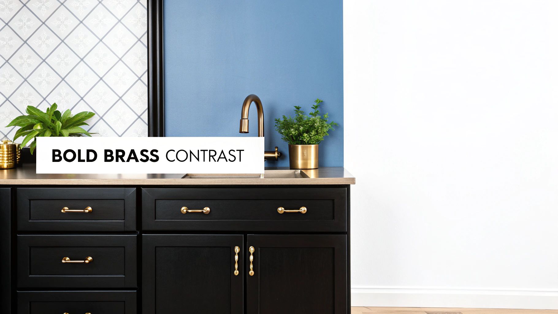
6. Black and Brass Accent
For a look that is unapologetically bold and luxurious, the black and brass accent combination delivers high-end drama. This kitchen cabinet color combination pairs deep, often matte, black cabinetry with the radiant warmth of brass hardware. The result is a high-contrast, sophisticated aesthetic that feels both modern and timeless, often seen in professional chef's kitchens and upscale restaurant designs.
This pairing transforms the kitchen into a statement space, blending industrial chic with glamorous elegance. While all-black kitchens can risk feeling cavernous, the reflective quality of brass introduces light and warmth, creating a perfectly balanced and inviting atmosphere. It’s an ideal choice for modern luxury homes, industrial loft conversions, and anyone seeking to make a confident design statement.
How to Achieve This Look
Successfully executing a black and brass kitchen relies on balancing the dark, dominant cabinets with elements that add light, texture, and softness.
- Lighting is Crucial: A black kitchen demands excellent lighting. Incorporate a layered lighting plan with ambient, task, and accent lights to prevent the space from feeling dark. Under-cabinet lighting is especially effective at highlighting countertops and adding dimension.
- Countertop Contrast: Use light-colored countertops, such as white marble, quartz, or even a light-toned butcher block, to create a stark, beautiful contrast. This breaks up the expanse of black and brightens the workspace.
- Warm Wood Tones: Integrate warm wood elements through open shelving, flooring, or a butcher block island top. Wood adds natural texture and warmth, softening the bold black and complementing the brass fixtures beautifully.
- Hardware as Jewelry: The brass hardware is the "jewelry" of the kitchen. Choosing the right style is essential. For more information, you can explore this complete guide to cabinet hardware finishes.
7. Warm Beige and Soft White
For those seeking a serene and sophisticated neutral palette, the combination of warm beige and soft white offers an effortlessly elegant solution. This pairing moves beyond stark white, creating a kitchen with inviting warmth and a spa-like tranquility. Typically, this involves warm beige or "greige" cabinets complemented by soft white walls, countertops, or a contrasting island, resulting in a layered, monochromatic look that is both modern and timeless.
This kitchen cabinet color combination is a favorite in transitional designs, luxury model homes, and real estate staging because it provides a beautiful, high-end foundation that appeals to a wide audience. Its subtlety allows architectural details and material textures to take center stage, creating a space that feels calm, curated, and expensive. The look is versatile enough to adapt to various styles, from minimalist to a more traditional aesthetic.
How to Achieve This Look
Mastering this look is about creating depth through texture and subtle variation rather than bold color contrast. The goal is a harmonious and cohesive environment that feels intentionally designed.
- Add Rich Texture: Prevent a neutral palette from feeling flat by incorporating a textured backsplash, such as Zellige tile, or a countertop with gentle, warm veining like Calacatta Gold marble. Wood accents, like open shelving or a butcher block island, also add organic warmth.
- Vary Cabinet Styles: Introduce visual interest by mixing cabinet door styles. For example, use classic shaker-style perimeter cabinets and a flat-panel or beadboard-style island in a complementary soft white or slightly deeper beige hue.
- Select Quality Hardware: Hardware becomes a key design element in a neutral kitchen. Brushed nickel offers a sleek, contemporary feel, while aged brass or champagne bronze provides a touch of warmth and classic elegance.
- Incorporate Accent Colors: This neutral backdrop is the perfect canvas for accessories. Introduce pops of color through a vintage rug, colorful cookware displayed on open shelves, or a bowl of fresh fruit on the counter to add personality.
8. Dusty Blue and Cream
A serene and calming choice, the dusty blue and cream combination evokes the charm of a seaside cottage while maintaining a sophisticated elegance. This kitchen cabinet color combination pairs soft, muted blue cabinets with the gentle warmth of cream, creating a light, inviting, and tranquil atmosphere. The result is a palette that feels both nostalgic and refreshingly modern, perfect for creating a peaceful retreat.
This pairing is exceptionally well-suited for coastal, shabby chic, and vintage-inspired designs, but its understated grace also fits beautifully within transitional or farmhouse kitchens. Popularized by styles seen in coastal retreats and design publications focused on relaxed living, this combination offers a softer alternative to the classic blue-and-white look, providing a unique blend of color and warmth.
How to Achieve This Look
Success with this palette lies in layering textures and complementary tones that enhance its calming, airy qualities. The goal is to create a space that feels collected and cozy, not stark.
- Hardware Selection: Cool-toned metals like brushed nickel or pewter hardware complement the dusty blue without overpowering it. These finishes add a touch of classic, understated elegance that aligns with the palette's gentle feel.
- Backsplash Choice: A simple, classic white or off-white subway tile backsplash works beautifully, allowing the cabinet color to be the star. For a more textured look, consider a Zellige tile in a creamy hue.
- Natural Elements: Incorporate natural wood elements through open shelving, butcher block countertops, or flooring. The warmth of the wood grounds the soft blue and cream, adding an essential layer of organic texture.
- Accessorize with Texture: Enhance the coastal vibe with decorative accents like woven baskets, linen textiles, or sea glass in vases. These touches complete the look and add personality to the space.
9. Burgundy and Gold Accent
For a look that exudes opulence and dramatic flair, the burgundy and gold accent combination is unmatched. This sophisticated pairing features deep, wine-colored cabinets that create a rich, enveloping atmosphere. The addition of gold hardware and fixtures introduces a layer of luxury, transforming the kitchen into a jewel-toned space that feels both historic and glamorous.
This bold kitchen cabinet color combination is particularly at home in traditional, transitional, and historic homes, where it enhances architectural details and adds a sense of grandeur. Inspired by the lavish interiors of wine country estates and historic restorations, this palette is for those who aren't afraid to make a statement. It is a testament to how color can create an experience, not just a backdrop.
How to Achieve This Look
Mastering this look is about balancing the deep, commanding burgundy with reflective, warm accents to avoid overwhelming the space. The goal is to create a sophisticated and inviting, rather than dark and heavy, environment.
- Hardware Selection: This is where the combination truly comes to life. Select brushed or polished gold handles, knobs, and faucets. The warm, metallic sheen provides a stunning contrast against the deep red tones of the burgundy, illuminating the cabinetry.
- Countertop and Backsplash: To balance the richness of the cabinets, opt for light-colored countertops. Cream, beige, or white marble with subtle gold veining works beautifully. A simple, light-colored backsplash prevents the design from becoming too busy.
- Warm Lighting is Essential: Ample warm-toned lighting is critical. Under-cabinet lights, pendant lights with gold finishes, and dimmable fixtures will highlight the warm undertones in the burgundy paint and make the gold accents sparkle.
- Strategic Color Placement: If a full burgundy kitchen feels too intense, consider using it on a central kitchen island. Paired with creamy white or soft gray perimeter cabinets, a burgundy island becomes a magnificent focal point, offering a powerful dose of color without total commitment.
Top 9 Kitchen Cabinet Color Combos Comparison
| Color Combination | Implementation Complexity 🔄 | Resource Requirements ⚡ | Expected Outcomes 📊 | Ideal Use Cases 💡 | Key Advantages ⭐ |
|---|---|---|---|---|---|
| Navy Blue and White Two-Tone | Moderate: requires balance and lighting | Medium: needs quality paint, lighting | Classic, sophisticated, visually spacious | Traditional, coastal, farmhouse kitchens | Timeless look, versatility, hides wear |
| Sage Green and Cream | Moderate: precise shade selection important | Medium: natural materials favored | Calming, organic, spa-like atmosphere | Scandinavian, cottage, wellness-focused | Earthy, biophilic, pairs well with wood |
| Charcoal Gray and Light Gray | Moderate: lighting crucial to avoid dullness | Medium: stainless steel compatible | Sleek, modern, monochromatic depth | Urban lofts, minimalist, industrial styles | Modern, hides fingerprints, great neutral base |
| Forest Green and Natural Wood | Higher: needs lighting and color coordination | Medium-high: brass hardware advised | Luxurious, cozy, dramatic focal points | Luxury lodges, traditional manor kitchens | Sophisticated, intimate, timeless elegance |
| Soft Pink and White | Moderate: subtlety in pink tone important | Medium: quality paint and brass hw | Warm, feminine, sophisticated, photo-friendly | Feminine, boutique, Instagram-worthy spaces | Adds warmth & personality, elegant |
| Black and Brass Accent | High: needs excellent lighting & contrast | Medium-high: brass hardware required | Bold, dramatic, professional luxury feel | Chef kitchens, luxury homes, lofts | Dramatic, hides dirt, timeless |
| Warm Beige and Soft White | Low to moderate: easy to implement | Low to medium: neutrals easy to source | Versatile, calming, timeless | Transitional, model homes, broad appeal | Highly versatile, timeless, easy to accessorize |
| Dusty Blue and Cream | Moderate: lighting and balance important | Medium: natural textures preferred | Serene, coastal, vintage charm | Coastal cottages, shabby chic, vintage styles | Calming, timeless coastal vibe |
| Burgundy and Gold Accent | High: bold colors require coordination | Medium-high: quality lighting & hw | Elegant, warm, jewel-tone drama | Traditional, luxury renovations, historic | Rich, inviting, timeless traditional appeal |
Crafting Your Perfect Palette with Expert Guidance
Choosing the perfect kitchen cabinet color combinations is more than just a design decision; it's about crafting the heart of your home. As we've explored, the possibilities are vast and inspiring, ranging from the timeless sophistication of Navy Blue and White to the earthy, organic feel of Forest Green and Natural Wood. Each pairing, whether it's the gentle harmony of Sage Green and Cream or the dramatic flair of Black and Brass, offers a unique opportunity to infuse your space with personality and style. The key takeaway is that color is a powerful tool. It can make a small kitchen feel expansive, a dark room feel bright, and a simple layout feel luxurious.
Your journey doesn't end with selecting a color scheme. The true success of your design lies in the execution and the thoughtful consideration of every detail. Think of your cabinet colors as the foundation upon which the rest of your kitchen's design is built. The next steps involve layering in complementary textures, materials, and accents that bring the entire vision to life.
Bringing Your Vision into Focus
To move from inspiration to implementation, consider these final actionable steps:
- Gather Physical Samples: Never finalize a color based on a screen alone. Obtain physical paint swatches and cabinet door samples. View them in your kitchen at different times of the day to see how they interact with your home’s unique natural and artificial lighting.
- Factor in Fixed Elements: Your chosen kitchen cabinet color combinations must harmonize with existing elements you aren't changing, such as flooring, countertops, and backsplash tile. Place your samples next to these finishes to ensure a cohesive look.
- Accessorize Thoughtfully: The small details make a big impact. Hardware, lighting fixtures, and even functional decor can elevate your chosen palette. For instance, the warmth of brass hardware can beautifully offset the coolness of charcoal gray cabinets.
- Complete the Scene: A truly polished kitchen design considers every surface. To truly complete your kitchen's aesthetic, remember to consider other design elements, such as choosing the right stylish kitchen window blinds to complement your chosen cabinet colors.
Ultimately, the most beautiful kitchen is one that reflects you. It’s a space that functions for your lifestyle while providing a backdrop for life's daily moments. Trust your instincts, use these combinations as your guide, and commit to quality craftsmanship. By doing so, you are not just painting cabinets; you are creating a lasting, joyful environment that you will love for years to come.
Ready to bring your perfect color combination to life with unparalleled craftsmanship? Sinclair Cabinetry inc specializes in creating custom, real-wood cabinets that serve as the stunning centerpiece of your dream kitchen. Let our 35 years of experience guide you in creating a space that is both beautiful and built to last.