
Unveiling the Hottest Kitchen Cabinet Colors
Kitchen cabinets do far more than just store your culinary tools—they're the visual anchors that define your home's personality. They establish the atmosphere, shape how people feel in the space, and play a major role in your kitchen's perceived value. Selecting the perfect cabinet color stands as one of the most important decisions in any kitchen renovation project, whether you're aiming for contemporary elegance, warm country charm, or enduring classical beauty.
Cabinet color trends have evolved significantly over time. From the pristine white kitchens of the early 1900s that emphasized cleanliness, to the bold, optimistic hues of mid-century design, cabinet colors have consistently reflected broader cultural movements and design philosophies.
The success of any cabinet color depends on several key factors: how well it works with your overall design scheme, how it interacts with the natural light in your space, and how it enhances your kitchen's functionality. Each color brings its own set of advantages and potential challenges to consider.
Understanding these shifting preferences is essential if you want to create a kitchen that's not only beautiful but also expresses your personal style while standing the test of time. In this guide, we'll explore the top 10 trending kitchen cabinet colors, diving into what makes each special, their pros and cons, and how you might incorporate them into your own kitchen design.
Get ready to discover a range of stunning colors that could transform your kitchen from ordinary to extraordinary and inspire your next cooking adventure!
1. Navy Blue
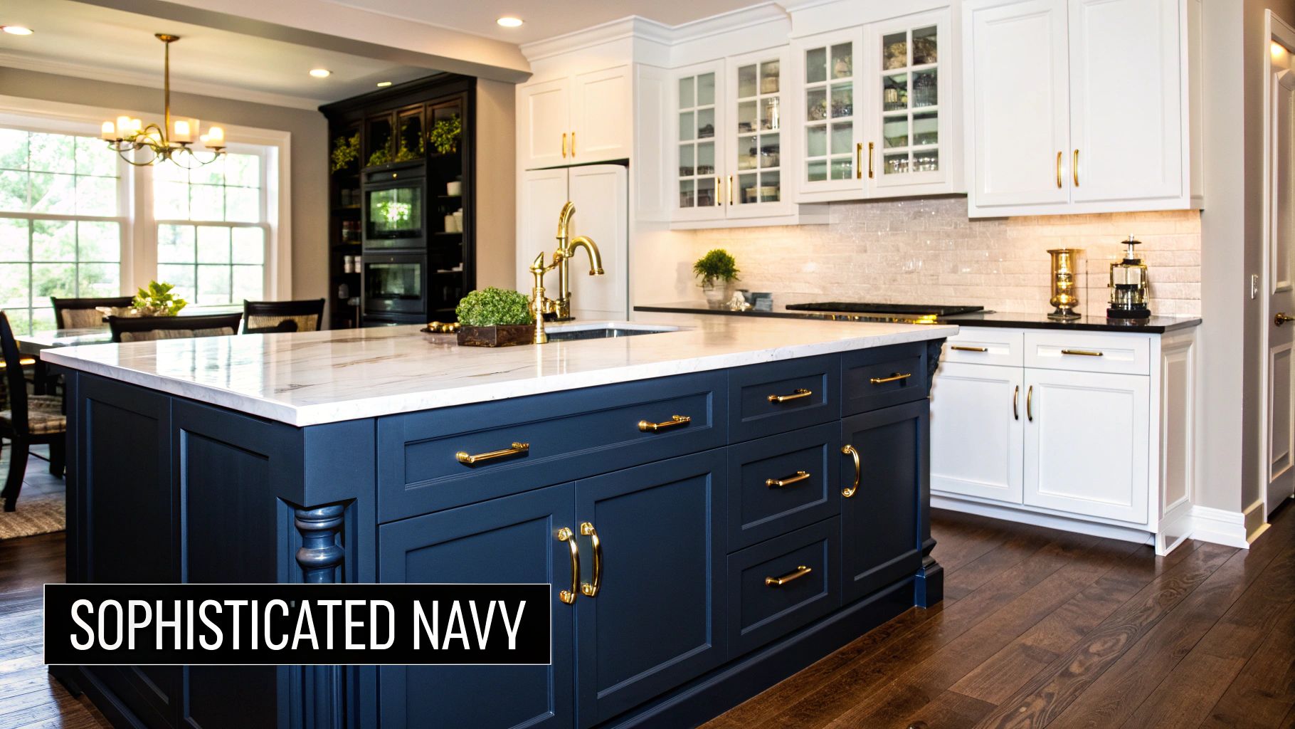
Navy blue has emerged as a standout choice for kitchen cabinets, offering a refined alternative to standard black or gray options. This deep blue shade with black undertones serves as both a grounding neutral and a rich color element. What makes navy particularly special is how beautifully it adapts to different lighting conditions, making it suitable for kitchens of all sizes and layouts. It deserves recognition for providing an upscale, elegant appearance that won't quickly become outdated.
The magic of navy cabinetry lies in its ability to create a dramatic yet sophisticated atmosphere. This rich color brings depth to your kitchen space, making it feel both luxurious and welcoming. As a neutral, navy pairs effortlessly with various countertops, backsplashes, and hardware finishes, accommodating design styles from traditional to modern, farmhouse to transitional.
Several factors have contributed to navy's rising popularity. Design experts like Emily Henderson have showcased its transformative potential in numerous projects. Paint manufacturers such as Benjamin Moore (Hale Navy HC-154) and Sherwin-Williams (Naval SW 6244) have made specific navy shades easily accessible to homeowners. High-end retailers like Restoration Hardware have incorporated navy extensively in their kitchen displays, cementing its status as a premium design choice. Houzz trend reports consistently feature navy kitchens paired with gold hardware, while designer Sarah Richardson often combines navy lower cabinets with white uppers. Coastal homes frequently embrace the nautical feel of navy cabinets paired with crisp white subway tile backsplashes.
Pros:
- Creates a sophisticated, high-end look: Navy instantly elevates your kitchen's appearance with a touch of luxury.
- Hides dirt and smudges better than lighter colors: A practical advantage for busy family kitchens.
- Pairs well with marble countertops and brass hardware: These classic combinations create timeless elegance.
- Timeless appeal that won't quickly go out of style: Navy offers enduring style beyond passing trends.
Cons:
- Can make small kitchens feel darker: Smaller spaces require careful planning and lighting design.
- May show dust more readily than medium-toned cabinets: Regular dusting becomes part of maintenance.
- Requires thoughtful lighting to prevent a cave-like effect: Under-cabinet lighting and natural light sources are essential.
- Higher maintenance than lighter colors if touched frequently: Fingerprints may be more noticeable on the surface.
Tips for Implementing Navy Blue Cabinets:
- Two-Toned Approach: Use navy for lower cabinets only, combining with lighter uppers (white, cream, or light gray) to create balance and prevent the space from feeling overwhelmed.
- Metallic Accents: Incorporate warm metals like brass or gold for contrast and a touch of elegance. Black hardware creates a more modern, striking look.
- Illumination is Key: Install under-cabinet lighting to brighten work areas and prevent a dark, closed-in feel. Maximize windows and natural light whenever possible.
- Durable Finish: Select a semi-gloss or satin finish for easier cleaning and to minimize the appearance of fingerprints and smudges.
By weighing these pros, cons, and implementation strategies, you can confidently embrace the timeless elegance of navy blue cabinetry to create a stunning and functional kitchen space that truly stands the test of time.
2. Sage Green
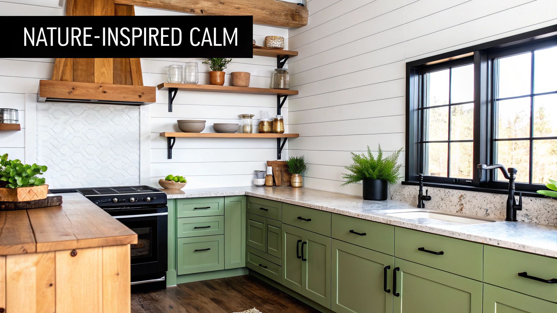
Sage green has emerged as a favorite kitchen cabinet color, offering a refreshing change from standard kitchen palettes. Its growing popularity comes from our collective desire to bring nature indoors and create spaces that feel both peaceful and welcoming. This soft green with subtle gray undertones strikes a perfect balance – it's neither too bold nor too bland, making it a versatile choice that works across design styles from country farmhouse to sleek contemporary spaces.
The earthy quality of sage green creates a genuinely calming kitchen environment. I love how it changes character throughout the day as natural light shifts, adding unexpected depth to your space. Unlike more trendy color choices that can quickly feel dated, sage green has staying power – it's a timeless option that continues to look fresh years after installation.
One of sage green's greatest strengths is how beautifully it pairs with natural materials. Wood elements like open shelving, butcher block countertops, or woven rattan seating create a cohesive, organic look alongside these cabinets. For homeowners tired of the ubiquitous white or gray kitchen, sage offers personality without overwhelming your space – it's distinctive yet still neutral enough to work with changing decor.
Design professionals like Amber Lewis have showcased sage green's versatility across numerous projects. Paint colors such as Farrow & Ball's Mizzle and Pigeon and Sherwin-Williams' Clary Sage SW 6178 have become go-to choices for creating serene kitchen spaces. The modern farmhouse movement, which gained massive traction through social media, has embraced sage green wholeheartedly. Design firms like Studio McGee frequently feature sage lower cabinets in their signature spaces, demonstrating how this color grounds a room with quiet confidence. In historic home renovations, sage green bridges old and new, respecting architectural heritage while feeling current. Joanna Gaines often incorporates this shade in her Magnolia Home designs, showcasing its timeless appeal.
Features:
- Muted green with gray undertones
- Earthy, organic feel
- Soft appearance that shifts with lighting
- Works in both traditional and modern contexts
Pros:
- Creates a soothing, calming atmosphere
- Pairs well with natural wood and stone
- Versatile yet less common than white or gray
- Ages well and remains stylish
Cons:
- Can appear washed out in low-light rooms
- May clash with countertops with warm undertones
- Color matching cabinet components can be challenging
- Shows fingerprints and smudges more readily than darker colors
Tips for Implementation:
- Pair with cream or off-white walls to avoid stark contrasts.
- Opt for matte or eggshell finishes for a more authentic, aged look.
- Combine with natural stone countertops like soapstone or honed marble.
- Incorporate warm wood accents through open shelving, flooring, or accessories.
Sage green's blend of calming color, versatility, and enduring style has secured its position among top kitchen cabinet trends. By thoughtfully considering its characteristics and following these implementation tips, you can create a kitchen that feels both visually appealing and emotionally grounding – a space where you'll truly want to gather.
3. Warm White
Warm white has become a leading kitchen cabinet color trend because it offers the best of both worlds: the brightness of white with the comfort of warmer tones. This style moves away from stark, cool whites and embraces creamy, off-white shades with subtle undertones of yellow, beige, or pink. The result is a kitchen that feels both fresh and timeless, creating a welcoming atmosphere perfect for family gatherings and everyday living.
This trend's popularity comes from homeowners wanting spaces that feel lived-in rather than clinical. Think about the cozy kitchens in Nancy Meyers' films like "Something's Gotta Give" and "It's Complicated" – these spaces use warm white cabinetry to create effortless elegance with plenty of warmth. Designers like Sarah Richardson, known for beautiful cottage-style kitchens, and Martha Stewart, whose Bedford home features warm white cabinetry, have helped establish this trend's staying power. Popular paint choices like Benjamin Moore's White Dove OC-17 and Farrow & Ball's Pointing No. 2003 have become go-to options for achieving this look, especially recommended by designers like Shea McGee of Studio McGee.
Features and Benefits:
- Soft white with warm undertones: The hints of yellow, beige, or pink prevent cabinets from feeling clinical and add depth to the kitchen's look.
- More forgiving than pure white: While still bright, warm white is less likely to show every speck of dust and smudge, making it practical for busy family kitchens.
- Creates a cozy, welcoming atmosphere: The warmth of these shades instantly makes kitchens feel more inviting and comfortable.
- Light-reflecting properties enhance space: Like other light colors, warm white bounces light around the room, making kitchens appear larger and more open.
Pros:
- Brightens spaces without feeling cold or sterile
- Highly versatile, works well with virtually any accent color and design style
- Makes kitchens appear larger and more spacious
- Provides a neutral backdrop that adapts as other décor elements change
Cons:
- Shows dirt and wear more readily than darker colors, requiring regular cleaning
- Can be difficult to match across different materials (cabinets, trim, walls)
- May develop yellowing over time, especially in humid or heavy cooking environments
Tips for Implementation:
- Test, test, test: Always sample paint colors in your actual kitchen lighting before committing. The same shade can look completely different depending on light sources and surrounding colors.
- Prime properly: Use high-quality primer designed specifically for cabinetry to ensure even coverage and good paint adhesion.
- Consider the finish: A pearl or semi-gloss finish will make cleaning easier and resist stains better than matte options.
- Coordinate with countertops: Warm whites pair beautifully with marble or quartz countertops that have warm veining, enhancing the kitchen's inviting feel.
By considering these factors and following these practical tips, you can successfully bring the warm white trend into your kitchen design, creating a space that's both stylish and welcoming for years to come.
4. Two-Tone Cabinets
Two-tone cabinetry has become a standout kitchen design choice that brings depth and character to any space. By pairing different colors for upper and lower cabinets, or adding a contrasting island, you create visual interest while naturally defining different areas of your kitchen. This approach lets you play with color in a thoughtful way, creating a custom look that feels professionally designed.
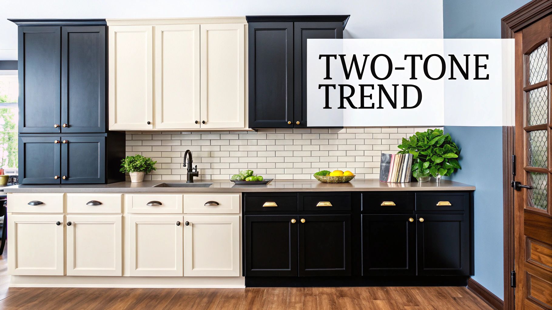
One of the biggest advantages of two-tone cabinets is how they add visual interest without overwhelming the space. Using lighter colors on upper cabinets creates an airy, open feeling, while darker colors on lower cabinets provide a grounding effect and sense of stability. This intentional contrast adds architectural interest that makes your kitchen feel custom-designed. Think of it as creating visual weight at the bottom that anchors the kitchen, while keeping things bright and open above. This technique can even help balance proportions in your kitchen – making low ceilings appear higher or narrow spaces seem wider. These practical benefits have secured two-tone cabinets a firm spot on our list of trending kitchen cabinet colors.
This design approach has gained popularity through designers like Nate Berkus and shows like HGTV's Fixer Upper with Chip and Joanna Gaines, who often showcase kitchens with contrasting islands. You'll find plenty of examples in Architectural Digest, featuring combinations like navy lower cabinets with crisp white uppers. IKEA kitchen displays, along with trending designs on Houzz and Pinterest, further confirm that the two-tone look has become a staple in modern kitchen design.
Pros:
- Adds visual interest without overwhelming the space
- Creates a custom, designer look
- Allows introduction of color in a balanced way
- Can visually correct proportion issues in a kitchen
Cons:
- Requires more careful color coordination
- May date more quickly than single-color kitchens
- Potentially higher cost due to multiple paint colors or materials
- Can make some spaces feel busy if not well-executed
Tips for Implementing Two-Tone Cabinets:
- Ground the space: Use the darker color on the lower cabinets
- Cohesive undertones: Ensure both colors share similar undertones for a harmonious look
- Hardware consistency: Maintain consistent hardware across both cabinet colors for a unified feel
- Island focal point: If space allows, use the island as a focal point with a distinct third color
You might be interested in: Cabinet Doors and Drawers for a closer look at different cabinet styles that can be incorporated into a two-tone design. For instance, shaker style doors on the upper cabinets combined with slab doors on the lower can further enhance the visual contrast.
Real-world examples include Sarah Beeny's renovation projects, which frequently incorporate two-tone kitchens to maximize visual impact and functionality. These projects show how two-tone cabinetry can clearly define different zones, such as a brighter area for food preparation and a darker, more grounded area for cooking and cleaning. This thoughtful use of color and contrast not only looks great but also improves the overall flow and usability of your kitchen.
5. Matte Black
Matte black has become a powerhouse in kitchen design, transforming this classic color from severe to sophisticated. This trend elevates kitchens from purely functional spaces to style statements, earning its spot on our list of top cabinet color trends. The non-reflective finish creates unmatched depth and drama, giving spaces a modern edge that glossy finishes simply can't replicate.
What makes matte black so popular is its role as a sophisticated neutral. It creates a dramatic backdrop that makes other elements – from marble countertops to brass hardware – truly stand out. This adaptability allows it to work in various design styles, from minimalist to industrial. Design icon Kelly Wearstler has championed this trend in her high-end residential projects. Retailers like Restoration Hardware with their kitchen collections and paint companies like Farrow & Ball with their iconic Pitch Black No. 256 have helped cement its place in contemporary design. The architectural minimalism movement has further boosted its popularity by emphasizing clean lines and stark contrasts.
The matte finish adds a unique dimension to kitchen spaces. Its depth makes rooms feel more luxurious while setting a bold tone that immediately captures attention. A major practical benefit is that matte black hides fingerprints and smudges better than glossy finishes – a significant advantage in busy kitchens. It also creates the perfect canvas for colorful accents and metallic hardware, making them pop dramatically. You might be interested in: Different Cabinet Handle and Pull Styles for Matte Black Cabinets. In open-concept spaces, matte black cabinetry creates a stunning focal point that anchors the entire kitchen.
This bold choice does come with considerations. In smaller kitchens, matte black can feel overwhelming and make spaces seem tighter. It also tends to show dust and light-colored debris more visibly than lighter cabinets. Thoughtful lighting design is essential to prevent a cave-like effect. Under-cabinet lighting is highly recommended to brighten work areas and add warmth. In rooms with limited natural light, the dark finish might feel too heavy and imposing.
Pros:
- Creates a bold, high-impact look
- Hides fingerprints and smudges
- Makes colorful accents and metallics pop
- Works well in open-concept spaces
Cons:
- Can make small kitchens feel cramped
- Shows dust and light-colored debris
- Requires thoughtful lighting design
- May feel overpowering in rooms with limited natural light
Real-world examples showcase the trend's staying power, including celebrity chef Gordon Ramsay's home kitchen with its sleek matte black cabinetry. The 2019 KBIS (Kitchen & Bath Industry Show) featured numerous matte black kitchen displays, confirming its status as a leading design trend.
Tips for Implementing Matte Black Cabinetry:
- Balance with Contrast: Pair matte black cabinets with light countertops and backsplashes, such as marble or quartz, for striking visual contrast.
- Illuminate Strategically: Add under-cabinet lighting to prevent a dark, closed-in feel and highlight the depth of the black finish.
- Soften with Warmth: Incorporate warm wood elements, like open shelving or a butcher block island, to soften the look and add visual interest.
- Consider a Two-Tone Approach: If your kitchen is small or lacks natural light, consider using matte black for lower cabinets and a lighter shade for upper cabinets to create balance and spaciousness.
By understanding the characteristics of this dramatic hue and following these practical tips, you can successfully incorporate matte black cabinetry into your kitchen design, creating a space that's both sophisticated and functional.
6. Greige (Gray-Beige)
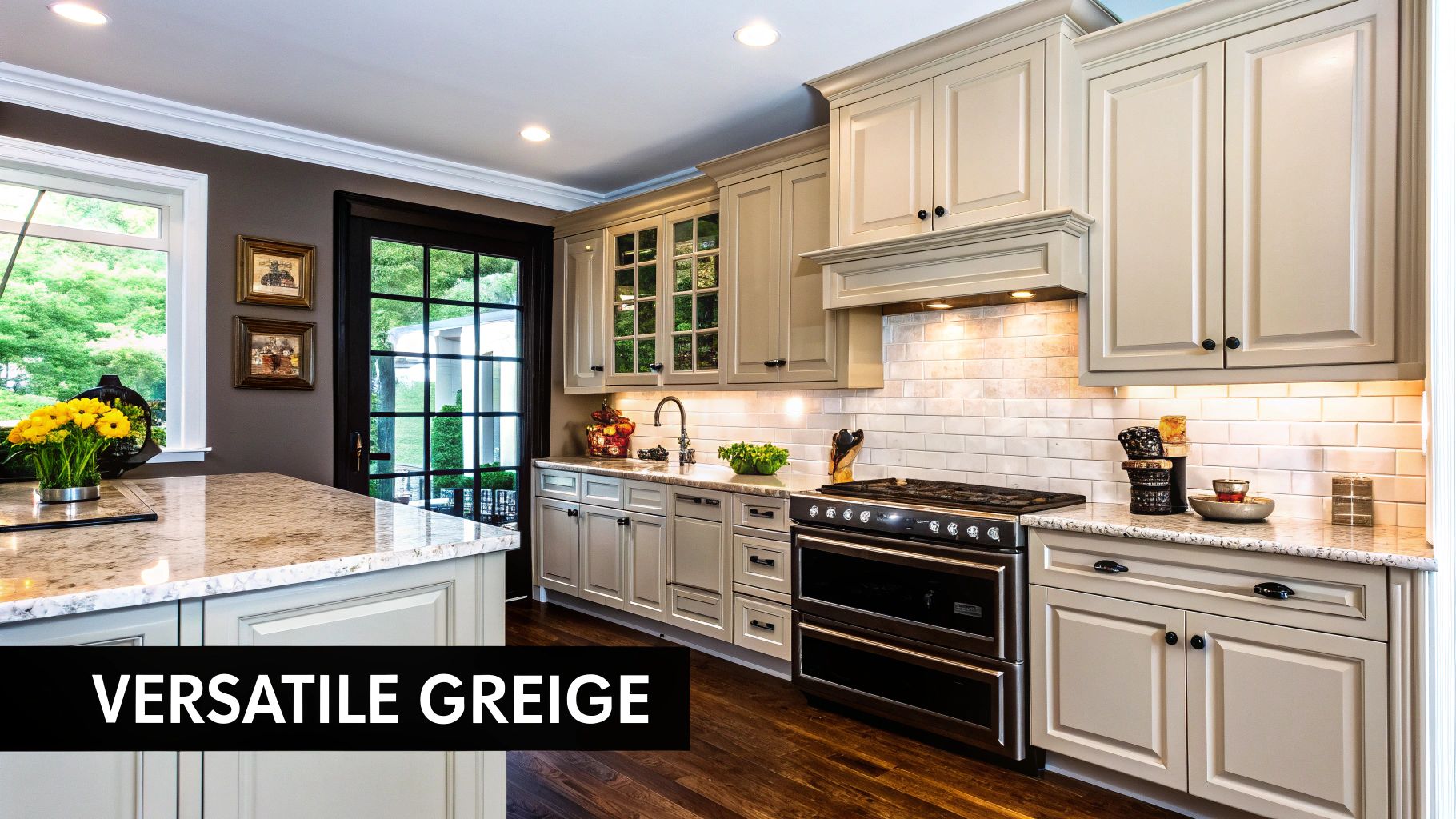
Greige, the beautiful marriage of gray and beige, has become a standout choice for kitchen cabinets in recent years. This sophisticated neutral delivers a perfect balance: gray's cool undertones paired with beige's inherent warmth. What makes greige truly special is how it adapts to different spaces and lighting conditions, making it a go-to option for kitchens of any style.
The color's chameleon-like quality is its secret weapon. Depending on your lighting and surrounding color palette, greige cabinets can lean more gray or more beige. This flexibility allows it to complement both warm and cool color schemes, giving you far more design freedom than you'd have with either gray or beige alone.
Several factors explain greige's popularity in today's kitchens. As homeowners moved away from all-white kitchens toward warmer, more inviting spaces, greige stepped in as the perfect transition color. Popular designers like Joanna Gaines and the Property Brothers helped popularize this shade through their televised renovations. Specific paint colors have become household names, with Benjamin Moore's Revere Pewter HC-172 and Sherwin-Williams' Agreeable Gray SW 7029 leading the pack. You'll also notice greige throughout model homes built by Toll Brothers, showcasing its appeal in luxury properties. Design experts like Sarah Richardson and Candice Olson frequently feature greige in their transitional and neutral designs, further cementing its status.
Features and Benefits:
- Versatility: Works beautifully across design styles from farmhouse to modern
- Adaptability: Shifts appearance based on lighting and surrounding colors
- Timeless Appeal: Avoids dating quickly unlike trendy bold colors
- Practicality: Conceals dirt and wear better than white or light colors
Pros:
- Creates a calm, sophisticated backdrop for your kitchen
- Pairs effortlessly with virtually any accent color or metal finish
- Offers a warmer alternative to stark gray cabinets
- Maintains relevance through changing design trends
Cons:
- Can appear flat without proper texture and contrast elements
- Might feel uninspiring if not paired with interesting materials
- Touch-ups can be challenging to match precisely
- Less dramatic than bolder color choices
Tips for Implementation:
- Add Depth: Incorporate wood elements, stone countertops, and mixed metals to prevent a flat look
- Create Contrast: Consider a deeper-toned or differently colored island for visual interest
- Define the Space: Pair with crisp white trim to create clean, defined lines
- Play with Variation: Use slightly different greige shades for upper and lower cabinets for subtle dimension
Greige deserves its spot on this list because it strikes that rare balance between practical and beautiful. Its versatility across different design styles, adaptability to changing light conditions, and timeless appeal make it perfect for creating a kitchen that feels both current and enduring. While you'll need to incorporate contrasting elements to avoid blandness, greige's inherent benefits make it one of today's smartest cabinet color choices.
7. Rich Emerald Green
Emerald green has become a standout choice in kitchen design, offering a luxurious alternative to conventional cabinet colors. This deep, saturated jewel tone with blue undertones brings both vibrancy and drama while establishing itself as a surprisingly versatile "new neutral." Its rich appearance connects indoor spaces with nature, aligning perfectly with the growing biophilic design movement. This natural connection, paired with its inherent elegance, secures emerald green's position among the top kitchen cabinet color trends.
What makes emerald green so appealing are its distinct characteristics. The deep, saturated quality creates a bold statement, while the jewel-toned finish adds luxury to any kitchen space. This elegant feel becomes even more pronounced when combined with brass or gold hardware, resulting in a truly timeless look. As a practical bonus, emerald green hides dirt and marks much better than lighter cabinet colors.
High-end design associations have significantly boosted emerald green's popularity. British kitchen companies like DeVol, known for their signature deep green cabinetry, and Plain English Design, with their stunning emerald kitchen installations, have showcased the color's versatility in upscale settings. Interior designer Athena Calderone has also championed this rich hue, further cementing its place in luxury design circles. Even celebrity kitchens have embraced the trend – Dakota Johnson's emerald green kitchen featured in Architectural Digest has inspired countless homeowners. Paint colors such as Benjamin Moore's Essex Green HC-188 and Farrow & Ball's Studio Green No. 93 have made this rich hue more accessible to the public.
Before committing to emerald green cabinets, consider these advantages and challenges:
Pros:
- Creates an unforgettable, distinctive kitchen
- Pairs beautifully with brass and gold hardware
- Hides dirt and marks better than lighter colors
- Brings life and energy to the space
Cons:
- Bold choice that may not appeal to all future buyers
- Can dominate a space if not balanced properly
- May feel dated if emerald trends fade
- Requires careful color coordination with other elements
For a successful emerald green cabinet installation, keep these practical tips in mind:
- Balance is key: Offset the intensity of emerald green with plenty of white or neutral space on walls, backsplashes, and countertops.
- Strategic application: Consider using emerald green for a statement island or lower cabinets only, leaving upper cabinets in a lighter color to create a sense of airiness.
- Material pairings: Natural materials like marble, brass, and wood complement emerald green beautifully, enhancing its luxurious feel. Black or antique brass hardware further elevates the look, adding a touch of classic sophistication.
- Color coordination: Carefully consider the surrounding colors and ensure they harmonize with the emerald green.
You might be interested in: Blog post about kitchen cabinet hardware. Read also: Article about sustainable cabinet materials. This blog features various articles related to cabinet trends, including tips on choosing the perfect hardware and information about sustainable materials, perfect for homeowners, interior designers, and luxury real estate developers looking for more in-depth information. If you're looking to incorporate custom cabinetry solutions, you'll find valuable resources on our site.
8. Warm Wood Tones
The return of natural wood in kitchen cabinetry signals a meaningful shift away from painted finishes that have dominated recent years. Warm wood tones are experiencing a genuine renaissance, bringing an authentic and welcoming feel to modern kitchens. This trend celebrates wood's natural beauty by showcasing grain patterns and textures without excessive treatment. Its growing appeal comes from homeowners' desire for authenticity and a stronger connection to natural materials, earning it a well-deserved spot on our kitchen cabinet color trends list.
This isn't the dark, heavy wood kitchen from decades past. Today's trend embraces lighter and medium-toned woods like oak, walnut, and cherry, allowing their natural character to be the star. The focus is on tactile, organic surfaces with matte or low-sheen finishes that enhance the wood's inherent warmth. The result is a kitchen that strikes the perfect balance between contemporary design and timeless appeal.
Features and Benefits:
- Natural Grain Visibility: Minimal staining allows the unique patterns of each wood species to shine through.
- Medium to Light Brown Tones: Oak, walnut, and cherry are popular choices, offering a range of warm, inviting hues.
- Tactile, Organic Quality: Wood adds a sense of warmth and texture that painted cabinets can't replicate.
- Matte or Low-Sheen Finishes: These finishes enhance the natural beauty of the wood grain and create a contemporary feel.
Pros:
- Warmth and Texture: Wood cabinets inject warmth and visual interest into modern spaces, creating a cozy and inviting atmosphere.
- Timeless Appeal: Wood is a classic material that transcends fleeting trends, ensuring your kitchen remains stylish for years to come.
- Graceful Aging: Wood ages beautifully, hiding wear and tear more effectively than painted finishes. Scratches and dings can even add to the character of the wood over time.
- Connection to Nature: Wood cabinets bring a touch of the outdoors in, fostering a sense of tranquility and connection to nature.
Cons:
- Higher Cost: Solid wood cabinets are generally more expensive than painted alternatives.
- Less Versatility: Updating or changing the color of wood cabinets is more challenging than repainting.
- Maintenance Requirements: Wood requires regular maintenance, such as oiling or waxing, to prevent drying and damage.
- Color Changes: Certain wood species may continue to darken or change color over time due to exposure to light and air.
Real-World Examples and Inspiration:
- Japanese Minimalism: Pale oak cabinets are a hallmark of Japanese-inspired minimalist kitchens, creating a serene and calming atmosphere.
- Mid-Century Modern: Walnut cabinetry is a popular choice for mid-century modern revivals, adding a touch of retro sophistication.
- Scandinavian Design: Light ash or white oak cabinets contribute to the bright and airy aesthetic of Scandinavian-inspired kitchens.
Tips for Implementation:
- Engineered Veneers: Opt for engineered veneers for more consistent grain patterns and greater stability.
- Mixed Materials: Combine wood cabinets with a painted island or contrasting countertops for added visual interest.
- Matte Finishes: Choose matte finishes to highlight the natural beauty of the wood grain and create a contemporary look.
- Textural Contrast: Pair wood cabinets with concrete or natural stone countertops for a striking textural contrast.
Influencers and Popularization:
The warm wood tone trend has gained momentum thanks to designers like Amber Interiors, whose work often features natural materials and a relaxed, California-cool aesthetic. The trend also draws inspiration from Scandinavian design principles and the clean simplicity of Japanese interiors. Additionally, many custom cabinet makers focusing on sustainable materials have helped propel this trend into mainstream kitchen design.
By understanding what makes this trend special and following these practical tips, you can successfully bring warm wood tones into your kitchen design, creating a space that feels both current and enduring.
9. Dusty Blues
Dusty blue cabinetry has become one of the most popular kitchen trends recently, offering a beautiful middle ground between stark white and bold navy. This calming color creates a serene atmosphere while still maintaining enough character to make a statement. With subtle gray undertones, dusty blue has a timeless quality that won't quickly fall out of fashion, making it a smart choice for homeowners looking for lasting appeal.
One of the most captivating aspects of dusty blue is how it transforms throughout the day. In morning light, it appears as a soft, airy pastel, while evening shadows bring out deeper, more reflective tones. This natural variation adds visual interest to your kitchen without any extra effort on your part.
Dusty blue works beautifully across multiple design styles. In coastal kitchens featured in Better Homes & Gardens, it creates a peaceful seaside feel. In French country settings, dusty blue lower cabinets add rustic charm. Even in sleek transitional spaces, like those designed by Sarah Richardson, a dusty blue island introduces elegant sophistication without overwhelming the room. The popularity of modern farmhouse and coastal design, along with in-demand paint colors like Farrow & Ball's Light Blue No. 22 and Benjamin Moore's Boothbay Gray HC-165, has helped push dusty blue into mainstream kitchen design.
Pros of Dusty Blue Cabinets:
- Creates a calming, peaceful atmosphere: The soft, muted tones promote relaxation in the heart of your home.
- More subtle than navy while still adding character: Offers color without dominating the space.
- Pairs well with both warm and cool elements: Gives you flexibility with other design choices.
- Less trendy than bright colors, ensuring longevity: Won't quickly look dated or tired.
Cons of Dusty Blue Cabinets:
- Can appear washed out in spaces with poor lighting: Needs good light to show its true beauty.
- Shows fingerprints and smudges more than darker colors: Requires regular cleaning to look its best.
- May clash with warm-toned flooring or countertops: Consider your existing elements carefully.
- Can feel cold if not balanced with warm elements: Needs thoughtful pairing with warmer materials.
Tips for Implementing Dusty Blue Cabinets:
- Pair with warm brass or copper hardware for contrast: These metals add warmth and visual interest.
- Add natural wood elements to balance the coolness: Wood flooring, shelving, or butcher block countertops create harmony.
- Consider marble or quartz countertops with blue-gray veining: These materials complement dusty blue perfectly.
- Use in kitchens with good natural light to appreciate the subtle color shifts: Maximize windows and lighting to showcase the color's nuances.
Dusty blue offers a fresh yet sophisticated approach to kitchen design that works in various settings. By weighing the advantages and challenges, and following these practical implementation suggestions, you can create a beautiful kitchen space that feels both current and timeless.
10. Taupe
Taupe has quickly become a favorite in kitchen cabinet color trends, offering a refined alternative to standard white and gray. This nuanced grayish-brown tone, which often features subtle purple or green undertones, brings an elegant, grounded feel that works beautifully in both modern and classic kitchens. What makes taupe special is its ability to change character with different lighting conditions, helping it blend seamlessly into various design styles. This adaptability is why homeowners and designers increasingly choose taupe for kitchen renovations.
The growing popularity of taupe reflects a broader desire for complex neutrals that create warmer, more inviting spaces than stark white or cool gray can achieve. Design influencers like Kelly Hoppen, known for her sophisticated neutral palettes, and high-end brands such as Restoration Hardware have embraced taupe in their collections, showcasing its versatility and understated elegance. You'll find taupe kitchens featured in prestigious publications like Elle Decor and in California kitchen designs by Jeffrey Alan Marks, cementing its reputation for creating spaces that feel both luxurious and livable. Even luxury urban condo developments have adopted taupe, highlighting its wide appeal. Beyond aesthetics, taupe cabinets hide everyday wear and dirt better than lighter options – a practical consideration for busy households.
Features and Benefits:
- Rich Grayish-Brown with Subtle Undertones: Taupe's complexity, with hints of purple or green, creates depth that simple neutrals can't match.
- Changes with Lighting: This color shifts throughout the day, adapting to different lighting conditions and creating visual interest.
- Works with Warm and Cool Colors: Neither as cold as gray nor as basic as beige, taupe pairs beautifully with both warm and cool color schemes.
- Hides Daily Wear: For families especially, taupe effectively conceals fingerprints, small marks and everyday dirt.
- Creates a Calm Background: Taupe forms a sophisticated backdrop that allows fixtures, accessories and artwork to stand out.
Pros:
- More sophisticated alternative to white or gray
- Conceals dirt and marks better than lighter cabinets
- Pairs well with most countertop materials
- Creates a gentle, elegant foundation for accessories
Cons:
- Can look muddy if undertones clash with other elements
- More difficult to coordinate with existing finishes
- May feel dated if not paired with contemporary touches
- Less dramatic impact than bolder color choices
Tips for Implementation:
- Test in Your Kitchen's Light: Taupe's undertones vary widely, so test samples under your specific lighting before committing.
- Add White Trim: Pairing taupe cabinets with crisp white trim creates definition and prevents the color from feeling too heavy.
- Choose Complementary Hardware: Champagne bronze or brushed nickel hardware works beautifully with taupe, adding warmth and refinement.
- Match Stone Elements: Select natural stone countertops and backsplashes with similar undertones for a cohesive, elegant look.
Made popular by paint colors like Benjamin Moore's Weimaraner AF-155 and Sherwin-Williams' Mega Greige SW 7031, taupe offers an adaptable solution for creating a timeless kitchen. By paying attention to undertones and incorporating complementary elements, you can use taupe to transform your kitchen into a space of understated luxury that will remain stylish for years to come.
Kitchen Cabinet Color Trends: 10-Point Comparison Guide
| Trend | 🔄 Complexity | ⚡ Resources | 📊 Outcomes | 💡 Ideal Use Cases | ⭐ Advantages |
|---|---|---|---|---|---|
| Navy Blue | Medium – requires thoughtful lighting design | Medium – additional lighting & hardware details | Sophisticated, dramatic, high-end look | Larger kitchens or lower cabinets for balance | Timeless appeal; hides dirt and smudges effectively |
| Sage Green | Low-to-Medium – subtle color matching challenges | Low-to-Medium – minimal accent enhancements needed | Calm, soothing, nature-inspired ambiance | Traditional and modern kitchens prioritizing organic feel | Soothing appeal; versatile with natural wood elements |
| Warm White | Medium – needs frequent cleaning and sample tests | Low-to-Medium – quality primer and finish required | Bright, open, and inviting space | Kitchens aiming for a bright, airy and neutral backdrop | Highly versatile; enlarges perceived space |
| Two-Tone Cabinets | High – meticulous color coordination is key | High – multiple finishes and materials involved | Visually interesting, designer-inspired look | Trend-forward spaces focusing on visual balance | Custom, balanced aesthetic with added architectural interest |
| Matte Black | Medium – demands careful lighting to avoid darkness | Medium – upkeep and accent lighting considerations | Bold, dramatic statement that elevates hardware | Open-concept, modern kitchens seeking a striking look | Modern sophistication; accentuates design elements |
| Greige (Gray-Beige) | Low – adapts easily though matching can be tricky | Low-to-Medium – forgiving with wear and dirt | Timeless, sophisticated neutral backdrop | Transitional or mixed-style kitchens | Versatile; effectively hides marks while pairing with accents |
| Rich Emerald Green | High – precise coordination with complementary tones | Medium-to-High – requires bold finishes and accents | Unforgettable, dramatic, and luxurious impression | Statement zones or feature islands in upscale kitchens | Luxurious impact; distinct and energetic look |
| Warm Wood Tones | Medium – coordination with other materials is needed | High – premium wood and proper maintenance essential | Warm, textured, and organic ambiance | Contemporary kitchens embracing natural elements | Timeless natural warmth; adds texture and craftsmanship |
| Dusty Blues | Low – easy integration with slight light variability | Low – minimal accenting needed | Calming and airy environment | Kitchens with ample natural light to showcase subtle hues | Soft, serene appeal without overpowering the space |
| Taupe | Medium – requires careful matching to avoid muddiness | Low-to-Medium – standard finishes suffice | Elegant and understated atmosphere | Urban, sophisticated kitchens seeking a refined neutral | Versatile charm; masks wear while offering softened elegance |
Choosing Your Dream Kitchen Cabinet Color
Selecting the perfect kitchen cabinet color is a key decision in any kitchen renovation. It's not just about picking a color you love; it's understanding how that color works with your existing décor, natural light, and the atmosphere you're trying to create. In this article, we've explored ten trending cabinet colors, from classic warm white and natural wood tones to bold matte black and rich emerald green. While these trends can inspire you, your final choice should reflect your personal style and your kitchen's unique characteristics.
When applying these color concepts, carefully consider your kitchen's size, layout, and existing elements. Smaller kitchens often benefit from lighter shades like warm white, sage green, or dusty blue to create an open, spacious feel. Larger kitchens can handle darker, richer colors such as navy blue, emerald green, or matte black. Pay attention to the undertones in your countertops, flooring, and backsplash to create a harmonious color palette. Two-tone cabinets offer an interesting way to incorporate multiple colors and add visual interest, particularly in open-concept kitchens.
Don't hesitate to experiment with these trends and adapt them to your specific needs. Use paint swatches, online design tools, and mood boards to visualize different colors in your space. Consider the psychological effects of color in your decision: blues and greens create calm, yellows and oranges energize a space, while grays and blacks offer modern sophistication. Stay informed about emerging trends like textured finishes and sustainable materials to keep your kitchen design current.
The most important takeaway is that your cabinet color should be a thoughtful choice that complements your lifestyle and enhances your home's overall design. Whether you prefer the timeless appeal of warm wood tones or the dramatic statement of matte black, always prioritize quality and durability in your cabinetry selection.
Ready to bring your dream kitchen to life? Sinclair Cabinetry Inc. offers over 35 years of expertise in crafting bespoke, real wood cabinetry solutions customized to your exact specifications. From classic to contemporary styles, we transform your vision into reality with meticulous craftsmanship, premium materials, and a commitment to lasting quality. Explore our extensive range of customizable options, professional installation services, and diverse accessories, and experience the difference of truly custom cabinetry. Start designing your dream kitchen today: Visit Sinclair Cabinetry