The best colors for a kitchen are usually the ones that feel timeless and welcoming. You really can't go wrong with choices like crisp whites, calming blues, earthy greens, and warm greiges. These shades consistently top the charts because they look great in almost any style of kitchen and under different lighting.
Ultimately, a good kitchen color is one that pulls everything together—your cabinetry, countertops, and your own personal taste.
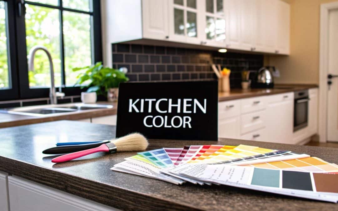
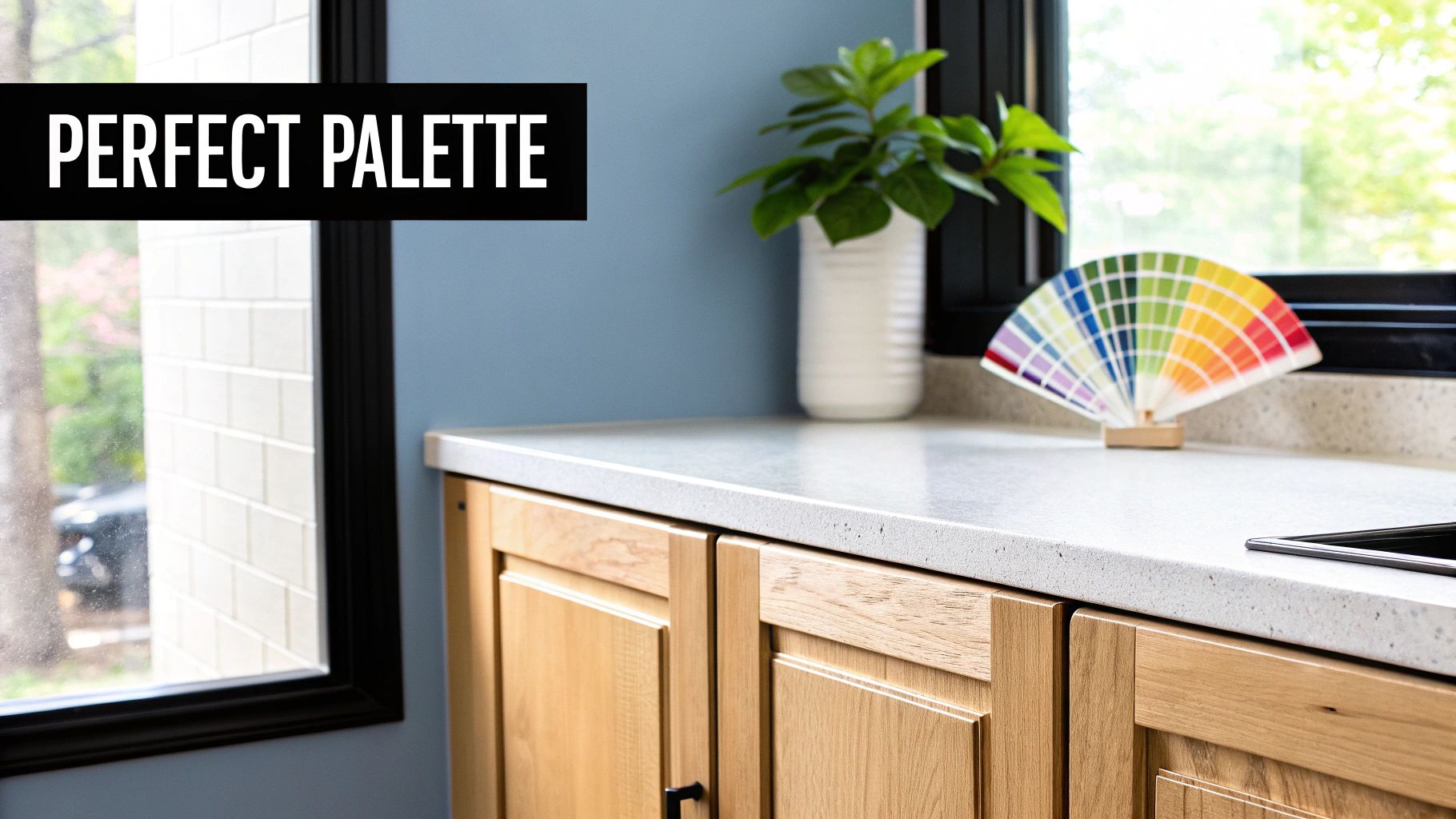
Finding Your Perfect Kitchen Color Palette
Picking a kitchen color isn’t just about chasing the latest trend; it's about defining the feel of the heart of your home. The right hue is like the perfect seasoning—it enhances everything around it, from your quiet morning coffee to a lively family dinner.
Think of your kitchen's color as the backdrop to your life. It sets the emotional tone, making the space feel energetic, calming, or totally sophisticated.
Before you start taping paint chips to the wall, it's helpful to get a handle on the bigger picture of color in design. If you can master the principles of home design color, you'll be able to make choices that feel intentional, not just for the kitchen but for your entire home. The goal is to create a natural flow from one room to the next.
Why Neutrals Are Still King
There's a good reason why neutrals are the trusted workhorses of kitchen design. They create a clean canvas that lets other elements, like the gorgeous grain of Sinclair Cabinetry’s real wood, become the star of the show.
White, in particular, continues to dominate kitchen design. Why? It has this incredible ability to make a space feel bigger, brighter, and cleaner. A recent survey found that about 33% of homeowners chose white for their cabinets, blowing natural wood tones out of the water. This tells you that people are looking for longevity and adaptability in their kitchen design.
A great kitchen color doesn’t just look good on a paint chip; it feels right in your space. It should reflect your personality while complementing the architectural style of your home and the quality of its components, like your cabinetry.
Tapping Into Color Psychology
Every color family triggers a different emotion, and knowing this can help you craft the perfect atmosphere for your kitchen. Let’s break down the psychology behind some of the most popular choices.
For a quick reference, here's a look at the top contenders, what they make us feel, and the kitchen styles they shine in.
Top Kitchen Color Choices At a Glance
| Color Family | Psychological Feel | Best For Kitchen Styles |
|---|---|---|
| Whites & Off-Whites | Clean, Simple, Spacious, Bright | Modern, Farmhouse, Coastal, Minimalist |
| Blues (Navy, Sky) | Calming, Serene, Stable, Refreshing | Coastal, Traditional, Transitional, Luxury |
| Greens (Sage, Olive) | Natural, Balanced, Tranquil, Grounding | Farmhouse, Traditional, Craftsman, Eclectic |
| Grays & Greiges | Sophisticated, Stable, Modern, Chic | Modern, Industrial, Transitional, Contemporary |
Let's dig a little deeper into what these colors bring to the table:
- Whites and Off-Whites: These shades instantly signal cleanliness, simplicity, and space. They're your go-to for achieving that bright, airy vibe that so many of us crave in a kitchen.
- Blues (Navy, Slate, Sky): Known for their calming and serene effect, blues can do it all. A deep navy feels grounding and luxurious, while a soft sky blue is light, breezy, and refreshing.
- Greens (Sage, Olive, Mint): Green connects us back to nature, creating a sense of balance and tranquility. It's an incredibly versatile choice that can feel both traditional and totally modern.
- Grays and Greiges: These are the sophisticated, modern alternatives to pure white. They provide a stable, chic backdrop that plays well with almost any accent color or material you throw at them.
Figuring out the right color for your kitchen really starts with these foundational ideas. When you balance timeless appeal with a bit of personal expression, you create a space you'll love walking into for years to come.
How Light and Space Shape Your Color Choice
Before you get your heart set on a specific color, you have to understand how it will actually behave in your kitchen. A paint chip under the harsh fluorescent lights of a hardware store is a totally different animal than that same color on your walls at sunrise. It’s like trying on an outfit in a brightly lit dressing room—it almost never looks the same once you step outside.
The exact same thing happens when you’re figuring out what is a good color for a kitchen. The amount of light, where it’s coming from, and even the size of your room can completely change a color's personality. A soft beige might look warm and inviting in one space but dreary and flat in another. This dance between color, light, and space is the secret language of great interior design.

Working With Your Natural Light
The direction your kitchen windows face is one of the biggest players in how a color will feel throughout the day. Each direction casts its own unique quality of light, which can either bring your chosen hue to life or wash it out completely.
- North-Facing Kitchens: These rooms get a cool, indirect light that can make colors appear a bit bluer or grayer than they really are. To fight this chill, lean into warmer colors like creamy off-whites, warm grays, or rich beiges to create a cozy vibe.
- South-Facing Kitchens: Lucky you! Bathed in bright, warm light for most of the day, these kitchens can handle almost anything. Cool and warm tones both look fantastic, but be warned: intense colors can become even more vivid, so definitely sample them on the wall first.
- East-Facing Kitchens: You’ll get a bright, warm glow in the morning that cools off as the day wears on. A color that looks perfect with your morning coffee might feel a little flat by dinnertime. Versatile colors with balanced undertones, like a soft greige, are your best bet here.
- West-Facing Kitchens: These spaces are cool in the morning and then drenched in a warm, golden light in the afternoon and evening. This intense evening sun can pull unexpected orange or red undertones out of neutral colors, so keep that in mind.
Making Your Space Work For You
Beyond the light, the actual size of your kitchen helps determine how you can use color to your advantage. In a smaller kitchen, lighter colors are your best friend. They are masters at reflecting light, creating an optical illusion that makes the space feel bigger and more open.
A classic designer trick for small kitchens is to paint the walls and cabinets in very similar light shades. This blurs the lines where one surface ends and another begins, tricking the eye into seeing a larger, more cohesive room.
On the flip side, a large kitchen can sometimes feel a bit empty or impersonal. This is where you can strategically use darker, more saturated colors to your advantage. Painting an island in a deep navy or a feature wall in a rich charcoal creates a stunning focal point and adds a sense of intimacy and sophistication. You can also ground the space with darker lower cabinets while keeping the uppers light, which gives you drama without sacrificing that open feel.
The Critical Role of Paint Sheen
Finally, let's talk about finish. The paint's sheen is what controls how it plays with light. It doesn't just affect how a color looks; it also impacts durability—a non-negotiable factor in a high-traffic area like the kitchen.
- Matte/Flat: This finish absorbs light, which is great for hiding imperfections on walls. The downside? It’s the least durable and hardest to clean, making it a poor choice for most kitchen surfaces.
- Eggshell/Satin: Offering a soft, low-sheen glow, this is the perfect middle ground. It provides excellent durability and is easy to wipe down, making it a go-to for kitchen walls.
- Semi-Gloss: This finish reflects a good amount of light, making colors appear a little brighter. Its high durability makes it perfect for cabinets, trim, and backsplashes that need to withstand frequent cleaning.
Choosing the right sheen is the final step to ensuring your color looks exactly how you envisioned it while holding up to everything life throws at it.
Exploring Trending Kitchen Color Ideas
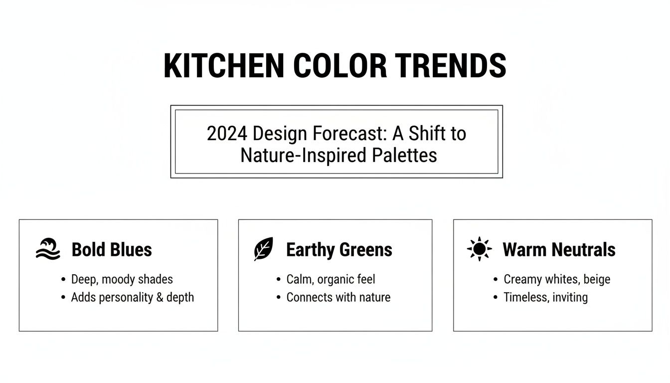
Okay, now that we've covered the fundamentals of light and space, let's get to the fun part: the colors that are actually defining kitchens right now. Keeping an eye on current palettes helps answer the big question—what is a good color for a kitchen—by showing what’s really clicking with homeowners and designers today. These aren't just fleeting fads; they're a reflection of our desire for kitchens that feel more personal, sophisticated, and connected to the world around us.
We're seeing three major movements gain serious traction: the deep, moody sophistication of bold blues, the grounding, natural vibe of earthy greens, and the soft, inviting elegance of warm neutrals. Each one brings its own unique personality to the table, ready to transform your kitchen into a hub you'll love spending time in.
The Calm Sophistication of Bold Blues
Blue has officially graduated from a trend to a new kitchen classic, striking that perfect balance between calm and drama. Deep shades like navy or midnight blue instantly add a layer of luxury and depth. They're fantastic for grounding a design, especially when used on a kitchen island or just the lower cabinets.
These confident blues look incredible next to crisp white or light gray countertops, which makes the color pop. When it comes to hardware, you can't go wrong with brushed brass or gold finishes—they bring a touch of warmth and glamour that plays beautifully against the cool, deep backdrop. To keep things from feeling too heavy, a simple, light-colored backsplash like classic white subway tile or a sleek marble slab is the perfect finishing touch.
Industry data shows that blue isn't going anywhere. It's a top choice for a 'good' kitchen color because it feels both soothing and confident. One key report even named blue the hottest kitchen color, with shades like navy and slate leading the pack, drawing inspiration from natural water elements.
The Grounding Influence of Earthy Greens
We all want to bring a little more of the outdoors in, and earthy green tones are making it happen. Colors like sage, moss, and olive forge a direct connection to nature, creating a kitchen atmosphere that feels serene and restorative. The best part? These muted greens are incredibly versatile, managing to feel both timeless and totally fresh at the same time.
A soft sage green on cabinets can make a kitchen feel light and airy without being boring. It pairs beautifully with natural wood, whether it’s butcher block countertops or open shelving. If you're after something a bit more dramatic, a deep olive green feels incredibly rich and organic, especially with matte black hardware and creamy off-white walls. These colors are a natural match for stone backsplashes and slate floors.
For more inspiration on using these organic tones, check out our guide on the latest https://sinclaircabinets.com/kitchen-cabinet-color-trends/.
The Versatility of Warm Neutrals
White kitchens will always be in style, but the focus is shifting toward warmer, more complex neutrals. We're talking creamy off-whites, soft beiges, and the undisputed champion of versatility: greige (that perfect blend of gray and beige). These shades offer a subtle warmth that stark, sterile whites can sometimes miss, making the whole room feel cozier and more inviting.
These nuanced neutrals give you incredible flexibility. A color like Sherwin Williams’ Accessible Beige on cabinets creates a soft, warm base that works with almost any style imaginable. You can pair it with dark granite countertops just as easily as you can with light quartz. Sometimes, looking outside the kitchen for inspiration helps, as broader color principles, like those discussed for the best paint colors for living rooms, can spark great ideas.
Where warm neutrals really come alive is through texture. Imagine pairing those creamy cabinets with a subtly veined countertop, a textured tile backsplash, and hardware in a warm metal like champagne bronze. It all comes together to create a rich, layered look that feels both sophisticated and completely welcoming.
Pairing Colors with Cabinet and Kitchen Styles
The perfect kitchen color doesn't just hang out on the walls; it’s part of the team. It has to play well with your cabinet style and the overall architectural vibe of your home. When you start thinking about color this way, it stops being just a background and becomes the key element that ties the whole design together for a truly intentional look.
Let's be honest, a color that looks fantastic in a sleek, modern high-rise might feel completely out of place in a cozy farmhouse kitchen. The secret is knowing how to match your palette to your kitchen's personality, ensuring the final result feels cohesive and professionally designed. This is how you answer the question, "what is a good color for a kitchen?" for your specific home.
To see how today’s color trends are shaping kitchens, here's a quick look at the palettes making the biggest splash.
This snapshot clearly shows a shift toward colors that feel both sophisticated and deeply connected to nature.
Modern and Minimalist Kitchens
Modern kitchens are all about clean lines, uncluttered surfaces, and sleek, flat-panel cabinets. The color strategy here is usually about making a striking yet simple statement.
- Monochromatic Schemes: Think layers of gray, from a light dove to a deep, moody charcoal. It creates a sophisticated look with tons of depth.
- High-Contrast Palettes: You can't go wrong with classic black and white. It’s a hallmark of modern design that delivers timeless drama.
- A Single Bold Accent: Using one saturated color, like a deep navy or rich burgundy on an island, gives you a powerful focal point without cluttering the space.
Traditional and Farmhouse Kitchens
Traditional kitchens, with their beautifully detailed, raised-panel cabinets like those from Sinclair Cabinetry, are built on warmth and timeless elegance. The colors here should feel classic and genuinely inviting.
Creamy whites and warm off-whites are the go-to choices, offering a soft backdrop that lets those ornate cabinet details really pop. Heritage colors are also making a huge comeback. Soft, earthy greens like moss and dusty sage are fantastic for their welcoming vibe. In fact, one report found that soft greens showed up in 22% of surveyed designs, celebrated for their calming, nature-inspired feel. You can learn more about how to choose between painting or staining your cabinets to nail this look.
Coastal and Airy Kitchens
Coastal design is all about capturing that light, breezy feeling of being by the sea. Colors need to be soft, light, and reflective to make the room feel as spacious and tranquil as possible.
A coastal palette is less about specific colors and more about a feeling. It’s the soft glow of morning light on the water, the pale shade of sand, and the crisp white of a seafoam crest.
Think in terms of:
- Soft Blues and Greens: Light sky blues, seafoam greens, and gentle aquas bring a sense of watery serenity.
- Sandy Neutrals: Warm beiges and sandy off-whites create a relaxed, beach-inspired foundation for the room.
- Crisp White: Use it generously on trim, cabinets, and backsplashes. White is your best friend for keeping the space feeling bright and wide open.
Luxury and Dramatic Kitchens
If you're aiming for a high-end, luxurious feel, the color palette often gets a lot more dramatic and sophisticated. These are spaces defined by rich, saturated colors that create an atmosphere of opulence and depth.
Deep jewel tones—think emerald green, sapphire blue, or even a rich plum—can create an unforgettable statement on your cabinetry or an accent wall. In the same vein, dark charcoals and near-blacks provide a moody, elegant backdrop that looks stunning next to metallic hardware and high-end stone countertops.
How to Test and Finalize Your Color Choice
You've narrowed it down, but making that final color decision can feel like a huge commitment. Don't worry. There's a systematic way to approach this that takes all the guesswork out of the equation and prevents any costly "what was I thinking?" moments. The secret is seeing the color in your space, not just under the harsh fluorescent lights of a hardware store.
That tiny paint chip you've been carrying around? It's not your friend. It can't possibly tell you how a color will behave when it’s next to your countertops, bouncing off your cabinet finish, or basking in the warm afternoon sun pouring through your window. To truly know if you've found the one, you have to bring it home and test it like a pro.
The Right Way to Sample Paint Colors
Here’s the golden rule: sample, sample, sample. But there’s a right way and a wrong way to do it. Slapping a tiny square on one wall and calling it a day just won't cut it. To get a true feel for the color, you need to follow the process designers swear by.
-
Go Big: Forget small swatches. Paint a large sample, at least two feet by two feet, either on a piece of poster board or directly on your wall. A bigger sample gives you a much more honest impression of how it will look once the whole room is done.
-
Use Multiple Locations: Apply your large samples to at least two different walls. Ideally, pick one that gets direct sunlight and another that tends to stay in the shade. This is how you see the color’s full range and personality.
-
Observe Over Time: This is the most crucial step. You have to live with the swatches for a day or two. Check them in the bright morning light, see how they look in the warm glow of the afternoon, and then flip on your kitchen lights at night. A perfect greige at noon might look disappointingly purple under your evening pendants.
A color isn't static; it's a living element in your room that shifts and changes with the light. The goal of sampling is to make sure you love the color in all its moods, not just the one you see at the store.
Taking the time for patient observation is what separates a good color choice from a great one. It's how you land on a color you'll still be happy with years from now.
Understanding Paint Finishes for Durability
Once you’ve locked in your color, there’s one final piece to the puzzle: the finish, or sheen. The right finish doesn’t just affect how the color looks—it’s absolutely critical for durability in a high-traffic, high-mess area like the kitchen.
For your kitchen walls, satin or eggshell finish is the undisputed industry standard, and for good reason. These finishes offer a soft, subtle sheen that's incredibly durable and, most importantly, scrubbable. You can wipe away spaghetti sauce splatters and greasy fingerprints without a second thought.
When it comes to cabinets and trim, you need even more armor. A semi-gloss finish is your best bet here. It provides a tough, moisture-resistant surface that can stand up to constant cleaning and the daily grind of opening and closing. It also reflects more light, which makes the details on your cabinetry pop while offering maximum protection. Just be sure to avoid flat or matte finishes on any high-touch kitchen surface—they tend to grab onto dirt and are a nightmare to keep clean.
Bringing Your Vision to Life with Sinclair Cabinetry
A beautiful color palette might be the soul of your kitchen, but the cabinetry is its backbone. This is where a good design becomes a truly great one—when your perfect color is married to exceptional craftsmanship. The quality of your cabinets is the foundation, ensuring your chosen hues look their absolute best and stand the test of time.
That’s where Sinclair Cabinetry becomes your most valuable partner. With over 35 years of experience, we've perfected the art of crafting real wood cabinets that serve as the ideal canvas for any color scheme you can dream up. Whether you're picturing the timeless elegance of a painted finish or the rich depth of a natural wood stain, the quality of what lies underneath is what matters most.
Real wood brings a durability and texture that just elevates any color, making your kitchen not only beautiful but built for a lifetime of memories.
Visualize Your Perfect Kitchen
Choosing a kitchen color can feel a little abstract, but thankfully, modern tools have eliminated the guesswork. Sinclair’s advanced design software is a complete game-changer, letting you see exactly how your color palette will come together in your unique space.
This step is crucial. It gives you the freedom to experiment with different combinations on a custom layout of your actual kitchen before you commit. You can see how that bold navy island really plays off soft gray perimeter cabinets, or how a warm greige pairs with the countertop you’ve been eyeing. This process takes the surprises out of the equation, leaving only a flawless result that perfectly matches your vision.
Partnering with an expert isn't just about getting premium materials; it's about gaining a collaborator who helps you navigate the complexities of design. The right team ensures your final kitchen is a perfect reflection of your style, functionality, and long-term goals.
The Sinclair Difference
The final look of your kitchen comes down to the quality of the finish. The difference between a professional, factory-applied finish and a DIY job is night and day, impacting both how it looks and how long it lasts. For anyone looking for that flawless, durable surface, understanding the advantage of a professional application is key.
To see why true craftsmanship really matters, you can dive deeper in our detailed guide on the best finish for kitchen cabinets.
Ultimately, figuring out what is a good color for a kitchen is a journey of marrying your inspiration with practical, high-quality application. When you combine your carefully chosen palette with the enduring quality and expert guidance of Sinclair Cabinetry, you’re not just remodeling a kitchen; you’re creating the heart of your home. You're building a space designed to be loved and lived in for decades, all built on a foundation of unmatched quality and timeless style.
Got Questions About Kitchen Colors? We've Got Answers.
Choosing a kitchen color palette can feel like a huge decision, and it's natural to have questions. From figuring out which colors will stand the test of time to picking the right paint finish, getting some clarity can make the whole process feel less daunting.
Let’s tackle some of the most common questions we hear from homeowners trying to land on the perfect color for their kitchen.
What Are the Truly Timeless Kitchen Colors?
Timeless kitchen colors are the ones that look just as good today as they will a decade from now. They’re the chameleons of the design world—versatile, sophisticated, and never out of style. Think of them as the perfect neutral canvas that lets you switch up your kitchen's vibe with new decor or hardware whenever you get the itch.
Here are the tried-and-true classics:
- Crisp Whites: You really can't go wrong here. White creates a clean, bright, and airy feel that makes any kitchen feel bigger.
- Creamy Off-Whites: For a softer, cozier vibe, creamy tones offer a warm alternative to a stark white, bringing in a touch of classic charm.
- Soft Grays: Gray is the ultimate sophisticated neutral. It provides a cool, modern backdrop that plays nicely with almost any accent color you can imagine.
- Deep Navy Blue: If you want a bit of drama, navy is a fantastic choice. It feels bold and luxurious without being trendy, adding a grounding sense of depth to the space.
- Natural Wood Tones: While not a paint color, the authentic beauty of real wood cabinets is a look that has truly never gone out of fashion. It’s warm, inviting, and enduring.
Should My Kitchen Cabinets Be Lighter or Darker Than the Walls?
Honestly, there's no single right answer for this one—it all comes down to the atmosphere you're trying to create. Each approach has its own distinct personality.
If you love a classic, open feeling, go with lighter cabinets against slightly darker walls. This contrast makes your cabinetry the star of the show and adds a nice visual pop. On the flip side, if you're aiming for a more modern, dramatic statement, dark cabinets paired with light walls can anchor the room and create a stunning, high-contrast look.
A design strategy we love is the two-tone kitchen. It’s the best of both worlds: use darker base cabinets to ground the room and lighter uppers to draw the eye upward, making the space feel taller and more open.
How Can I Make My Small Kitchen Look Bigger with Color?
Color is your secret weapon for creating the illusion of space in a smaller kitchen. The whole game is about maximizing light.
Your best bet is to stick with a light and bright color palette. White, cream, pale gray, and even soft pastels are brilliant at bouncing light around the room, which instantly makes it feel more expansive and open.
For maximum effect, paint the walls, ceiling, and cabinets in similar light shades. This creates a seamless, cohesive look that blurs the room’s edges and tricks the eye into seeing a larger space. Using a semi-gloss finish on your cabinets will amplify this effect even more by reflecting light.
What’s the Best Paint Finish for a Kitchen?
Kitchens are the workhorses of the home—they see a lot of traffic and a lot of messes. That means durability is the name of the game when it comes to your paint finish.
For kitchen walls, the industry standard is a satin or eggshell finish. These have just enough sheen to make them easy to wipe down and resistant to moisture, but they aren't overly shiny.
For cabinets and trim, which take the most abuse, you need something tougher. A semi-gloss or a high-quality, durable satin finish is essential. These finishes create a hard, scrubbable surface that can handle frequent cleaning and resist stains, keeping your kitchen looking fresh for years. Whatever you do, avoid flat or matte finishes on any surface that needs regular wiping.
Ready to create a kitchen that perfectly balances color, style, and quality? The experts at Sinclair Cabinetry inc are here to help you design a space with real wood cabinets built to last a lifetime. Explore our gallery and schedule your design consultation today.