
Choosing your kitchen paint colour can feel like a massive commitment. But here's a little secret I've learned over the years: the goal isn't to find one single perfect shade. It's all about creating harmony.
The best colour for your kitchen walls is one that plays well with your existing features—especially your cabinetry, countertops, and flooring. It’s about listening to their undertones and finding a colour that speaks the same language.
Finding Your Perfect Kitchen Colour Palette
Before you even glance at a paint swatch, let's take a step back from the endless scroll on Pinterest. The first real step is to understand the core elements already at play in your kitchen. Your goal is to choose a wall colour that acts as a supportive backdrop, not the main event.
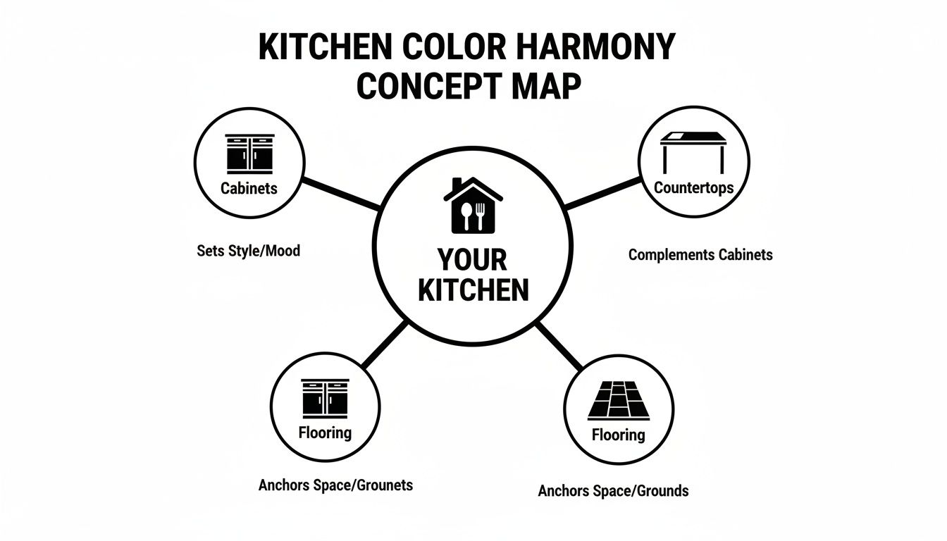
This whole process starts by identifying the "fixed elements" in the room—basically, anything that's expensive or a huge pain to change.
- Your Cabinets: As the largest vertical surfaces in the room, their colour and material are king. A warm, real-wood finish from Sinclair needs a completely different paint partner than a set of sleek, cool-toned grey cabinets.
- Your Countertops: Get up close and personal with your granite or quartz. Do you see flecks of cool blue and grey, or are there warmer hints of gold and brown? Those little undertones are your best clues for finding a wall colour that ties it all together.
- Your Flooring: The colour of your floor, whether it's a warm hardwood or a cool slate tile, dramatically changes how light bounces around the room and sets the overall mood.
The most successful kitchen colour schemes don’t fight the existing finishes; they embrace them. Your countertop, cabinets, and flooring create a built-in palette. Your job is simply to find a wall colour that speaks the same language.
Creating a Cohesive Foundation
Think of these three core elements—cabinets, countertops, and flooring—as being completely interconnected. When they work together, your kitchen just feels right.
This image really drives home how a great paint choice is one that thoughtfully considers and balances these foundational pieces. To get this right and confidently pick your perfect shade, it helps to understand the fundamentals of how to choose paint colors for rooms.
When you start by analyzing these elements, you instantly narrow down your options from thousands of possibilities to just a handful of great choices. If you need some more direct ideas, checking out the latest https://sinclaircabinets.com/kitchen-cabinet-color-trends/ can give you fantastic inspiration for both modern and classic pairings.
How Light Transforms Your Kitchen's Colour
Before you even think about picking up a paint chip, you need to become a student of light. This is, without a doubt, the single most overlooked step in choosing a kitchen color, and it’s the one thing that will make or break the final result. A color that looks absolutely perfect under the harsh fluorescent lights of a hardware store can look like a completely different shade in your actual home.
Think of it this way: a paint color’s personality shifts dramatically throughout the day. That soft, welcoming greige you fell in love with on a sample card might look stark and cold in the bright morning sun of an east-facing kitchen. On the flip side, a west-facing room gets that warm, afternoon glow that can turn a subtle cream into a much stronger, buttery yellow you weren't bargaining for.
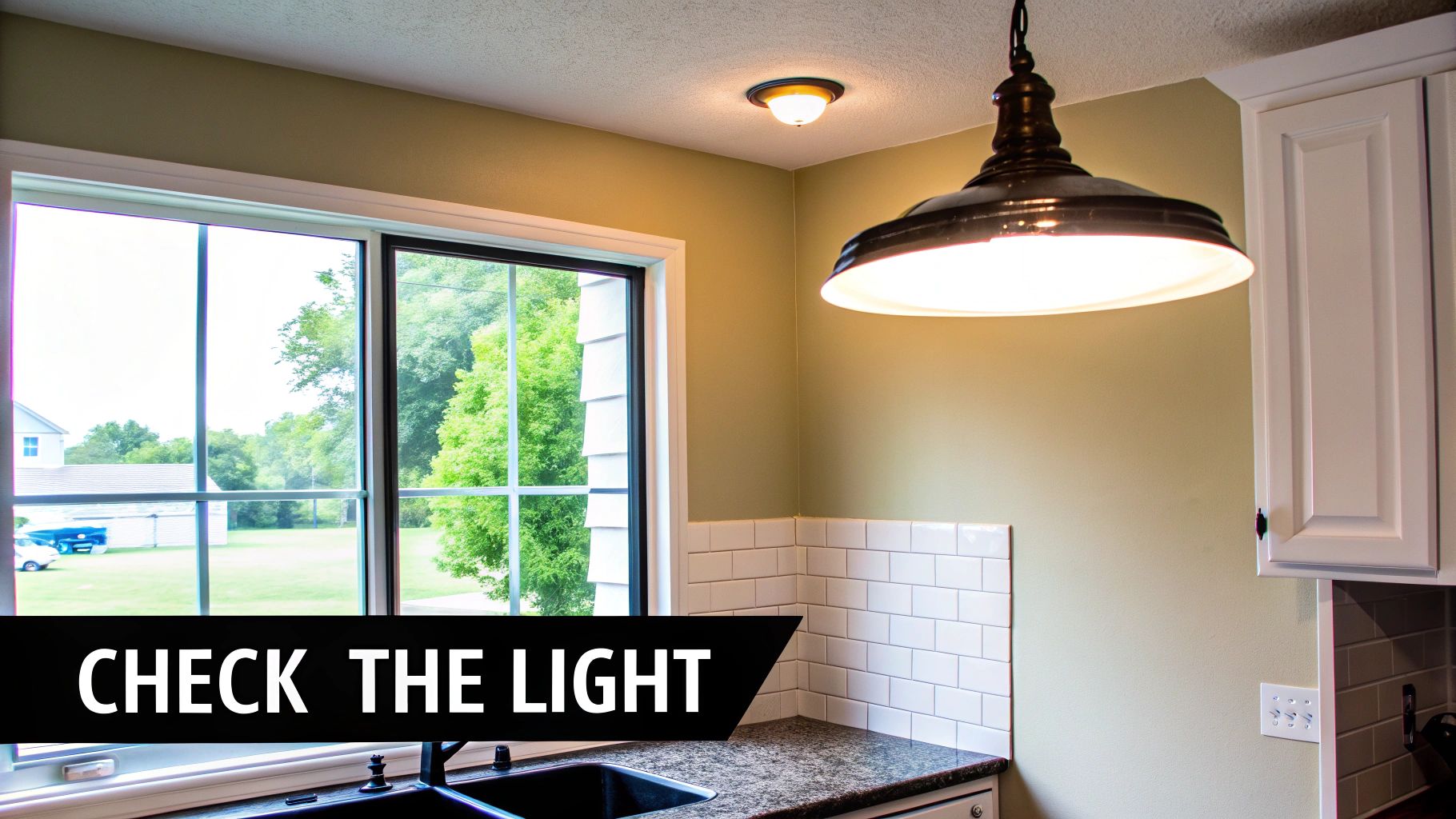
And it’s not just the sun. Your artificial lighting plays an equally crucial role, especially since the kitchen is often the hub of activity long after sunset. The type of lightbulb you use can either complement your chosen wall color or completely sabotage it.
Understanding Your Lightbulbs
It all boils down to Kelvin temperature (K), which is simply a measure of the color temperature of light. Bulbs with a lower Kelvin rating give off a warmer, yellowish light, while those with higher Kelvin ratings produce a cooler, bluish-white light. This isn't just a tiny detail—it fundamentally changes how your eyes perceive color.
Let's walk through a real-world example. Say you’ve painted your walls with Benjamin Moore's White Dove, a gorgeous, soft white with creamy undertones.
- Under Warm Bulbs (2700K): This light will pull out and amplify those creamy undertones, making the color feel cozy and inviting. It's perfect if you're aiming for a traditional, comfortable vibe.
- Under Cool Bulbs (4000K+): That same White Dove paint will have its warmth neutralized. The walls will look crisper, cleaner, and much closer to a true white, which is a better fit for a modern or minimalist aesthetic.
A simple lightbulb swap can be the difference between a kitchen that feels warm and welcoming versus one that feels sterile and cold. Before you even test paint samples, take a hard look at your current lighting and decide if it creates the mood you're after.
A Practical Plan for Light Assessment
To avoid any nasty surprises after the paint is on the walls, you need to see how your top contenders perform in your kitchen over a full 24-hour cycle. Please, don't just hold a tiny paint chip against the wall for five seconds. It’s not enough.
Instead, get some large sample boards (at least 12×12 inches) and paint them with your top two or three choices. Place these boards in different spots around your kitchen—one near the window, another in a darker corner—and watch them methodically.
Make sure to check them at these key times:
- Morning: How does the bright, often cooler morning light hit the color?
- Midday: What does it look like under the most direct, true sunlight?
- Evening (with the lights on): This is the final test. Does the color hold up under your artificial lighting, or does it take on an odd, unwanted hue?
This simple process takes all the guesswork out of the equation. You’re no longer just picking a color; you’re choosing a shade that is proven to work beautifully with the unique light in your home, ensuring it looks just right from your morning coffee to your late-night snack.
Matching Paint With Cabinets and Countertops
Think of your cabinets and countertops as the main event in your kitchen. Your wall color? That's the essential supporting player that helps them look their best. When you're trying to figure out what color to paint your kitchen, the real goal is to create a cohesive look that ties everything together. It’s what makes a space feel intentional and professionally designed.
The secret is all in the undertones. Get right up close to your countertops—whether they're granite, quartz, or marble—and look for those subtle, secondary colors hiding in the pattern. Do you see tiny flecks of cool blue-grey? Warm gold? Maybe an earthy taupe? Those little details are your roadmap to the perfect wall color.
When you pull a color directly from those details, you create an instant, harmonious connection. For example, a countertop with subtle warm beige veining will look incredible with a soft greige or creamy off-white on the walls. This simple trick ensures your paint choice complements, rather than competes with, your kitchen's most significant investments.
Moving Beyond Basic White
The days of the stark, clinical all-white kitchen are definitely evolving. While neutrals are still king, designers and homeowners are leaning into warmer, more complex shades that add personality and depth. Let's be honest, a stark white can feel a bit cold, especially when it’s right up against the natural beauty of real wood cabinets.
The kitchen design world is making a big move away from the monochromatic look that was so popular over the last decade. Homeowners are getting tired of stark whites and cool grays. Instead, designers are reporting a huge spike in requests for warmer, more sophisticated neutral palettes. You can see more on this trend over at Elle Decor.
This shift is all about creating a softer, more layered look. Instead of a pure, sterile white, think about these alternatives that pair beautifully with wood finishes:
- Creamy Off-Whites: Shades like Benjamin Moore's White Dove have just a hint of warmth. It keeps them from feeling chilly and works perfectly with both light and dark wood stains.
- Soft Beiges and Greiges: These are the ultimate chameleons. They bridge the gap between warm and cool tones, making them a fantastic choice for kitchens with mixed metal hardware or varied countertop colors.
- Muted Greens and Blues: Earthy greens or soft, dusty blues can bring in a gentle touch of color that feels both calming and sophisticated, especially next to natural oak or walnut cabinets.
Harmonizing with Wood Finishes
Your cabinet finish is a huge part of this puzzle. Whether you have light oak, rich cherry, or a dark walnut stain, the right wall color will bring out its natural beauty. For a Sinclair cabinet with a deep, warm stain, a lighter, contrasting wall color like a soft beige can really make the cabinetry pop.
On the flip side, lighter wood tones like maple or white oak give you a lot more freedom. You can go for a low-contrast, serene look with a creamy white or get bold and create a dramatic effect with a moodier color like deep charcoal or navy. To get a better feel for how different stains interact with color, you might want to explore various cabinet wood stain colors to find your perfect match.
Your countertop is what bridges the gap between the cabinets and the walls. For a deeper dive into this crucial element, check out this comprehensive guide to choosing and installing countertops. At the end of the day, creating that cohesive look is about letting your fixed elements guide you to a paint color that feels like it was always meant to be there.
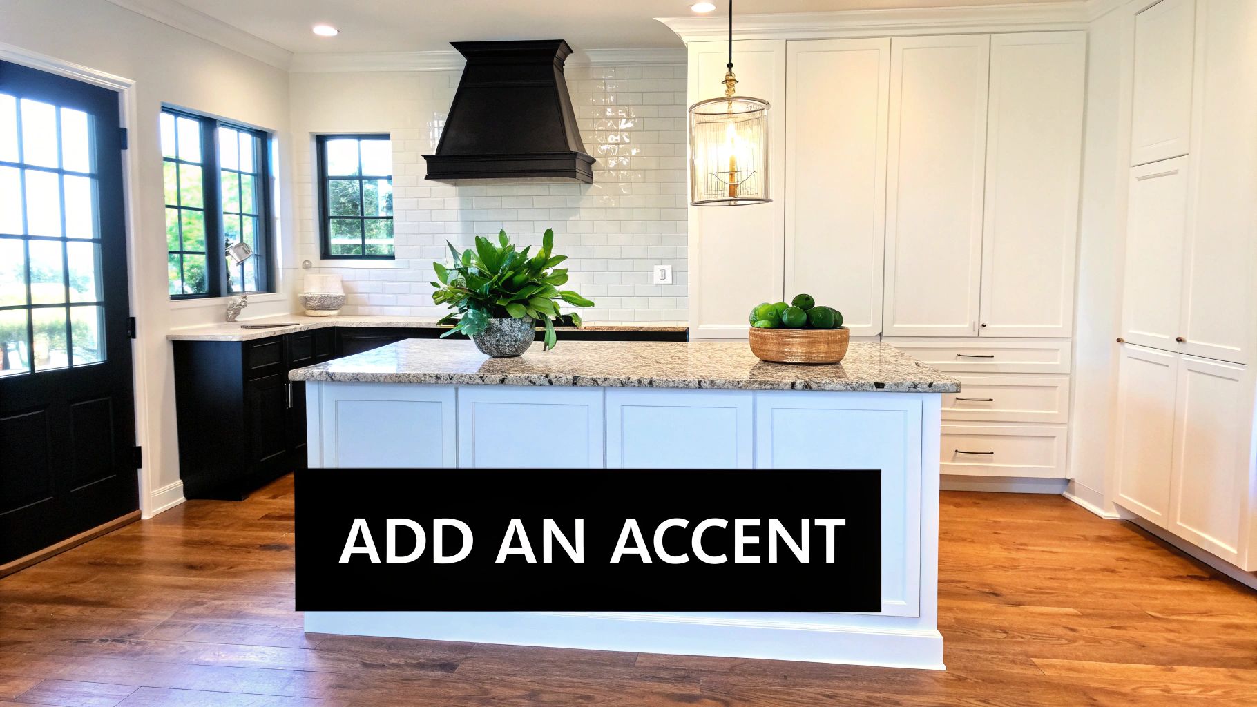
Using Accent Colours for a Designer Look
A neutral kitchen is a classic for a reason, but a strategic pop of accent color is what really gives the space its soul. This isn't about slapping a jarring color on one random wall and calling it a day. The modern, designer-led approach is all about using bold hues in targeted, thoughtful ways to create a high-end, custom feel.
Instead of overwhelming the room, a carefully chosen accent creates a deliberate focal point that elevates the entire design. It’s the difference between a kitchen that’s just nice and one that’s truly memorable.
This intentional use of color marks a major shift in kitchen design. We're seeing designers and homeowners move away from strictly monochromatic palettes and embrace personality through specific color placements. In fact, a major industry report shows just how targeted this trend has become, with statement colors being applied to backsplashes (60%), wallpaper (60%), kitchen islands (57%), and decorative accessories (55%). You can dive deeper into these evolving kitchen trends in the full report from the NKBA.
Where to Add a Pop of Colour
The trick is to place your accent color where it will have the most impact without throwing off the room's harmony.
Here are a few of my favorite designer-approved spots:
- The Kitchen Island: Painting just the island is a fantastic way to ground the space. A deep forest green or a moody charcoal blue on the island base adds weight and character, turning it into a beautiful centerpiece—especially when topped with a contrasting countertop.
- The Backsplash: A colorful tile backsplash acts like a piece of art. It’s a contained area where you can really be bold with color or pattern without committing to painting the entire room.
- Inside Glass Cabinets: This is a subtle but incredibly effective trick. Painting the interior back wall of a glass-front cabinet adds a surprising layer of depth and creates a beautiful backdrop for showing off your favorite dishes.
Don’t be afraid to choose a deep, saturated color. Rich hues like earthy terracotta, deep navy, or even a sophisticated plum can look incredibly chic when used in a focused way. They add a sense of luxury that lighter colors often can’t achieve.
Choosing Your Accent Hue
When you're picking an accent color, look for inspiration in the elements you've already chosen. Pull a minor color from the veining in your countertops or a shade from an adjacent room's decor to create a cohesive, natural flow.
Consider a deep, rich tone that contrasts with your primary neutral. If your walls are a soft greige, a dramatic charcoal accent on the island can be absolutely stunning. Have warm, creamy walls and wood cabinets? A deep olive green can provide a beautiful, earthy contrast that feels both modern and timeless. By being selective and bold, you can add that perfect touch of personality that makes the space uniquely yours.
Choosing the Right Sheen and Testing Your Colours
You’ve analyzed your lighting and found the perfect hue to complement your cabinets and countertops. Now for the make-or-break moment: choosing the right paint sheen and testing your color choice in the real world.
So many people rush this part, but getting the finish right is what separates a good-looking kitchen from a great one. The sheen you pick doesn't just affect how the color looks—it determines how well your walls stand up to the daily grind of a busy kitchen.
A kitchen is a tough environment. It’s a high-traffic, high-moisture, high-grease space. Your paint needs to be durable and, above all, easy to clean. While a flat or matte finish is fantastic for hiding minor imperfections in a living room, it's a terrible choice for a kitchen where splatters are just a part of life. These porous finishes trap dirt and are nearly impossible to wipe down without leaving shiny spots behind—a frustrating problem known as "burnishing."
Decoding Paint Sheens for Your Kitchen
For kitchen walls, you need to focus on sheens that offer serious washability. This is where eggshell, satin, and semi-gloss finishes really shine.
- Eggshell & Satin: These are, hands down, the most popular choices for kitchen walls, and for good reason. They give off a soft, subtle glow that isn’t overly shiny but delivers excellent durability and scrubbability. A satin finish is a bit more reflective and even easier to clean than eggshell, making it a true workhorse for busy family kitchens. If you're painting your cabinets, we have a complete guide on finding the best paint for kitchen cabinets that dives deeper into finishes.
- Semi-Gloss: Traditionally reserved for trim and doors, semi-gloss is the most durable and easiest-to-clean option of the bunch. But be warned: its high reflectivity will highlight every single tiny imperfection on your walls. If you go this route, your surface prep has to be absolutely flawless.
The Absolute "Can't-Skip" Step: Proper Sample Testing
I see this mistake all the time: never, ever paint a tiny swatch directly onto your current wall. Your existing color will completely distort how you perceive the new shade. Instead, get some large 12×12 inch sample boards or peel-and-stick samples and apply at least two full coats.
Once you have your large samples, place them in different spots around the kitchen. Put one near a window, another in a darker corner, and one right next to your backsplash.
Then, just live with them for at least 48 hours. Watch how the color shifts with the morning light, how it feels at midday, and most importantly, how it looks at night under your artificial lighting. This final, patient check ensures the color you fell in love with at the store is the color you’ll still love for years to come.
Still Have a Few Questions About Kitchen Paint?
Even the most buttoned-up plan can leave you with a few nagging questions before you pop open that first can of paint. That's completely normal. Let's walk through some of the most common last-minute concerns I hear from homeowners, so you can move forward feeling totally confident in your choices.
Getting these details right can be the difference between a project you love for years and one that needs a do-over sooner than you'd like. We'll cover everything from the nitty-gritty of paint formulas to the weird ways color can play tricks on your eyes.
What’s the Best Type of Paint for Kitchens, Really?
In a kitchen, the best paint is always the one that can take a beating. This is a high-traffic, high-moisture space that has to deal with everything from grease splatters to boiling-pot steam. Your number one priority should be a paint that's scrubbable without losing its finish.
Look for formulas specifically labeled as "kitchen and bath" paint—they're engineered with mildew-resistant additives and a tougher finish. When it comes to sheen, your best bets for walls are satin or eggshell. Both offer a soft, subtle luster that's leagues easier to clean than a flat or matte finish, which tends to grab onto grime and can get ruined when you try to scrub it.
The biggest mistake I see is someone falling in love with a matte finish that looked amazing in their living room. In a kitchen, that choice can be a disaster. The first time you wipe off a grease spot, you'll likely "burnish" the paint, leaving a permanent shiny patch on your wall that sticks out like a sore thumb.
Is There Such a Thing as Too Many Paint Colors?
When it comes to your kitchen's color palette, less is almost always more. A well-designed room usually sticks to a variation of the classic "rule of three" to keep things cohesive.
Here’s a simple framework that just works:
- A primary wall color: This is your workhorse neutral that will cover the majority of the wall space.
- A trim color: Usually a crisp white or a complementary off-white for things like baseboards, window frames, and doors.
- An optional accent color: Think of this as your "personality" shade. Use it sparingly on a kitchen island, the back of a glass-front cabinet, or maybe a small feature wall.
Following this structure helps the room feel intentional and calm, not chaotic. Once you start introducing more than three distinct paint colors, the space can quickly feel disconnected and visually cluttered.
Can I Just Paint Over the Old Kitchen Paint?
You absolutely can, but success is 100% in the prep work. You can't just roll a new coat over the old one and expect a professional result. It simply won't last.
The most critical step is a thorough cleaning. Over the years, kitchen walls build up a thin, often invisible layer of grease and grime. If you paint over that, your beautiful new color will start to peel or chip in no time. Grab a degreasing cleaner (a TSP substitute works wonders) and wipe down every surface you plan to paint.
After it's clean and dry, give the walls a quick scuff with fine-grit sandpaper—this gives the new paint something to grip. Then, finish your prep with a high-quality primer before you even think about opening your color.
Why Does My Paint Color Look So Different on the Wall?
This is probably the most common (and frustrating) question out there. You find the perfect paint chip, but once it's up on the wall, it looks completely wrong. Two main culprits are almost always at play: the lighting in your room and the colors that are already there.
As we've covered, both natural and artificial light will dramatically change how a color appears. A soft greige in the store might suddenly look muddy green in a north-facing room that gets cool, blueish light.
The other factor is color reflection. Your existing wall color, the warm tones in your wood flooring, and even that bright red stand mixer on your counter can cast their own hues onto your new paint, subtly altering its appearance. This is exactly why you should never test a paint sample by painting a little swatch directly on your old wall. Instead, paint a large poster board, leave a white border around the edge, and move it around the room to see the color's true character without interference.
Ready to pair your perfect paint color with cabinets that are built to last? At Sinclair Cabinetry inc, we craft bespoke, real-wood cabinetry that serves as the perfect foundation for any kitchen design. Explore our custom solutions.