
Before you even dream of picking up a paint swatch, take a good, hard look at your kitchen. The two most influential designers in the room are already hard at work: light and space. These two elements are the real decision-makers; they'll determine which colours sing and which ones fall flat. Nailing this first step is everything.
How Light and Space Influence Your Kitchen Colour
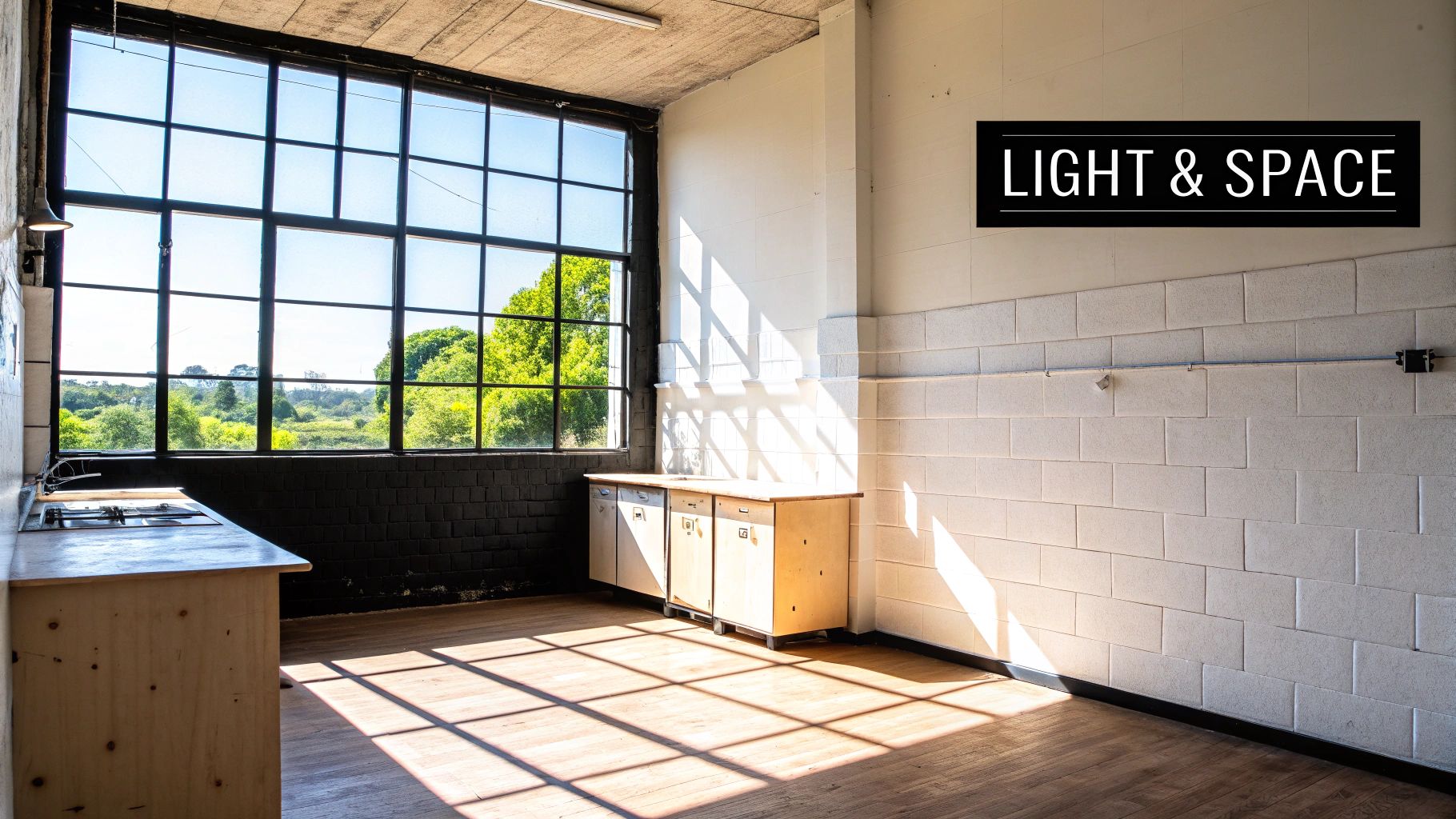
Think of natural light as the director of your kitchen's colour story. It’s not a static spotlight; it moves and changes from sunrise to sunset, completely altering how a colour looks and feels on your walls. A paint chip that looks perfect under the hardware store's fluorescent lights can be a total letdown at home.
And then there's artificial lighting, which adds another layer to the mix. The warm, yellow cast from incandescent bulbs can make colours feel cosy and inviting. On the other hand, the crisp, blue-white light from most LEDs can make those same colours appear sharper, sometimes even a bit sterile. Your lightbulbs are just as important as your paintbrush.
The Role of Natural Light Direction
The direction your kitchen windows face is a huge deal. It’s not some minor detail—it fundamentally shapes a colour’s personality throughout the day.
- North-Facing Kitchens: These rooms get a cool, indirect light that can feel a bit flat. That chic, crisp grey you loved on the swatch? It might look cold and dreary here. Your best bet is to fight the chill with colours that have warm undertones—think creamy whites, warm greiges, or even a soft, buttery yellow.
- South-Facing Kitchens: Lucky you. These kitchens are flooded with bright, warm light all day long, which means they can handle almost anything. In fact, very pale shades can sometimes get washed out by the intensity. Feel free to go a little bolder here. Cool tones like blues and greens will look balanced and lively.
- East-Facing Kitchens: You get a beautiful, warm glow in the morning that shifts to a cooler, indirect light in the afternoon. You need a colour that can play both parts well. A versatile neutral with just a hint of warmth is often the perfect solution.
- West-Facing Kitchens: The light here starts off soft and then turns into a powerful, golden glow in the late afternoon. This is where you need to be careful with intensely warm colours like reds or oranges—they can become seriously overwhelming when the evening sun hits.
"Stop fighting your home and start LISTENING to it. The needs of your home’s interior finishes and its unique light are pretty darn important. When you take your heart out of it and put your head back in, the right choice becomes much clearer."
Making Your Kitchen Feel Larger or Cozier
Beyond the light, the actual square footage of your kitchen plays a massive role. Paint is one of the most powerful tools you have for manipulating the perception of space. So, if you're wondering what colour to paint your kitchen to make it feel different, this is your starting point.
For smaller or more compact kitchens, the mission is usually to create an illusion of space. Light colours are your best friend. Shades like off-white, pale grey, and soft beige are masters of reflection, bouncing light around the room to make the walls feel like they’re receding. Painting the trim and ceiling in a similar light shade is a pro move that enhances the effect, creating a seamless look that draws the eye upward.
On the flip side, if you're working with a large, open-plan kitchen, you might want to create a more intimate, cosy vibe. This is where darker, more saturated colours shine. Deep blues, rich forest greens, or warm charcoals absorb light, making the walls feel a bit closer and wrapping the room in drama and sophistication. You can also use a darker colour on just an accent wall to define a specific area, like a breakfast nook, without shrinking the whole space.
Understanding Paint Undertones and Finishes
Have you ever picked the “perfect” beige paint, only to get it on the kitchen walls and realize it looks strangely pink? Or a sophisticated grey that suddenly turns baby blue in the afternoon light? If so, you’ve been tricked by paint undertones—the subtle, hidden hues living just beneath a color’s surface.
It’s a bit like a good cup of coffee. The main color is brown, of course, but an expert can pick up notes of chocolate, cherry, or even nuts. Paint is no different. A grey is rarely just grey; it probably has a hint of blue, green, or purple that only shows itself when the light hits it just right. Nailing this is the real secret to answering the question "what color should I paint my kitchen" without a single regret.
Ignoring undertones is one of the biggest mistakes you can make. That beautiful neutral cream might have a strong yellow undertone that clashes horribly with your cool-toned marble countertops, creating a look that just feels… off.
How to Spot Pesky Undertones
Learning to identify undertones isn’t a superpower; it’s a skill anyone can develop. The trick is to compare your chosen color against others.
- Use Pure White: Hold your paint chip against a sheet of truly pure white paper or a crisp white paint swatch (like Benjamin Moore's Chantilly Lace). The stark contrast makes the undertone pop. A greige might suddenly show its green or pink side.
- Compare with Primary Colors: Put your swatch next to primary red, yellow, and blue. This simple test can help you see which color family the undertone belongs to.
- Look at the Darkest Shade: On any paint strip, the darkest color at the very bottom often reveals the true nature of the undertone for the entire color family. If that last shade is a deep, muddy brown, you can bet the lighter shades have warm, earthy undertones.
An undertone mismatch is often so subtle you can’t quite put your finger on why a room feels wrong. Learning to spot these hidden hues ensures your walls, cabinets, and countertops are all speaking the same design language.
Choosing the Right Paint Finish for Durability
Once you’ve wrestled your undertones into submission, the next step is choosing the paint’s finish or sheen. This isn’t just about how shiny your walls will be—it determines how well they’ll stand up to the daily abuse of a busy kitchen. The right finish is just as important as the right color.
Different sheens reflect light differently and, more importantly, have wildly different levels of durability. In a high-traffic, high-mess zone like a kitchen, this choice is absolutely critical.
Common Kitchen Finishes:
- Matte/Flat: With almost no shine, this finish has a rich, velvety look that’s fantastic at hiding imperfections on your walls. The downside? It’s the least durable option and notoriously tough to clean, making it a poor choice for kitchen walls, especially near a sink or stove.
- Eggshell: This is a crowd-pleaser for a reason. Eggshell offers a soft, low-sheen glow that’s much more durable and easier to clean than matte. It strikes that perfect balance between a sophisticated look and practical washability, making it a solid choice for most kitchen walls.
- Satin: A step up in gloss from eggshell, a satin finish is highly durable and stands up well to serious scrubbing. This makes it a workhorse for kitchens, trim, and even cabinets. Be aware, though, its noticeable sheen will highlight any texture or imperfections on your walls more than eggshell will.
- Semi-Gloss: This finish is tough, scrubbable, and resistant to moisture and stains, which is why you see it so often on trim, doors, and cabinetry. While it’s perfect for high-impact areas, its high shine can be overwhelming on entire walls, making every tiny flaw stand out.
If you're weighing the options for your cabinets, exploring a guide on the pros and cons of painted versus stained cabinets can give you some valuable perspective.
Pairing Paint with Cabinets and Countertops
Your kitchen cabinets and countertops are the main event—the undeniable stars of the show. The wall color you choose is their most important supporting actor, and its job is to make them look their absolute best. Answering "what colour should I paint my kitchen?" often starts not with the walls, but with these foundational elements.
Think of it as creating a team where every player has a distinct role. If you have rich, warm walnut cabinets, the wall color needs to complement that warmth, not fight against it. Got crisp, white quartz countertops? Your paint can either echo that clean feeling or provide a dramatic, contrasting backdrop.
This is where you move from choosing a color you simply like to selecting one that’s strategically smart. A thoughtful pairing creates a cohesive, high-end feel, while a mismatch can make even the most expensive materials look disconnected and cheap.
Harmonizing with Natural Wood Cabinets
Natural wood cabinets bring so much warmth and texture into a kitchen, and the right paint color can amplify this beautifully. The key is to respect the wood's inherent undertones.
For warm woods like white oak, walnut, and cherry—which have yellow, orange, or red undertones—you want colors that create a sense of balance. Earthy greens and deep blues are exceptional choices. These cooler tones contrast with the wood's warmth, making the grain and color of the cabinetry really pop.
This is a fast-growing trend for a reason. According to the NKBA's 2026 Kitchen Trends Report, a huge 86% of designers are using greens, with shades like forest green and juniper surging in demand. This is happening right alongside the rising popularity of natural wood, especially white oak, which 51% of designers say is a top choice.
- White Oak Cabinets: Pair beautifully with sage green, deep navy, or even a sophisticated charcoal for a modern, organic look.
- Walnut Cabinets: The rich, dark tones of walnut are stunning against creamy off-whites, warm greiges, or a dramatic emerald green.
- Cherry Cabinets: A warm beige or a muted green-gray can tone down cherry's red undertones for a more contemporary feel.
This concept map breaks down how undertones and finishes work together to create the final look.
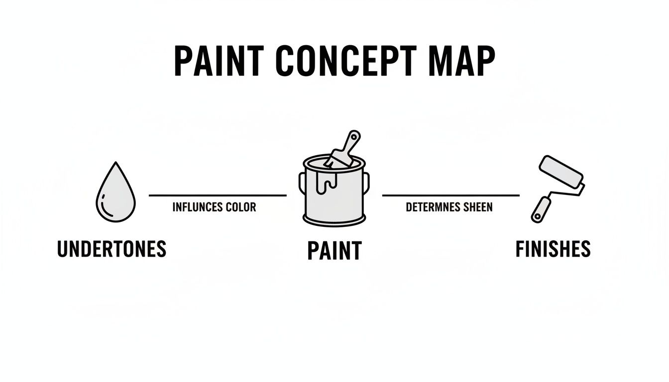
It’s a great reminder that choosing paint is about more than just the main shade; it’s a balance of its underlying hue and its surface sheen.
Creating Palettes for Painted Cabinets
When your cabinets are painted, you have a whole different set of opportunities. You can create a seamless, monochromatic look or go for a bold, contrasting one. To make sure your choice works perfectly with your built-ins, it's always helpful to consult a practical guide to kitchen cabinet design.
Here are three popular strategies that always work:
- Monochromatic: Painting your walls the same color as your cabinets (or a shade slightly lighter or darker) creates a calm, unified, and expansive feel. This is a fantastic trick in smaller kitchens with white or light-colored cabinets.
- Complementary: For a dynamic yet balanced look, choose a wall color that sits opposite your cabinet color on the color wheel. A soft, dusty blue on the walls, for example, is a classic partner for warm, off-white cabinets.
- Contrasting: This high-impact approach pairs light with dark. Crisp white walls behind dark navy or black cabinets create a timeless, dramatic statement that makes the cabinetry the undisputed focal point.
Key Takeaway: A monochromatic scheme makes a kitchen feel larger and more serene. A contrasting scheme adds drama and highlights the craftsmanship of your cabinetry.
For more ideas, you might be interested in exploring our detailed overview of stunning kitchen cabinet color combinations.
Coordinating with Countertop Materials
Finally, don't forget the countertop. This large horizontal surface has a massive impact on how a wall color is perceived in the room. Your paint should coordinate with the veins, flecks, and base tones of your countertop material.
- For Quartz with Grey Veining: Pull a soft grey from the veining for the walls. This creates an intentional, layered look that feels professionally designed.
- For Warm-Toned Granite: If your granite has brown, gold, or beige flecks, choose a wall color with a warm undertone—like a creamy white or a warm greige—to tie everything together.
- For Pure White or Black Countertops: These provide a neutral canvas. You can either continue the minimalist look with a neutral wall or go bold with almost any color you love, from a vibrant green to a moody charcoal.
Here’s a quick reference table to help you visualize some classic pairings.
Paint Colour Pairings for Popular Cabinet and Countertop Materials
| Cabinet/Countertop Material | Recommended Wall Colour Families | Design Style Achieved |
|---|---|---|
| White Oak Cabinets | Sage Green, Navy Blue, Soft Greige, Charcoal | Modern, Organic, Transitional |
| Walnut Cabinets | Creamy Off-White, Emerald Green, Muted Blue-Gray | Mid-Century, Sophisticated |
| White Painted Cabinets | Crisp White (Monochromatic), Light Gray, Dusty Blue, Black | Classic, Coastal, Farmhouse |
| Marble-Look Quartz | Soft Grays, Greiges, Muted Blues (pulled from veining) | Elegant, Luxurious, Timeless |
| Warm Granite | Cream, Warm Beige, Terracotta, Olive Green | Traditional, Tuscan, Earthy |
| Soapstone or Slate | Off-White, Deep Charcoal (Contrasting), Warm Gray (Harmonizing) | Industrial, Moody, Classic |
By treating your cabinets, countertops, and walls as a single, cohesive palette, you ensure the final result is harmonious, sophisticated, and feels completely intentional.
Choosing Colours That Match Your Kitchen Style
The right colour palette does more than just decorate your kitchen; it sets its entire personality. It’s what turns a functional workspace into a true reflection of your taste. Think of your kitchen's style as a blueprint—the colours you choose are the materials that bring that vision to life.
This is where the question "what colour should I paint my kitchen?" becomes less about fleeting trends and more about creating a specific identity for the heart of your home.
Each design style has its own colour language. A modern kitchen speaks in clean lines and sharp contrasts, while a traditional farmhouse kitchen whispers in warm, familiar tones. Understanding this connection is the key to creating a space that feels cohesive and intentional, not just like a random collection of finishes.
Let’s explore four distinct styles and their go-to colour palettes, giving you the vocabulary to choose a scheme that perfectly captures the mood you want to create.
Modern and Minimalist Kitchens
The modern kitchen is all about clean lines, uncluttered surfaces, and a "less is more" philosophy. Here, the colour palette is deliberately restrained, designed to create a backdrop that feels serene and sophisticated.
Crisp, true whites and cool, light grays are the cornerstones of this look. These shades act like a blank canvas, highlighting the architectural details of your space and the sleekness of high-end appliances. They bounce light around the room, making even smaller kitchens feel open and expansive.
But minimalist doesn't have to mean boring. The trick is to introduce a single, bold accent for impact.
- Dramatic Contrast: Think about a feature wall or lower cabinets in a deep charcoal or even a true black. This creates a powerful focal point without overwhelming the calm simplicity of the space.
- A Pop of Primary: A sliver of wall painted in a saturated primary colour, like a vibrant yellow or cobalt blue, can add an unexpected and artistic touch.
- Monochromatic Texture: You can stick to a single colour family but play with the finish. For example, pairing matte walls with semi-gloss cabinets in the same shade adds subtle depth and visual interest.
Traditional and Farmhouse Kitchens
Warmth, comfort, and a timeless feel are the hallmarks of traditional and farmhouse kitchens. The colour schemes here are pulled from a heritage palette, creating a space that feels instantly welcoming and lived-in.
Instead of stark whites, this style leans into creamy off-whites and warm beiges. These colours have soft, yellow undertones that create a gentle glow, especially when paired with natural wood finishes. They evoke a sense of history and comfort.
The goal is to create a palette that feels like it has evolved naturally over time. Look for muted, slightly "muddy" colours that feel soft and organic rather than crisp and brand-new.
Heritage tones are also essential players. Muted sage greens, dusty blues, and soft, buttery yellows are perfect for either walls or cabinets. These colours feel grounded and familiar, pairing beautifully with classic elements like shaker cabinets and butcher block countertops. They add personality without ever feeling loud or trendy.
Coastal and Transitional Kitchens
A coastal kitchen is all about capturing the light, airy feeling of being by the sea. The colour palette is carefully chosen to create a bright, breezy, and relaxed atmosphere. Think open windows and a gentle ocean breeze.
Light, airy blues are the signature of this style, from a pale sky blue to a soft, hazy blue-gray. These shades instantly make a space feel cooler and more open. When paired with crisp white trim and light-coloured cabinetry, they create that classic coastal look that never feels dated.
To balance the cool blues, sandy beiges and warm greiges are brought into the mix. These colours mimic the warmth of the sand, grounding the space and keeping it from feeling too chilly. They are perfect for walls, providing a neutral backdrop that complements both white and wood-toned cabinets beautifully.
Bold and Eclectic Kitchens
For those who see the kitchen as a canvas for creative expression, an eclectic style offers the freedom to play with rich, saturated colours. This approach is all about injecting personality and drama to curate a space that is uniquely you.
Rich jewel tones are the stars of this palette. Deep emerald greens, luxurious sapphire blues, and moody plums can turn cabinets or a feature wall into a stunning statement piece. These colours absorb light, creating a cozy and intimate atmosphere that’s perfect for entertaining.
The key to a successful eclectic look, however, is balance. When using such a strong colour, it's critical to pair it with calming neutrals elsewhere in the room. For example, those gorgeous emerald green cabinets will look spectacular against warm, off-white walls and brass hardware. This contrast stops the bold colour from becoming overwhelming and ensures it remains the sophisticated focal point of your kitchen.
The Best Way to Test and Sample Paint Colours
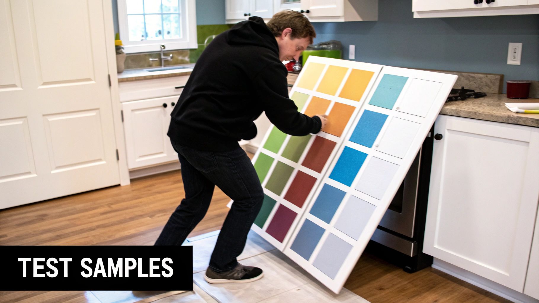
Let’s be honest. Committing to a full gallon of paint based on a tiny two-inch paper swatch is one of the biggest gambles in any kitchen remodel. It's like picking a life partner from a single photograph—you're missing all the crucial context. The colour that looked perfect under the harsh fluorescent lights of the hardware store can completely transform in your home's unique light.
This is why the final, non-negotiable step in choosing a kitchen paint colour is a proper sampling process. It’s the only way to see how your chosen hue will truly behave when it meets your specific lighting, cabinetry, and countertops. Getting this right prevents costly mistakes and ensures the colour you choose is one you'll love for years to come.
Ditch the Wall Swatches for This Pro Method
The common impulse is to paint small test patches directly onto your existing walls. This is a critical mistake. Your current wall colour will dramatically skew your perception of the new sample, influencing its undertones and making an accurate assessment impossible.
Instead, the method professionals rely on involves creating large, mobile sample boards.
- Get the Right Tools: Purchase at least two foam boards or large poster boards (aim for at least 2×2 feet) for each colour you are testing.
- Apply Two Coats: Paint each board with two full coats of your sample paint, allowing for proper drying time between coats. This is key to seeing the true, rich colour.
- Create a White Border: Use painter's tape to create a one-inch white border around your sample. If you skip this, the old wall colour will still bleed through and interfere with your perception.
This approach gives you a large, accurate representation of the colour, completely isolated from any distracting background hues. It’s a simple change that makes a world of difference.
The 24-Hour Observation Test
Once your sample boards are ready, the real test begins. Your goal is to see how the colour performs throughout an entire day in various locations around your kitchen. Think of it as an audition for the most important role in your kitchen's design.
By moving a large sample board around the room, you are not just testing a paint colour; you are testing how that colour interacts with the soul of your kitchen—its light, its shadows, and its core features.
Move your boards around the room and observe them at different times, paying close attention to these key moments:
- Morning Light: Place the board next to a window. Does the colour feel energizing and bright, or does it wash out completely?
- Midday Sun: Move it to the wall directly across from your cabinets. How do the undertones interact with your wood grain or existing paint finish?
- Evening (Artificial Light): Prop it up near your countertops under your main kitchen lights. Does it stay true to its colour, or does it turn muddy or sterile?
- Shadowed Corners: Don't forget the darker areas. Does the colour maintain its character, or does it become gloomy and dull?
Before you start this process, it's also a great idea to make sure your surfaces are ready. For those with painted cabinets, learning how to prep cabinets for painting can provide a clean slate for both your project and your colour testing. This hands-on evaluation is the single best way to guarantee you'll love your new kitchen colour from your morning coffee to your late-night snack.
Common Questions About Kitchen Paint Colours
Choosing the perfect kitchen paint colour can feel like a huge decision, but it doesn't have to be a stressful one. To help you feel confident in your final pick, we've rounded up the most common questions we hear from homeowners. Think of these answers as a final gut-check before you start painting.
We’ll tackle the big debates—like whether your cabinets should be lighter or darker than the walls—and give you straightforward advice for creating a look you’ll love for years. By working through these points, you can make sure your choice is both beautiful and a perfect fit for your home.
Should Kitchen Cabinets Be Lighter or Darker Than Walls
The dynamic between your cabinet and wall colour is one of the most powerful tools for shaping the feel of your kitchen. There’s no single right answer here; it all comes down to the atmosphere you want to create. Each approach has its own unique impact.
If you’re dreaming of an open, airy kitchen, pairing lighter cabinets with slightly darker walls is a fantastic choice. This creates a subtle, sophisticated contrast that gently defines the cabinetry without closing in the space. On the other hand, for a bold and modern statement, dark cabinets against light walls will make your cabinetry the undisputed star of the show. This high-contrast look is perfect for highlighting gorgeous custom millwork.
A two-tone strategy is another popular and incredibly effective option. Using dark lower cabinets while the uppers match the light wall colour helps to ground the kitchen. It makes the bottom half feel solid and established, while the top half seems to disappear, drawing the eye upward and making the whole room feel more spacious.
What Is the Most Timeless Colour for a Kitchen
While design trends come and go, some colours have a classic, enduring appeal that never feels dated. If longevity is your goal, you can't go wrong by sticking to a palette with proven staying power.
Whites and off-whites are perennial favorites for a reason. They create a clean, bright backdrop that works with any style, from a traditional farmhouse to a sleek, modern space. Soft grays and versatile 'greige' (that perfect blend of gray and beige) are also here to stay, thanks to their chameleon-like ability to complement both warm and cool finishes.
A timeless colour is often one that connects to nature. It feels familiar and grounded, which is why it doesn't go out of style.
More recently, colours pulled from nature are being recognized as new classics. Muted sage greens and deep navy blues add personality and depth without screaming "trendy." The trick is to choose a classic, muted version of the colour, not a super-saturated, bright one. If you're looking for guidance beyond the kitchen, you'll find great advice in a comprehensive guide to picking the perfect paint color for your home.
How Do I Choose a Paint Colour for Wood Cabinets
When you have natural wood cabinets, the key is to choose a paint colour that works with the wood, not against it. The secret is all in the wood's undertone. Get that right, and you'll create a harmonious look instead of a jarring one.
First, you need to figure out if your wood has warm or cool undertones.
- Warm Woods: Woods like oak, cherry, and maple have noticeable yellow, orange, or red undertones. To make them look their best, pick paints that also have warm undertones, like creamy whites, warm beiges, or earthy greens.
- Cool Woods: Woods with cooler undertones, such as ash or certain stained maples, look stunning next to crisp grays, cool off-whites, or different shades of blue.
Don't skip this step: always test a large paint sample right next to your cabinet door. It’s the only way to truly see how the undertones play together in your kitchen’s specific lighting.
What Paint Finish Is Best for Kitchen Walls
In a busy space like a kitchen—with all its steam, splatters, and traffic—durability is just as critical as the colour itself. The paint’s finish, also known as its sheen, dictates how well it holds up to scrubbing and stains.
An eggshell or satin finish is your best bet for kitchen walls. These finishes have a soft, subtle sheen that makes them incredibly easy to wipe down. They stand up to everyday messes far better than a flat or matte paint, giving you that perfect sweet spot between good looks and practical function.
For surfaces that see even more action—like trim, doors, and even painted cabinets—a semi-gloss finish is the undisputed champion of durability. Its higher shine creates a tough, scrubbable surface. Just be aware that the glossier the paint, the more it will show any little bumps or imperfections on the wall, so it works best on smooth, well-prepped surfaces.
Ready to bring your vision to life with cabinetry that perfectly complements your new colour palette? At Sinclair Cabinetry inc, we specialize in crafting custom, high-quality wood cabinets that serve as the stunning centerpiece of any kitchen. Explore our gallery and see how expert craftsmanship can transform your home at https://sinclaircabinets.com.