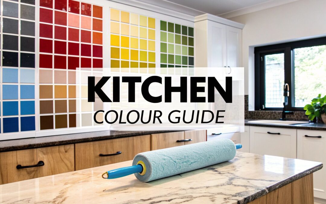
Choosing a kitchen paint colour can feel like a massive commitment, but honestly, it’s also the single best way to completely transform your space. The right colour isn’t just about what's trendy; it’s about creating a perfect harmony between your home’s unique lighting, your existing materials like cabinets and countertops, and the overall vibe you’re going for. This guide will walk you through how to choose with confidence, so you end up with a colour you love.
How to Confidently Choose Your Kitchen Colour
Staring at an endless wall of paint swatches can be paralyzing. It's easy to get lost in the sea of options. The trick is to stop thinking about paint as a standalone decision and start seeing it as part of a bigger picture. Your wall colour should always complement the most permanent (and expensive) elements already in your kitchen.
Think of it like putting together an outfit. Your cabinets and countertops are the main pieces—the jacket and trousers. The paint colour? That’s the perfect accessory that ties it all together, making those investment pieces look even better.
Start with Your Kitchen's Core Elements
Before you even glance at a paint chip, take a good, hard look at what you’re working with. These "non-negotiables" are your foundation, and they'll do most of the work in narrowing down your choices for you.
- Cabinets: What’s the undertone of your cabinets? Are they a warm-toned wood like cherry or oak? A cooler-toned maple? Or are they already painted a specific shade of white, grey, or something bolder? This is your primary clue.
- Countertops: Lean in and look closely at your countertops. Do they have subtle veining or tiny flecks of colour? That faint grey vein in a quartz slab or the warm gold speckle in a granite counter can be the perfect jumping-off point for your wall colour.
- Flooring: Don’t forget to look down! The colour and material of your floors—be it tile, wood, or vinyl—add another critical layer to the room’s overall palette.
This decision-making process can feel complicated, but breaking it down helps. To get started, we've put together a quick overview of the key factors that will guide your choice.
Key Factors for Your Kitchen Colour Decision
This table simplifies the essential elements, helping you pinpoint where to start your color selection journey.
| Factor to Consider | Key Question to Ask Yourself | Example Application |
|---|---|---|
| Fixed Elements | What are the undertones of my cabinets, counters, and floors? | Warm oak cabinets and granite with gold flecks call for a warm-toned paint like cream or beige. |
| Natural Light | How much sunlight does my kitchen get, and from which direction? | A north-facing room with cool, limited light will feel warmer with a soft yellow or a warm off-white. |
| Room Size & Layout | Is my kitchen large and open, or small and galley-style? | Light colours like pale grey or sky blue can make a small kitchen feel more spacious and airy. |
| Desired Mood | Do I want the space to feel calm and serene, or energetic and bold? | For a calming atmosphere, choose muted greens or blues. For an energetic feel, try a vibrant accent wall. |
By thinking through these points, you create a solid foundation for your decision instead of just picking a colour you like on a paint chip.
This flowchart is a great way to visualize how to narrow down your options by considering your kitchen's light, cabinet style, and the aesthetic you're aiming for.
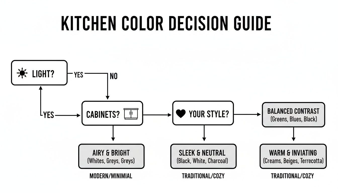
This visual guide breaks the process down, showing you a clear path from your existing elements to a final colour family. Understanding how your fixed features influence your paint choice is the first real step toward a beautifully cohesive design. Staying informed on the latest kitchen cabinet color trends can also offer some fantastic inspiration.
How Light Changes Everything in Your Kitchen
Have you ever picked out the perfect paint swatch at the hardware store, brought it home, and then watched it turn into a completely different color on your kitchen walls? You’re not imagining things. The culprit isn’t a bad batch of paint; it’s the light in your room. Light is an active ingredient, constantly shifting how a color looks and feels throughout the day.
Think of light as a personality filter for your paint. That serene, neutral gray you loved under the store's fluorescent bulbs can suddenly throw off sneaky blue or even purple undertones in the cool, indirect light of a north-facing window. On the flip side, a west-facing room might blast a subtle cream with so much warmth during sunset that it looks intensely yellow.
This is why a color can feel absolutely perfect at 9 AM but just plain wrong by dinnertime. The real secret to answering "what colour shall I paint my kitchen?" is to find a shade that looks beautiful not just for a moment, but all day long.
Natural Light and Its Direction
The direction your windows face is the single biggest factor in how natural light will behave in your kitchen. Each direction casts its own unique color temperature, which can either bring out the best in your paint or clash with its undertones.
- North-Facing Light: This is cool, indirect light that casts a soft, almost bluish hue. Warm colors like a creamy off-white or a soft beige are great here because they balance out the coolness. A cool gray, however, might feel a bit too chilly or sterile.
- South-Facing Light: This is the jackpot of natural light—it's bright, warm, and wonderfully consistent all day. It makes nearly every color look its best, bringing both cool and warm shades to life just as you'd see them on the swatch.
- East-Facing Light: You'll get bright, warm light in the morning that gradually becomes cooler and more indirect in the afternoon. A versatile color with balanced, neutral undertones is your best bet here, as it can adapt beautifully as the light changes.
- West-Facing Light: This light is softer in the morning and then becomes intensely warm and golden in the late afternoon. Be careful with colors that are already very warm, as they can become overwhelmingly orange or red when the sun starts to set.
The Impact of Artificial Lighting
Once the sun goes down, your artificial lights take over and bring a whole new set of rules to the game. The Kelvin (K) temperature of your light bulbs will dramatically alter your paint color. Lower Kelvin bulbs (2700K) cast a warm, yellowish glow similar to old-school incandescent light, while higher Kelvin bulbs (4000K+) produce a cooler, bluer light that’s closer to daylight.
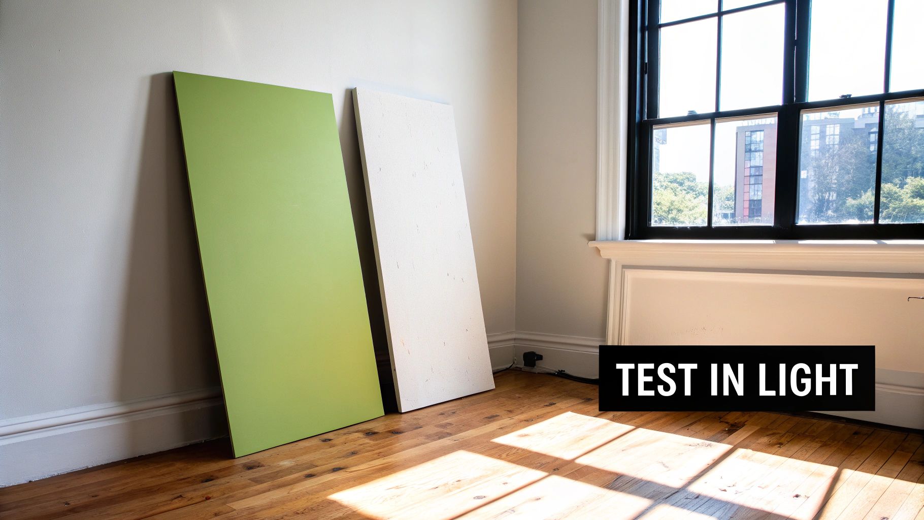
The most common mistake homeowners make is falling in love with a colour under one type of light. Your kitchen needs to look great under morning sun, afternoon shade, and your evening light fixtures. Testing is non-negotiable.
Choosing the right mix of fixtures and bulbs is absolutely essential for a cohesive design. To really get this right, exploring different kitchen cabinet lighting ideas can give you some fantastic insights on how to layer your light sources for the best effect.
So, how can you be certain? You have to test your samples—the right way. Don't just rely on a tiny paper swatch taped to the wall. Instead, grab a few large poster boards and paint your top color choices on them. Move these boards around your kitchen throughout the day and night. Place them next to your cabinets, your backsplash, and your countertops. This is the only way to see exactly how the color will behave in your unique space, ensuring you pick a winner you’ll love 24/7.
Creating Harmony with Cabinets and Countertops
Let's be honest, your cabinets and countertops are the undisputed stars of your kitchen. They're likely the biggest financial and visual investment in the room, and they absolutely set the tone for the entire space. The secret isn't finding a paint color that competes with them for attention. Instead, you want a color that acts as the perfect supporting character, making them look even better.
Think of your cabinets as the anchor. Their color, material, and undertone are your primary clues for picking a wall color. For example, if you have beautiful real-wood cabinets with a warm cherry or golden oak finish, the goal is to enhance that natural richness, not wash it out.
A paint color that works with the wood grain creates a look of grounded elegance. This approach ensures your answer to "what color shall I paint my kitchen?" results in a cohesive, professionally designed space that feels intentional, not accidental.
Working with Wood Cabinet Tones
Every species of wood has distinct undertones—they’re either warm (leaning yellow, orange, or red) or cool (leaning ashy or grey). Figuring this out is your first big step.
- Warm Wood Cabinets (Oak, Cherry, Hickory): These woods pair beautifully with colors that complement their inherent warmth. Earthy greens, from a soft sage to a deep olive, create a stunning, nature-inspired contrast. Creamy whites or warm greiges (that perfect mix of grey and beige) also work wonderfully, providing a soft backdrop that really lets the wood grain shine.
- Cool Wood Cabinets (Maple, Ash): Lighter woods with cooler or more neutral undertones give you a bit more flexibility. They look incredibly crisp and modern next to cool greys, soft blues, and even clean, bright whites. For a touch of drama, a deep charcoal or navy can create a sophisticated contrast that really pops.
Beyond just the color, understanding the best paint finish for kitchen cabinets is crucial for both durability and getting the look just right. The sheen you choose can totally change how the color interacts with your wood tones and the light in your room.
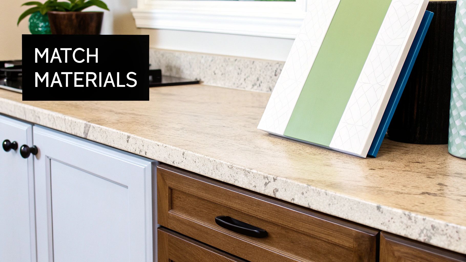
Pulling Colours from Your Countertops
Your countertops are a treasure map of potential paint colors. Seriously. Whether you have granite, quartz, or marble, there are almost always subtle specks, veins, and swirls of secondary colors hidden in the main pattern. This is a designer's secret weapon for creating a unified look.
Lean in close to your countertop and find the least dominant color—that tiny fleck of grey, the subtle streak of gold, or the faint blush tone. Using this minor color as the inspiration for your walls is a foolproof way to guarantee harmony.
This technique ties the whole room together effortlessly. For example, pulling a soft, muted grey from the veining in a marble countertop creates an instant connection between your horizontal and vertical surfaces. It tells a cohesive color story, making the entire design feel intentional and thoughtfully curated. If you're still in the selection process, learning more about how to pick countertops can help you choose a material with veining that offers versatile paint pairing options.
By letting these foundational elements guide your decision, you take all the guesswork out of the equation. Your paint choice becomes less about finding a standalone color you like and more about completing a beautiful, balanced picture that was already there.
Balancing Current Trends with Timeless Style
Choosing a kitchen paint color can feel like a high-stakes decision. You’re caught in a tug-of-war between what’s trending on Pinterest and what you know will still look good in five, ten, or even fifteen years. The goal is to land on a color that feels fresh and exciting today, but won't scream "that was a 2024 fad" before you’re ready for a change.
Finding that sweet spot is the secret to a design you'll love for the long haul. It's about blending a modern aesthetic with enduring appeal. For some fantastic inspiration on this front, look at the principles of contemporary Italian kitchen design, which masterfully creates spaces that feel both current and classic. Adopting this mindset helps you pick a color that’s personal and exciting without being tied to a fleeting trend.
Today’s Trend: Biophilic Palettes
Right now, there's a huge movement toward bringing the outdoors in. We're seeing a major shift to nature-inspired, biophilic palettes that create a sense of calm and grounding right in the heart of the home.
Think of those soothing shades you find in nature: soft sage, muted olive, and even deep, moody forest greens. These colors connect us to the natural world, fostering a serene, restorative atmosphere. This isn't just a random preference; it’s part of a bigger desire for wellness and tranquility in our homes.
Industry data shows this is more than just a passing phase. The days of sterile, all-white kitchens are fading. According to the National Kitchen & Bath Association, a whopping 76% of designers now rank green as a top color choice. What’s more, this trend has real financial upside—homes with nature-inspired palettes can see a 15-25% higher resale value in some markets.
Enduring Colors That Never Go Out of Style
On the other side of the coin are the timeless classics. These are the tried-and-true palettes with guaranteed longevity—colors that have looked sophisticated for decades and will continue to do so. They create a perfect neutral backdrop that lets other design elements, like your beautiful wood cabinets or a show-stopping backsplash, really shine.
A timeless color palette is like a little black dress or a perfectly tailored suit. It’s always appropriate, effortlessly stylish, and serves as the ideal foundation for any accessories you decide to add over the years.
Here are a few enduring options that always work:
- Classic Whites: This isn't just one shade, but a whole family of options. Think warm off-whites, crisp gallery whites, and soft, creamy ivories. They always feel fresh and bright.
- Sophisticated Greys: From a light, airy silver to a deep, dramatic charcoal, grey offers incredible versatility and an immediate sense of refined elegance.
- Versatile Creams and Beiges: These warm neutrals are masters at creating an inviting, cozy atmosphere that feels both comfortable and completely polished.
Ultimately, the best choice is found where your personal taste meets smart design. Whether you go all-in on a calming green or opt for a timeless cream, knowing the difference between trends and classics will give you the confidence to pick the perfect color for your kitchen.
Using Colour to Shape Your Kitchen's Mood and Size
Paint is so much more than just a protective layer for your walls; it’s one of the most powerful tools you have to completely transform the feel of a room. When you're asking, "what colour shall I paint my kitchen?" you're really asking how you want the space to make you feel. With a simple can of paint, you can make a room feel bigger, cozier, taller, or a whole lot more dramatic.
Think of light colours as your secret weapon for creating space. Shades like pale blues, soft off-whites, and gentle yellows are fantastic at reflecting light around a room. This creates a clever optical illusion, visually pushing the walls back and making a small or cramped kitchen feel significantly larger, brighter, and more open. It’s like opening a window where one doesn't exist.
Making Small Kitchens Feel Grand
To really maximize this space-enhancing effect, a couple of simple strategies work wonders:
- Go Monochromatic: Using a single light colour across the walls, trim, and even the ceiling blurs the lines where surfaces begin and end. This seamless look tricks the eye into seeing a larger, more unified area.
- Embrace Sheen: A paint with a slight sheen, like satin or eggshell, bounces more light around the room than a flat matte finish. That little bit of extra reflectivity really contributes to a brighter, more expansive atmosphere.
Creating Drama in Larger Spaces
On the flip side, deep and saturated hues can bring a welcome sense of intimacy and drama to larger kitchens that might otherwise feel a bit vast or impersonal. Don’t be afraid of colours like a deep navy, charcoal grey, or a rich forest green. These shades absorb light, which makes the walls feel closer, creating a cozier and more luxurious environment.
A bold colour isn't just for walls. Painting a kitchen island in a deep, contrasting shade can create a stunning focal point, grounding the room and adding a layer of sophisticated design without overwhelming the entire space.
These darker tones are perfect for setting a specific mood. A dark green can evoke a comforting, earthy feeling, while a deep blue can feel elegant and serene. You can also use colour to play with a room's height. Painting your ceiling a shade or two lighter than your walls will draw the eye upward, giving the illusion of a higher ceiling and a more open, airy feel. It's a classic designer trick that works every time.
Your Final Checklist Before You Start Painting
So, you’ve gathered your inspiration and narrowed down the contenders. Awesome. But before you even think about cracking open that can of paint, let's run through one final checklist. This is the crucial last step that separates a good-enough paint job from a finish that looks absolutely flawless and professional.
The single most important thing you can do now is test your paint color the right way. Those little paper swatches from the store? They're misleading. They can't possibly show you how a color will truly behave with your kitchen's unique lighting, cabinets, and flooring. You have to see it in its natural habitat.
Test Like a Pro
To get a real-life preview of how your final color will look, follow this dead-simple process:
- Buy Sample Pots: Don't skip this! Grab small sample pots of your top one or two colors.
- Use Large Boards: Paint two coats onto big white poster boards or even some scrap drywall. Go for at least two feet by two feet—big enough to make an impact.
- Move Them Around: Now, put your painted boards to work. Lean one against your cabinets, place another next to the backsplash, and stick one in that shadowy corner you're worried about.
- Observe for 24 Hours: This is key. Watch how the color changes throughout the day. See it in the bright morning sun, in the soft afternoon light, and under your kitchen's artificial lights at night. This is the only way to be 100% sure you’re making the right call.
Choose the Right Paint Finish
Okay, let's talk sheen. The paint's finish is just as critical as the color itself, dramatically affecting both the final look and its durability. Kitchens are workhorses; they need a finish that can stand up to steam, splatters, and scrubbing.
Your paint's sheen is just as important as its colour. The right finish protects your walls from daily life—splatters, steam, and scrubbing—while enhancing the overall look of your chosen hue.
Here’s a quick rundown of the best finishes for a kitchen:
- Satin/Eggshell: This is the go-to for most kitchen walls, and for good reason. It has a beautiful, soft glow that isn't too shiny, but it's durable and way easier to wipe down than a flat paint.
- Semi-Gloss: With a noticeable shine, semi-gloss is a beast when it comes to durability and moisture resistance. It’s a fantastic choice for trim, backsplashes, and any high-moisture zones. Just be aware that its shine will call attention to any bumps or imperfections on your walls.
- Matte/Flat: While a matte finish offers a sophisticated, velvety look, it's the least durable option. It's tough to clean without leaving shiny spots (a phenomenon called "burnishing"). It's really best saved for ceilings where it won't be touched.
Frequently Asked Questions About Kitchen Paint
Even with the perfect mood board and a stack of samples, a few lingering questions always seem to surface right before the brushes come out. Answering "what color should I paint my kitchen?" goes beyond just picking a shade; it involves practical details that can make or break the final look. Let's tackle the most common queries to give you that last bit of confidence.
What Paint Finish Is Best for a Kitchen?
When it comes to kitchens, durability and washability are non-negotiable. For walls and trim, a satin or semi-gloss finish is almost always the best bet. These finishes have a slight sheen that not only reflects light nicely but also stands up to moisture, grease, and the inevitable splatters from cooking. Best of all, they’re easy to wipe clean.
A matte or flat finish can give you that modern, velvety look, but it’s far less durable and notoriously difficult to scrub without leaving marks. It’s best to save the matte look for ceilings or kitchens that see very little action.
Should My Kitchen Walls Match My Cabinets?
Generally, you want to create a little separation between your walls and cabinets to add depth and keep the room from feeling flat. If you have classic white cabinets, for example, a soft grey, a warm greige, or even a deep, moody color on the walls will make your cabinetry the star of the show.
And if you have gorgeous real-wood cabinets, a complementary wall color like a creamy off-white or a soft sage green will highlight the wood’s natural beauty instead of clashing with it. A monochromatic scheme can work, but you'll want to use different sheens or slightly different shades to create a subtle, sophisticated contrast.
A common design mistake is matching wall and cabinet colors too closely. It can make a kitchen feel flat and one-dimensional. A little contrast goes a long way in creating a dynamic, layered look that feels professionally designed.
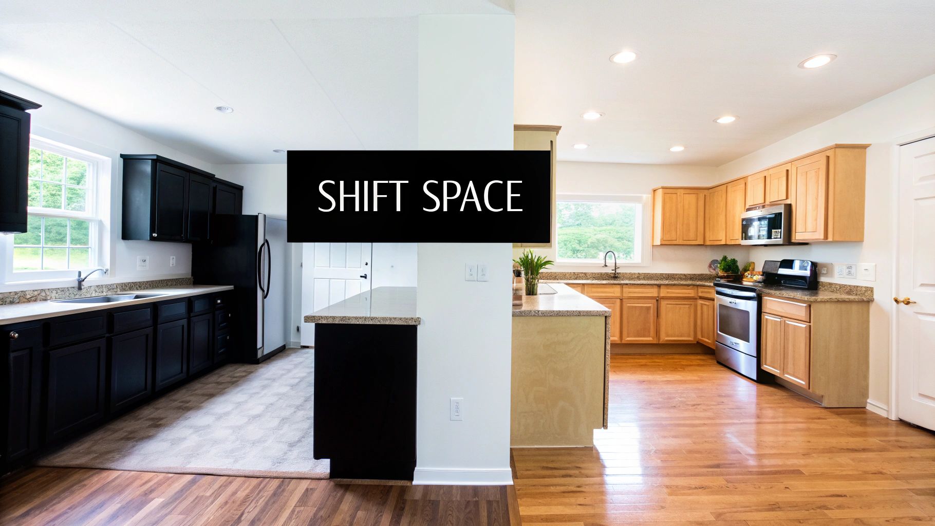
How Do I Choose a Colour for an Open-Concept Space?
Cohesion is key in an open-concept home. The most straightforward approach is to pick one versatile neutral color and use it on the majority of the walls to tie the living, dining, and kitchen areas together. You can then add personality by painting a kitchen feature wall or the island in a complementary accent color.
Another great strategy is to build a coordinated color palette of three to four shades. Use these colors thoughtfully throughout the entire open area to define different "zones" while ensuring the whole space feels harmonious and intentional.
Ready to pair your perfect paint color with equally stunning cabinetry? The expert team at Sinclair Cabinetry inc can help you design and build the real-wood kitchen of your dreams, creating a timeless foundation for any palette. Explore our custom options and start your transformation today at https://sinclaircabinets.com.