When you're trying to figure out what color to paint your kitchen, it's easy to get lost in trends. But the secret is usually simple: warm, inviting neutrals. While a pop of bold color can be fun, shades like creamy off-white, soft greige, and earthy taupe have a timeless appeal that works with almost any style. They create a welcoming vibe, make the most of natural light, and look fantastic with beautiful wood cabinetry.
Your Starting Point for Kitchen Paint Colors
Picking a kitchen paint color can feel like a huge decision, but the truth is, the perfect shade is already hiding in plain sight. Before you even think about grabbing paint chips, take a good, hard look at your kitchen's permanent features—the things you aren't planning to change.
Think of it this way: your kitchen already knows what it wants. Your job is to listen to the clues it's giving you. By focusing on the core components first, you can skip the guesswork and narrow down your choices in a way that just makes sense.
The Kitchen's Built-In Clues
Before you fall in love with a color swatch, get grounded by looking at the foundational elements that will ultimately steer your decision.
- Existing Finishes: Your countertops, backsplash, flooring, and—most importantly—your cabinets are the stars of the show. Their colors and undertones are your best guide.
- Natural Light: How much light does your kitchen get, and from what direction? Light can completely transform a color, making it look vibrant and airy or dull and shadowy.
- Kitchen Size: The right color can work wonders. It can make a cozy kitchen feel open and bright or help a large, open-concept space feel more defined and intimate.
The real goal here is harmony. You want a color that ties everything together. When your walls, cabinets, and countertops feel like they belong in the same room, the entire space feels intentional and professionally designed. That’s a win for your home’s visual appeal and your everyday enjoyment.
It’s not just a gut feeling, either. The National Kitchen & Bath Association (NKBA) recently reported that 96% of designers are pointing to neutrals as the top choice for kitchen projects, with warm tones really taking the lead. Here in sunny Southwest Florida, this couldn't be more true. Warm neutrals like greige and creamy whites are a perfect match for the beautiful natural wood cabinetry from Sinclair Cabinetry, and they do a fantastic job of balancing out our intense sunlight.
For a deeper dive, checking out a complete guide to color trends and finishes can give you even more great ideas.
How Light and Kitchen Size Shape Your Choice
Before you even think about picking up a paint chip, you need to get to know your kitchen on a deeper level. I'm talking about its two most defining features: the light it gets and its overall size. Think of choosing a paint color as having a conversation with the room itself. The light sets the mood, and the room's dimensions decide whether that conversation is a whisper or a shout.
Light is a living, breathing thing in a room, and it will completely change how a color looks on your walls. A warm, inviting yellow in the morning can look washed out and sterile by the afternoon. If you can master your kitchen's unique lighting, you'll be able to find a color that looks incredible from sunup to sundown.
Decoding Your Natural Light
The biggest player here is the direction your kitchen windows face. Each direction brings its own quality of light, and some color families just work better with certain exposures.
- North-Facing Light: This is cool, indirect light that often casts a subtle blueish tint. You'll want to counteract that coolness with warmer tones. Think creamy whites, soft beiges, or even a muted sage green to keep the space from feeling too clinical. I'd steer clear of stark grays here; they can feel downright icy.
- South-Facing Light: This is the jackpot for bright, warm, intense light all day long. Cool colors are your best friend here—light blues, soft grays, and crisp whites do a beautiful job of balancing out that intensity and creating a calm, serene vibe.
- East-Facing Light: Kitchens with an eastern exposure get a flood of bright, clear light in the morning, which softens and cools as the day goes on. A versatile greige is a fantastic choice because it adapts beautifully to both the warm morning glow and the cooler evening light.
- West-Facing Light: This exposure is the opposite of east-facing. You'll have soft, shaded light in the morning, but the room will be drenched in warm, golden tones in the evening. Earthy neutrals really shine here, making the space feel incredibly cozy as the sun sets.
Choosing a color isn’t about fighting your natural light; it’s about working with it. The real goal is to find a hue that complements the light you have, making your kitchen feel balanced and welcoming from your first cup of coffee to your last-call for a midnight snack.
Making the Most of Your Kitchen's Size
The square footage of your kitchen also has a huge say in which colors will work. The right shade can be a bit of a magic trick, making a room feel larger or cozier with just a few coats of paint.
For smaller kitchens, the mission is usually to create an illusion of space. Light colors are your secret weapon. Shades like off-white, pale gray, and soft pastels are fantastic because they reflect more light, making the walls seem to recede and the room feel more open and airy. For a pro tip, keeping your walls, cabinets, and backsplash in a similar light-toned palette creates a seamless look that really amplifies this effect. For more tips on this, check out our smart small kitchen remodel ideas.
On the flip side, large, open-concept kitchens can sometimes feel a bit cavernous or impersonal. This is where color can be used to define different zones and inject some warmth. You could paint a feature wall a deeper, more saturated color to create a stunning focal point, or use a medium-toned neutral to make the whole space feel more intimate and grounded. Bolder choices can add a ton of personality without swallowing the room whole.
Harmonizing Paint with Cabinets and Countertops
In any kitchen, your cabinets and countertops are the main characters in the room's design story. They aren't just features; they're foundational elements with their own colors, textures, and personalities. When you're asking, "What color should I paint my kitchen?" the best answer comes from treating your paint like a supporting actor—one chosen specifically to make these stars shine.
Think of it this way: your cabinets and countertops are the melody of a song. The wall color you pick is the harmony. It should lift the melody up, not compete with it. A clashing color choice can make the whole room feel off-key, but the right hue creates a seamless, polished look that feels intentional and professionally designed.
The first step is to stop seeing your cabinets as just "brown" or your countertops as simply "white." Instead, you need to look closer and identify their subtle undertones—those hints of underlying color that give every material its unique character.
Decoding Cabinet Undertones
Whether your cabinets are natural wood or painted, they have distinct undertones that will either work with or against your paint choice. Ignoring these subtle hues is one of the most common—and most frustrating—mistakes we see homeowners make.
- Warm Undertones: Woods like cherry, red oak, and hickory naturally lean warm with their red, orange, or yellow undertones. To bring out their best, stick with wall colors that have a similar warm base, like creamy off-whites, warm beiges (greige), or even a muted sage green.
- Cool Undertones: On the flip side, light maple, painted gray cabinets, or very dark espresso finishes can have cool undertones hinting at blue, purple, or gray. These pair beautifully with crisp whites, cool grays, or soft blues that echo their cool nature.
For example, if you pair rich cherry cabinets with a stark, cool gray paint, the wood can suddenly look dated and almost orange. A much better choice would be a warm greige that harmonizes with the cabinet’s natural warmth, creating a sophisticated, cohesive feel. In the same way, the quiet beauty of white oak cabinets is amplified by a soft green, giving you a calm, organic atmosphere.
Your home’s fixed elements are the boss. No matter how much you love a certain paint color, if your countertop and cabinets disagree with it, the final result will feel disconnected. Learning to listen to what these elements need is the key to creating a harmonious space.
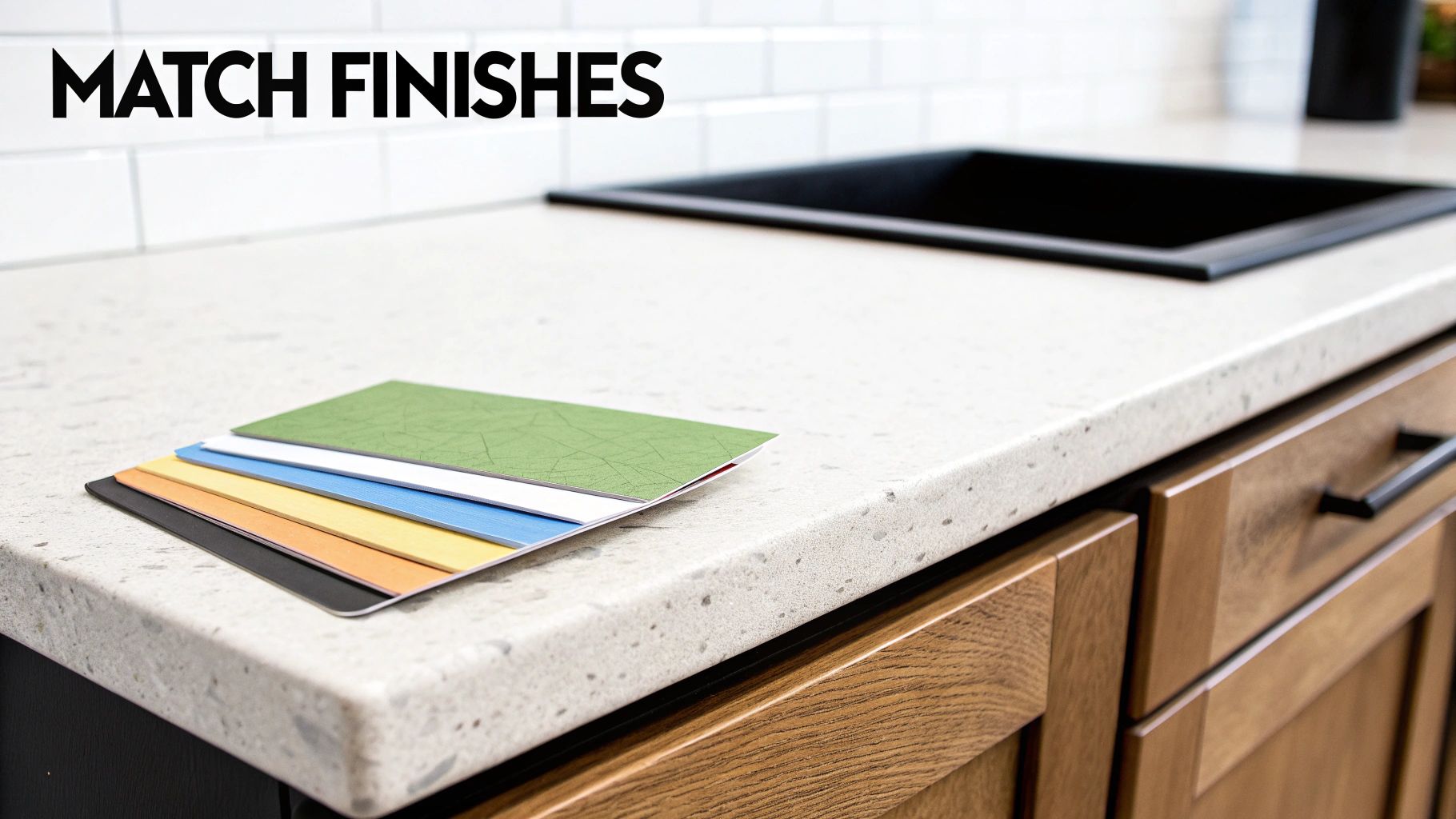
Pulling Colors from Your Countertops
Your countertops, especially natural stones like granite or engineered materials like quartz, are a treasure map of color inspiration. They almost always have a primary background color, but look closer—you'll find flecks, veins, and specks of secondary and tertiary colors.
Lean in and really study your countertop’s pattern. Do you see tiny flecks of gray? Specks of deep burgundy? Subtle veins of a creamy beige? Pulling one of these less dominant colors and using it for your wall paint is a designer-level trick that guarantees a unified look. This technique ensures your wall color has a clear reason for being there, as it’s directly tied to another major finish in the room.
If you're still in the selection phase, our guide on how to pick countertops can help you choose a material that offers a versatile and inspiring palette.
This approach works wonders for creating balance. A busy granite countertop with a lot of movement pairs best with a wall color pulled from its quietest, most subtle shade. This lets the countertop remain the star of the show without overwhelming the space. On the other hand, a simple, solid-color countertop gives you more freedom to choose a bolder wall color for contrast and personality.
Color Palettes for Popular Kitchen Styles
Okay, now that you've got a handle on how your kitchen's unique features—like lighting and cabinet finishes—steer your color choices, we can get to the fun part. It's time to explore some real-world palettes. The question "what color should I paint my kitchen?" gets a lot less intimidating when you can see how different shades work together to create a specific vibe.
Think of this section as a lookbook of curated color schemes for some of the most popular kitchen styles out there. Each style is like a recipe, and the colors are the ingredients. The right mix creates a distinct flavor, whether you're after something clean and minimalist or warm and rustic. By matching your personal taste to a proven palette, you’re well on your way to a cohesive, timeless look.
Here's a breakdown of color ideas to get you started, organized by kitchen style.
| Kitchen Style | Primary Wall Colors | Accent Color Ideas | Pairs Well With |
|---|---|---|---|
| Modern & Minimalist | Crisp whites, cool light grays | Deep charcoal, matte black, a single pop of primary color | Sleek, handle-less cabinets, quartz, stainless steel |
| Coastal & Airy | Soft off-whites, sandy beiges, light sky blues | Muted aqua, sea glass green, driftwood gray | White shaker cabinets, natural textures, light wood tones |
| Traditional & Timeless | Rich creams, warm beiges, muted greens | Navy blue, burgundy, forest green (often on islands) | Ornate cabinetry, brass or bronze hardware, granite/marble |
| Farmhouse & Rustic | Warm whites, greige, soft buttery yellows | Classic black, barn red, earthy sage green | Open shelving, apron-front sinks, butcher block, wood beams |
| Luxe & Dramatic | Deep jewel tones (emerald, sapphire), moody charcoal | Metallic gold, rich wood stains, black marble | High-gloss finishes, statement lighting, bold stone veining |
These palettes are a great starting point, but remember they're meant to be adapted. Your kitchen is unique, so feel free to tweak these ideas to perfectly match your space and personality.
Modern and Minimalist
A modern kitchen is all about clean lines, uncluttered surfaces, and an overall sense of calm. The color palette naturally follows this "less is more" philosophy, leaning on crisp neutrals that let the room's architecture and materials do the talking.
- Primary Colors: Think shades of pure, cool white (like Benjamin Moore’s Chantilly Lace) or a very light, subtle gray. These colors create a bright, almost gallery-like backdrop.
- Accent Colors: The key here is restraint. A single, bold accent is all you need. A deep charcoal feature wall, matte black hardware, or even a splash of primary color on the kitchen island can introduce drama without adding clutter.
- Pairs Well With: Sleek, handle-less cabinetry, stainless steel appliances, and quartz countertops with minimal, delicate veining.
Coastal and Airy
A coastal kitchen should feel like a breath of fresh air—light, breezy, and utterly relaxed. The color palette is pulled right from a seaside landscape, focusing on soft, watery, and sandy tones that help create a serene escape from the everyday.
A successful coastal design is about evoking a feeling, not just using literal beach themes. The colors should whisper "seaside" through airy blues, soft whites, and sandy beiges, creating a space that feels effortlessly calm and inviting.
This style thrives on natural light, so your color choices should be all about amplifying whatever brightness the room has.
- Primary Colors: Soft, off-whites (like Benjamin Moore's White Dove) and sandy beiges are the perfect foundation.
- Accent Colors: The accent is almost always a gentle shade of blue or green. Think pale sea glass, muted aqua, or a soft, misty blue. These hues add just the right splash of personality.
- Pairs Well With: White or light wood cabinets, natural textures like rattan or wicker, and a simple, classic backsplash.
Remember to consider all the elements in your kitchen. Exploring some of the trending kitchen tile colors can give you great ideas for making sure your wall paint and backsplash work together beautifully.
Traditional and Timeless
Traditional kitchens are warm, elegant, and full of character. The colors here are rich and classic, creating a welcoming atmosphere that feels both refined and comfortable. These are the palettes designed to stand the test of time.
You'll often find these schemes draw from historical references, using colors that feel established and sophisticated. To see how these classic colors can be applied specifically to your cabinets, check out our guide on kitchen cabinet color combinations.
- Primary Colors: Rich creams, warm beiges, and muted greens or blues are staples. These colors have a soft, lived-in quality that makes a kitchen feel like the heart of the home.
- Accent Colors: Deeper, more heritage-inspired shades work beautifully here. Think burgundy, a classic navy blue, or a forest green, which are often used on a kitchen island or the lower run of cabinets for a grounded look.
- Pairs Well With: Detailed cabinetry with raised panels, ornate hardware in brass or bronze, and natural stone countertops like granite or marble.
Choosing the Right Paint Finish for Durability
Once you’ve finally landed on the perfect color, you're only halfway there. The next, and arguably just as important, question isn't about the hue, but the finish. A paint's finish, or sheen, does more than just affect how the color looks on the wall; it’s the invisible armor that protects your beautiful new paint job from the reality of a busy kitchen.
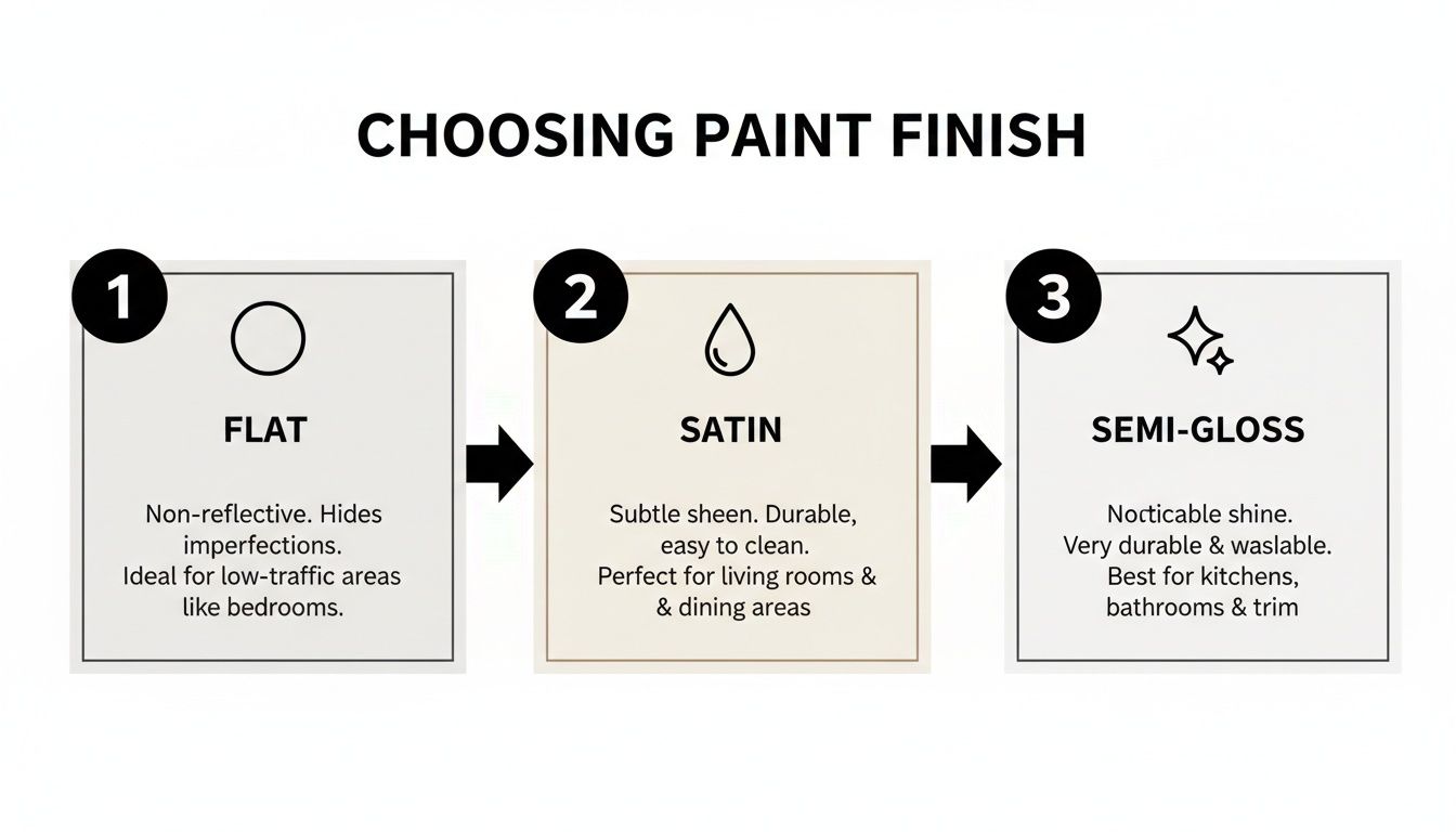
Think of paint finishes on a spectrum from no-shine to high-shine. On one end, you have flat or matte finishes. These are fantastic at hiding minor bumps and imperfections on your walls because they absorb light. The downside? Their porous texture acts like a sponge for splatters and stains, making them a risky choice for a high-traffic area like a kitchen.
At the other extreme is high-gloss. It’s incredibly durable and ridiculously easy to wipe down. While it can look stunning on trim or even cabinets for a bold statement, its mirror-like shine will highlight every single imperfection on your wall—every tiny crack, nail pop, or uneven patch will be magnified.
Finding the Sweet Spot: Satin and Semi-Gloss
For kitchen walls, the magic really happens in the middle of the spectrum. This is where you get the perfect marriage of good looks and workhorse durability. Most designers and professional painters will point you toward either a satin or semi-gloss finish.
-
Satin Finish: This is the go-to for many kitchens. It has a soft, velvety luster that gives a sophisticated look without being overly shiny. More importantly, it’s far more durable and scrubbable than a matte finish, so it can handle gentle cleaning for most everyday kitchen messes.
-
Semi-Gloss Finish: A step up in shine, semi-gloss is a powerhouse against moisture, grease, and stains. Its smooth, slick surface makes it exceptionally easy to wipe clean, which is why it’s a classic choice for backsplashes, trim, doors, and cabinetry—all the areas that take the most abuse.
Deciding between satin and semi-gloss often boils down to two things: your personal taste and the condition of your walls. Satin offers a softer look that’s more forgiving of minor flaws, while semi-gloss gives you maximum durability but will show imperfections more readily.
And for the ceiling? Flat finish is almost always the right answer. Its total lack of reflection hides flaws and stops any annoying glare from your overhead lights, giving you a clean, uniform look up top. By strategically mixing these finishes, you ensure every surface in your kitchen isn't just beautiful but is also perfectly equipped for its job, keeping your space looking fresh for years.
The Best Way to Test Paint Colors in Your Home
We’ve all been there. You see a tiny paint chip in the hardware store, fall in love, and commit to a full gallon. Then you get it on the wall, and… it’s a disaster. Those little squares look completely different under harsh fluorescent lighting than they will in your actual kitchen.
To sidestep that costly mistake and make sure you absolutely love the final result, you need a foolproof testing method.
From Small Chip to Large Swatch
The single most important step is to buy sample pots of your top two or three color contenders. Seriously, never skip this. A sample is a tiny investment that can save you from the massive headache and expense of repainting an entire room. It’s what moves your decision from a wild guess to a confident choice.
Once you have your samples, resist the temptation to paint little splotches directly on your wall. Why? Because your current wall color will totally skew your perception of the new shade.
Instead, grab a few large white poster boards or foam core panels. Paint a big swatch—at least 2×2 feet—of each color onto its own board. Always apply two coats to get the true, rich color you can expect on your walls. This method gives you a far more accurate preview than a tiny dab on the wall ever could.
This simple process lets you evaluate the color against a clean, neutral white background, giving you a real sense of its character. And speaking of character, the paint's finish is another key decision that impacts both its appearance and how well it holds up.
As you can see, moving from flat to semi-gloss increases both the sheen and the washability. For a high-traffic, messy-at-times environment like the kitchen, satin and semi-gloss are almost always the way to go.
The All-Day Lighting Test
Now it's time to put your large sample boards to the test. Move them around the kitchen throughout the entire day, taping them to different walls. How does the color look in the bright, direct morning sun? What about in the soft, shadowed light of the late afternoon?
The goal is to see how the color shifts and reacts to every kind of light, both natural and artificial. A color you adore in the morning might feel too dark or reveal strange undertones once you flip on your kitchen lights in the evening.
Hold the samples right up next to your cabinets, your countertops, and your backsplash. This methodical approach removes all the guesswork, guaranteeing the color you finally choose is one you’ll be happy with at all hours and in all conditions. No regrets.
Answering Your Final Kitchen Paint Questions
As you get closer to the finish line, a few common questions always seem to pop up. Let's tackle them head-on so you can move forward with total confidence.
What Is a Timeless Kitchen Color?
If you're looking for a color that will never feel dated, you can't go wrong with versatile neutrals. Think of soft whites like Benjamin Moore’s White Dove, warm greiges, or even muted, earthy greens. These shades have incredible staying power.
They create a classic backdrop that lets you easily swap out decor and accessories as trends change, keeping your kitchen feeling fresh for years. Plus, they look absolutely stunning next to the natural grain of high-quality wood cabinetry.
How Can I Make My Small Kitchen Look Bigger?
Light colors are your secret weapon in a compact kitchen. Shades of off-white, pale gray, and soft pastels are fantastic at reflecting light, which instantly creates an illusion of more space.
Want to take it a step further? Try a monochromatic approach. Painting your walls, trim, and even your cabinets in similar light shades erases visual breaks, making the entire room feel more open and seamless.
What Color Should I Paint an Open Concept Kitchen?
In an open layout, it's all about creating a sense of cohesion. The best strategy is to choose a single, go-to neutral for the main walls to unify the entire space. This creates a beautiful, uninterrupted flow between your kitchen, dining, and living areas.
From there, you can get creative. Use accent walls, different paint finishes, or coordinating colors from the same palette to define specific "zones" without making the space feel choppy or disconnected.
Ready to pair that perfect paint color with stunning, handcrafted cabinets? The experts at Sinclair Cabinetry inc can help you design a kitchen where every last detail works in perfect harmony. Explore our custom cabinetry and remodeling services today!