
So, what's the best color for a kitchen? If you ask a dozen designers, you'll likely get a dozen variations of the same answer: a warm neutral. Think greige, a soft mushroom, or a creamy off-white. These shades are the undisputed champions of kitchen design because they create an inviting, timeless atmosphere that lets natural materials sing and appeals to nearly everyone—a huge plus for both everyday comfort and future resale value.
Finding the Best Colors for Your Kitchen
Choosing a kitchen color can feel like a huge commitment, and in many ways, it is. The right shade does more than just cover the drywall; it sets the mood for the heart of your home. It’s the backdrop for hurried weekday breakfasts, relaxed family dinners, and quiet late-night chats. While bold trends are fun, the real goal is to land on a color that feels both personal and lasting.
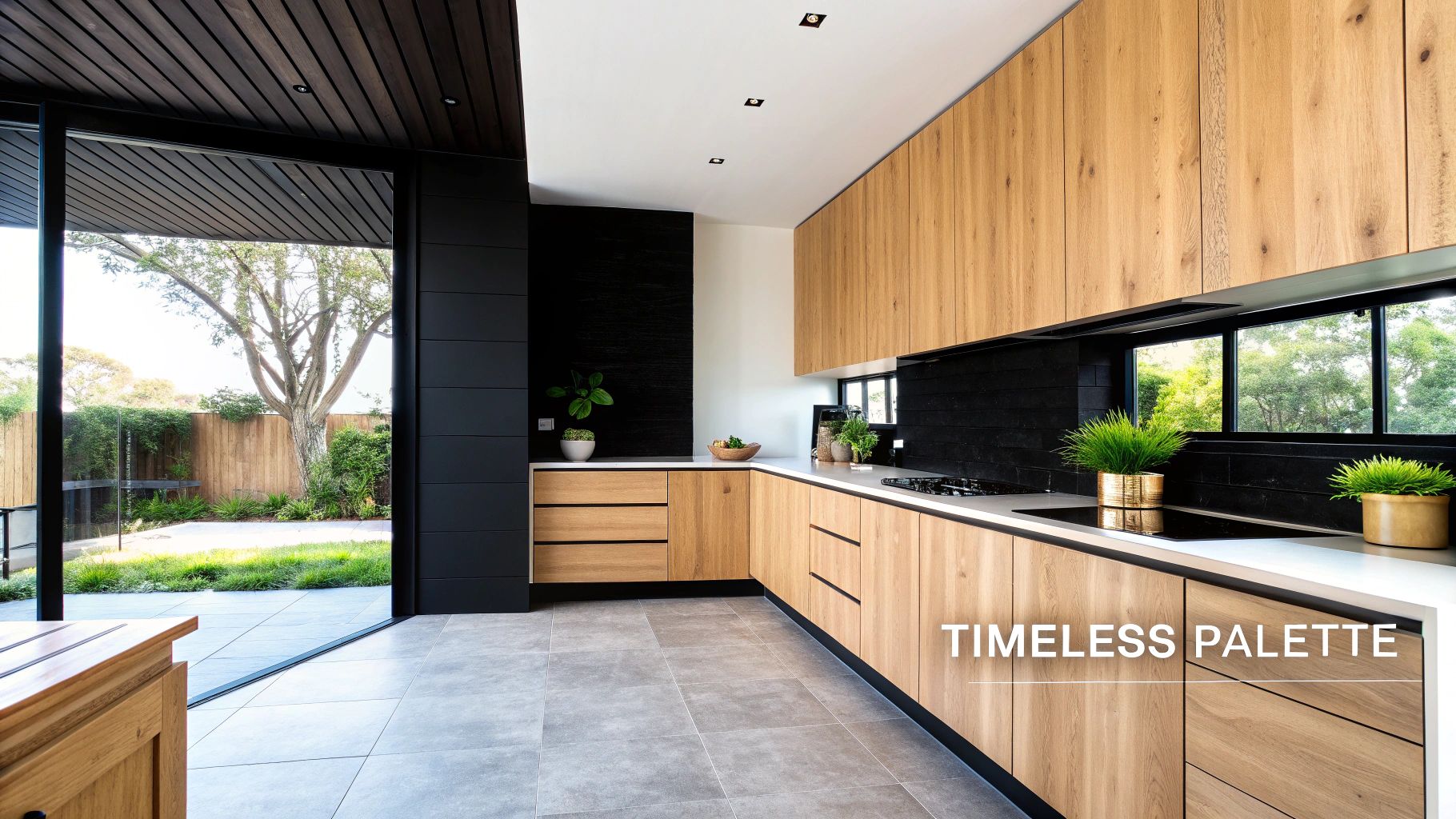
The trick is finding a color that plays well with the permanent fixtures in your home—your flooring, countertops, and especially your cabinets. If you're investing in beautiful, real wood cabinets like ours at Sinclair Cabinetry, the wall color needs to be a supportive partner. It should highlight the rich grain and expert craftsmanship, not fight it for the spotlight. This is exactly why the conversation always circles back to neutrals.
Why Neutrals Reign Supreme
Warm neutrals are the go-to for kitchen designers for good reason. They offer a unique blend of warmth and sophistication that makes a space feel welcoming, clean, and even more spacious. Unlike a stark, clinical white or a trendy color that will scream "2024" in a few years, warm neutrals provide a soft, flexible canvas you can build upon.
This isn’t just an opinion; the professionals agree. The NKBA 2026 Kitchen Trends Report, which polls hundreds of designers, found that a massive 96% of respondents named neutrals as the top choice for kitchens. On top of that, homes with neutral color schemes can fetch up to a 15% higher resale value in some areas, proving their universal appeal. You can dig deeper into kitchen trends and their impact on home value.
A great neutral doesn’t just blend in; it elevates everything around it. Think of it as the perfect frame for your stunning cabinetry, countertops, and backsplash, allowing each element to truly shine without creating visual chaos.
Before you start painting, it's helpful to see how these popular color families function in a real-world kitchen setting.
Top Kitchen Color Choices At a Glance
Here’s a quick summary of the most popular and effective kitchen colors, their psychological impact, and what they pair with best.
| Color Category | Psychological Feel | Best For | Pairs With |
|---|---|---|---|
| Warm Greige | Balanced, Welcoming, Modern | Creating a sophisticated yet cozy atmosphere that adapts to light. | Light and dark wood cabinets, black accents, brass hardware. |
| Mushroom & Taupe | Earthy, Grounded, Calming | Kitchens that need a touch of organic warmth and serenity. | Natural wood finishes, creamy countertops, stone backsplashes. |
| Creamy Off-White | Bright, Airy, Inviting | Smaller or darker kitchens to create a sense of light and space. | Rich wood tones like walnut or cherry, colorful accents, quartz. |
| Soft Sage Green | Tranquil, Natural, Refreshing | Bringing a connection to nature indoors for a peaceful vibe. | Light wood cabinets (maple/oak), white or butcher block counters. |
| Deep Navy Blue | Bold, Elegant, Dramatic | Creating a focal point on an island or lower cabinets. | White or gray countertops, gold or copper hardware, light wood. |
This table should give you a solid starting point for narrowing down your choices based on the feel you want to create in your kitchen.
Top Neutral Categories to Consider
Ready to find your perfect match? Start by exploring these foundational neutral families. Each one brings a slightly different personality to the table while still delivering that classic, timeless feel.
-
Warm Greiges: The perfect marriage of gray and beige, greige has depth without feeling cold or sterile. Colors like Sherwin-Williams' Accessible Beige are perennial favorites because they shift beautifully with the changing light throughout the day.
-
Mushroom and Taupe: These earthy, organic tones bring a sense of grounded calm into a kitchen. They have a slightly deeper presence that works exceptionally well with natural wood finishes, from light oak to rich walnut.
-
Creamy Off-Whites: Softer and far more inviting than a pure, bright white, creamy shades like Benjamin Moore’s Classic Gray add brightness without the glare. They create a cozy, luminous space that feels effortlessly elegant.
How Color Shapes Your Kitchen's Atmosphere
Color is so much more than just a decorative choice for your kitchen—it's the silent force that sets the entire mood. Think of it as the background music to your daily routine, subtly influencing how you feel from that first sip of morning coffee to a late-night snack. Every single hue carries a psychological weight, shaping the room's energy and affecting everything from your appetite to the flow of conversation.
Nailing this connection is the secret to choosing a kitchen color that not only looks incredible but feels right. The real goal isn't just to find a pretty shade; it's to intentionally design an atmosphere. Whether you’re dreaming of a peaceful, quiet retreat or a lively hub for family and friends, the right palette makes all the difference.
The Welcoming Embrace of Warm Neutrals
There’s a good reason why warm neutrals like greige, mushroom, and soft, creamy whites are perennial favorites in kitchen design. These colors are fundamentally tied to feelings of comfort and stability. On a psychological level, they create a sense of calm and safety, turning your kitchen into a true sanctuary where everyone feels relaxed and welcome.
A kitchen painted in a warm neutral is like a gentle hug. It’s the kind of space that encourages long conversations over a meal and makes the room feel more connected and inviting. This calming effect is a huge asset in what is often the busiest, most chaotic part of the home. These shades don’t scream for attention; they provide a serene, beautiful backdrop that lets life happen.
Warm neutrals are masters at making a kitchen feel like a genuine gathering place. Their inherent softness dials down the visual stress and fosters a sense of well-being—exactly the kind of atmosphere most of us crave in the heart of our home.
By creating this peaceful environment, you’re doing more than just painting walls. You're curating an experience of comfort and belonging for your family.
The Energy of Vibrant and Saturated Hues
On the other end of the color wheel, you have the bold, saturated hues that can completely energize a kitchen, flooding it with personality and life. These shades are anything but quiet. They’re meant to stimulate the senses and create a dynamic, engaging atmosphere.
-
Reds and Oranges: These are the powerhouses of the color world. They’re known to boost energy, increase heart rate, and even whet the appetite. A kitchen with pops of red can feel passionate and full of life, making it the perfect spot for hosting lively dinner parties.
-
Sunny Yellows: Yellow is pure optimism. It’s tied to happiness, positivity, and creativity. A splash of cheerful yellow can make a kitchen feel instantly brighter and more welcoming, giving the whole space a shot of joy that’s perfect for starting your day.
Of course, painting an entire kitchen fire-engine red might be a bit much for most people. But using these colors strategically—on an island, a feature wall, or a backsplash—can inject just the right dose of energy without overwhelming the room.
The Calm Focus of Cool Tones
If your ideal kitchen is a place of tranquility and focus, you really can’t go wrong with cool tones like blues and greens. These colors are pulled straight from nature and have a grounding effect that can turn your kitchen into a peaceful escape from the daily grind.
Blues are all about calmness, stability, and serenity. A soft, airy blue can make a kitchen feel more spacious, almost like a clear sky overhead. Deeper navy blues bring a touch of drama and sophistication while still keeping things feeling composed and orderly.
Greens connect us directly to the natural world, stirring up feelings of balance, renewal, and harmony. From a soft sage to a deep forest green, these shades create a restful environment that feels both refreshing and centering. Using these colors helps transform your kitchen into a place where you can cook with a clear, focused mind.
Using Light and Space to Guide Your Color Choice
A paint chip is a great place to start, but it can't tell you the whole story. The best color for any kitchen is one that feels right in that specific room, working with its unique size and, most importantly, the light it gets. Think of light as an active ingredient that changes the recipe of your color choice all day long.
Your kitchen's environment is the ultimate decider. A color that looks warm and inviting on a sample card can fall flat in a north-facing room with cool, indirect light. On the other hand, a shade that seems perfectly balanced might feel way too intense in a space flooded with southern sun. Understanding this interplay is the secret to avoiding a costly and frustrating color mistake.
Making Small or Dark Kitchens Feel Bigger
If your kitchen is on the smaller side or doesn't get a ton of natural light, your color choice can be an incredibly powerful tool. The goal is to grab every bit of light you do have and bounce it around, making the room feel brighter and more open than it really is.
Lighter colors are your best friends here. Shades like creamy whites, soft beiges, and pale grays have a high Light Reflectance Value (LRV). In simple terms, this means they reflect more light instead of absorbing it. This little trick of reflection fools the eye into thinking the walls are further away, which makes the whole space feel more expansive.
A common misstep is reaching for a stark, clinical white, which can feel cold and sterile in a poorly lit space. Instead, try a warm off-white or a light greige like Sherwin-Williams’ Accessible Beige. These colors give you the brightness you want without sacrificing that crucial sense of warmth and invitation.
Adding Coziness to Large and Bright Kitchens
On the flip side, a big kitchen drenched in sunlight brings a different kind of challenge. All that light is fantastic, but it can also make a large room feel a bit vast and impersonal. This is where color can step in to add definition, character, and a touch of sophisticated coziness.
You have the freedom to play with mid-tone or even deeper shades without worrying about them overwhelming the room. These colors absorb more light, which helps to ground the space and create a more intimate, pulled-together atmosphere. Try one of these strategies:
- Earthy Tones: A warm mushroom or a muted taupe on the walls can wrap a large kitchen in comfort, making it feel more like a dedicated gathering hub.
- Subtle Depth: A rich greige like Benjamin Moore’s Revere Pewter can add a layer of elegance that feels intentional and beautifully designed.
- Strategic Contrast: Paint just one feature wall or the kitchen island in a deeper color. This creates an instant focal point and helps break up a large visual expanse.
Of course, the layout of your space plays a huge role in all of this. For more inspiration on arranging your kitchen's key elements, take a look at these clever kitchen layout ideas to get the most out of both function and style.
Don't Forget Artificial Lighting
Your kitchen’s color story doesn't stop when the sun goes down. The kind of artificial light you have can completely change how your paint color looks and feels at night. The Kelvin scale is a simple way to measure the color temperature of your light bulbs, from warm to cool.
- Warm White LEDs (2700K-3000K): These bulbs give off a yellowish, cozy glow, much like old-school incandescent bulbs. They really bring out the best in warm colors like beiges, tans, and creams.
- Cool White LEDs (3500K-4100K): This light is crisper and whiter. It's great for accentuating blues, grays, and true, bright whites.
- Daylight LEDs (5000K-6500K): This bright, bluish light is designed to mimic natural daylight and will show your paint color in its truest form.
Before you commit, always test your paint swatches under your kitchen's natural daylight and with your artificial lights on at night. This is the only way to be sure you'll love the color around the clock.
Creating Harmony with Cabinets and Countertops
Your cabinets and countertops are the main characters in your kitchen’s story. They represent the biggest investment and command the most visual attention. Think of the wall color as the supporting actor—its job is to make the stars shine, tying the whole room together into a cohesive, beautiful space.
I like to compare this process to putting together a perfect outfit. Your cabinets are the tailored suit or elegant dress, and the countertops are the statement shoes. The wall color is the shirt or accessory that completes the look, either by blending in seamlessly or by providing a deliberate pop of contrast. The goal is to create a visual conversation between these three core elements.
This step is especially critical when you've invested in premium, real-wood cabinetry, like the custom pieces we build at Sinclair Cabinetry. The right wall color will bring out the natural beauty of the wood grain and the richness of the finish, rather than washing it out or competing with it. A thoughtful pairing elevates your investment and makes the craftsmanship the true centerpiece.
Choosing Your Design Strategy
When it comes to creating this harmony, you really have two main paths you can take: a harmonious, low-contrast approach or a more dramatic, high-contrast one. Neither is right or wrong; it all comes down to the atmosphere you want to create.
-
The Harmonious Approach: This strategy is all about using colors that are neighbors on the color wheel or sit within the same color family. For example, pairing Sinclair Cabinetry’s light white oak cabinets with a soft, creamy greige wall creates a serene, seamless look. The subtle shift in tone adds depth without any jarring visual breaks.
-
The High-Contrast Approach: This method uses complementary colors or a bold light-and-dark pairing to make a statement. Picture those same white oak cabinets set against a deep, moody green wall. The contrast makes the cabinets pop, turning them into a stunning focal point.
This diagram helps visualize how different kitchen sizes and lighting conditions can influence which approach might be the best fit for your space.
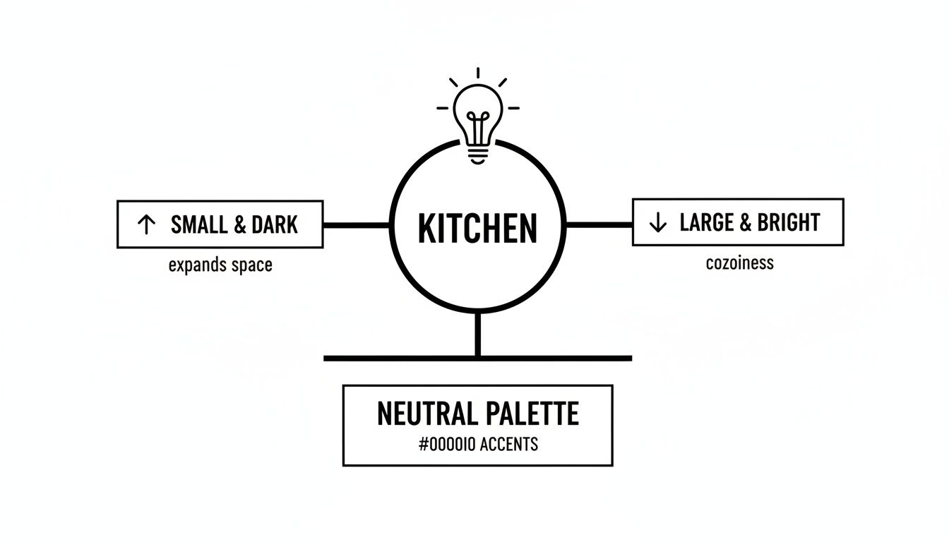
As you can see, small, dark kitchens often benefit from light, harmonious colors to feel larger, while big, bright kitchens can handle deeper, contrasting tones to feel cozier and more grounded.
Pairing with Popular Materials
Let’s get into some real-world examples. White oak cabinets are incredibly popular right now for their warmth and versatility. When you pair them with popular quartzite countertops—which often have soft, flowing veins of gray and beige—you have a beautiful, neutral foundation to build on.
For a harmonious look, a wall color like Sherwin-Williams’ Accessible Beige would gently echo the warm tones in both the wood and the stone. For a high-contrast vibe, a deep charcoal or a rich navy blue would make the light cabinets and countertops feel crisp and intentional.
Speaking of bold choices, green has emerged as a powerhouse for injecting life and sophistication into a kitchen. In a recent trends report, a staggering 86% of design professionals named it a top accent color. Deeper shades like olive and forest green are now favored over lighter sages, offering a moody depth that makes cabinetry stand out. It’s no surprise that 57% of statement islands are now sporting a bold finish like a rich green.
The key takeaway is to identify the undertones in your "fixed" elements—the cabinets and countertops—and select a wall color that either complements or intentionally contrasts with them. This ensures your color choice feels purposeful, not accidental.
To help you visualize these pairings with our own finishes, we've put together a quick reference guide.
Cabinet Finish and Wall Color Pairing Ideas
This chart offers a starting point for matching popular wall colors with some of our signature wood finishes, helping you nail down the mood you're aiming for.
| Sinclair Cabinetry Wood Finish | Harmonious Wall Color | Contrasting Wall Color | Resulting Mood |
|---|---|---|---|
| Natural White Oak | Creamy Off-White (e.g., SW Alabaster) | Deep Charcoal (e.g., BM Wrought Iron) | Warm, airy, and organic |
| Warm Cherry | Soft Greige (e.g., BM Revere Pewter) | Forest Green (e.g., F&B Green Smoke) | Rich, traditional, and cozy |
| Classic Maple | Light Gray (e.g., SW Agreeable Gray) | Navy Blue (e.g., BM Hale Navy) | Clean, timeless, and sophisticated |
| Dark Walnut | Warm White (e.g., BM White Dove) | Terracotta (e.g., SW Cavern Clay) | Modern, luxurious, and dramatic |
Remember, these are just suggestions to get the ideas flowing. The best combination is always the one that speaks to your personal style.
Coordinating with Finishes and Flooring
The finish on your cabinets also plays a crucial role in this decision. A matte finish absorbs light, so it can handle a slightly lighter wall color without looking washed out. On the other hand, a semi-gloss finish will reflect light and might pair better with a color that has a bit more depth to prevent glare.
At Sinclair Cabinetry, we offer a wide array of options. You can explore our full range to find the perfect match in our guide to cabinet wood stain colors.
And don't forget to look down! Your flooring is a huge surface that heavily influences the room's color harmony. If you have wood floors, make sure the wall color works with their undertones, too. For example, resources on choosing the perfect white oak floor stain can be invaluable for tying the entire design together from the ground up.
Balancing Timeless Style with Modern Trends
This is one of the biggest challenges in any kitchen design: finding that perfect sweet spot between a look that feels fresh today and one that won't feel dated in five years. We all want a kitchen with personality, but nobody wants to invest in a major renovation only to have it feel out of style almost as soon as it's finished.
The secret isn’t to avoid trends altogether. It’s all about how you bring them into your space. Think of your kitchen's core elements—your cabinets, countertops, and flooring—as the timeless foundation. These are the big-ticket items, the bones of the room that are most expensive and difficult to change.
By keeping these foundational pieces in a classic, neutral palette, you give your kitchen enduring style and a long, long lifespan. It's an approach that gives you the freedom to introduce personality and on-trend colors through elements that are much easier (and less costly!) to update down the road.
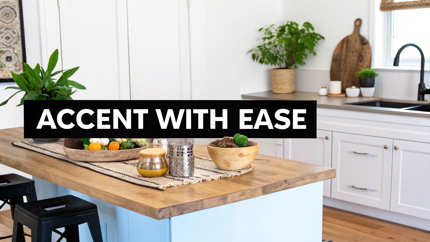
The Power of the Accent
So, how do you play with modern color trends without making a commitment you’ll regret? The answer is using them as accents. This strategy lets you inject those bold, contemporary shades you love—like deep forest greens or rich navy blues—without dedicating the entire room to a style that might be fleeting.
The key is to apply these exciting colors to features that can be updated without a full-scale demolition.
Consider these high-impact areas for a splash of trendy color:
- The Kitchen Island: Painting just the island a statement color is a designer's go-to trick. It creates an instant focal point and adds a layer of custom sophistication.
- A Feature Wall: A single wall painted in a deeper hue can introduce drama and depth to the room.
- The Backsplash: A colorful tile backsplash can bring in pattern and personality that ties the entire room together.
- Decor and Textiles: Bar stools, window treatments, area rugs, and even small appliances are fantastic, low-commitment ways to play with trendy shades.
This strategy ensures your beautiful, high-quality Sinclair Cabinetry remains the timeless star of the show, supported by accents that can be easily swapped out as your tastes or trends change.
Choosing Your Trendy Hues Wisely
While personal preference should always be your guide, some trendy colors simply have more staying power than others. Shades rooted in nature, like deep greens and blues, often feel more classic and less jarring over time than something overtly artificial.
For kitchens that need a dose of calm reliability that pairs flawlessly with custom wood cabinetry, blues are an outstanding contender. In fact, 78% of professionals surveyed in the NKBA 2026 Kitchen Trends Report endorsed blue as a top choice, highlighting a move toward soothing, versatile tones in high-end remodels. It's a smart accent choice that beautifully complements Sinclair Cabinetry's bespoke solutions.
The Golden Rule of Trends: If you love a color, use it. But apply it to the elements you can afford to change in five to seven years. Keep your biggest investments classic.
By following this balanced approach, you can confidently answer "what is the best color for a kitchen" with a two-part solution: a timeless neutral for the foundation and a bold, personal color for the accents. To see how today's most popular shades are being used on cabinetry itself, check out our deep dive into the latest kitchen cabinet color trends.
Bringing Your Vision to Life
Alright, we've walked through the psychology of color, talked about how light and space play a huge role, and figured out how to balance timeless foundations with those fun, trendy accents. Now for the best part: pulling it all together and turning that vision into a real, concrete plan. This is where your ideas start to take shape.
Think of the next steps as your game plan. It’s a simple, reliable way to make sure every choice—from the paint on the walls to the finish on your cabinets—is intentional. It’s all about creating a cohesive look that you’ll be happy with for years, not just a season. This checklist takes the guesswork out of the process, so you can feel excited, not overwhelmed.
Your Actionable Color Checklist
Before you even think about grabbing a paintbrush, run through these key steps. This isn’t just a list; it’s a framework that pulls together everything we've covered into a simple guide to nail your color choice.
- Start with a Timeless Neutral Base: Your most permanent fixtures, like your cabinets, are the backbone of your kitchen. Build your palette on a solid foundation of warm greige, a creamy off-white, or an earthy mushroom tone. This approach guarantees longevity and keeps your options open down the road.
- Analyze Your Room’s Environment: Spend a full day just watching how the light moves through your kitchen. Seriously, take notes. The way a color looks in the morning sun is completely different from how it feels in the evening with the lights on. This will tell you if you need to brighten things up or create a cozier vibe.
- Use Bold Accents for Personality: This is where you get to play. Pick one or two spots—like the kitchen island or the backsplash—to introduce a color that’s a little more personal or trendy. It’s the perfect way to inject some character without committing to a style that might feel dated in a few years.
- Always Test Your Paint Samples: I can’t stress this enough—it's the most crucial step. Get those sample pots and paint large swatches on a few different walls. Live with them for a day or two. A color you loved in the store can look dramatically different once it’s in your home, surrounded by your lighting and your stuff.
A well-chosen color palette is only as good as the materials it’s applied to. Superior craftsmanship ensures that your design vision is realized with precision, durability, and lasting beauty, turning a good kitchen into a truly exceptional one.
With your palette locked in, the final piece of the puzzle is pairing it with materials that can truly do it justice.
The Lasting Value of Quality Craftsmanship
The best color in the world will only shine when it’s enhancing high-quality materials. When you pair a thoughtfully selected color with the superior, real-wood construction of Sinclair Cabinetry, the result is more than just a pretty kitchen. It's a space that feels solid, enduring, and built to last. This combination of smart design and expert craftsmanship is what adds genuine, lasting value to your home.
Ultimately, the goal is to create a kitchen that feels like you and works perfectly for your life. If you find yourself needing a hand to translate all these ideas into a final plan, you can always seek professional interior design guidance. Armed with these principles, you’re ready to start your kitchen transformation with confidence and a clear vision.
A Few Final Questions About Kitchen Colors
Even with the perfect plan in hand, a few last-minute questions always seem to pop up right before you pull the trigger on a new color. It's completely normal. Getting those final concerns ironed out is the last step toward feeling totally confident in your kitchen’s new direction.
Let’s tackle some of the most common questions we hear from homeowners.
What Colors Make a Small Kitchen Look Bigger?
If you're trying to create a sense of space in a smaller kitchen, think light and bright. This is one of the oldest tricks in the design book because it just works. Shades like warm whites, soft creams, pale grays, and even gentle blues are fantastic because they reflect light, which makes the walls feel like they’re further away than they really are.
The result is a room that feels much more open and airy. For an even bigger impact, try pairing light-colored walls with cabinetry in a similar tone, like a natural white oak or a soft, painted finish. Sticking to a monochromatic scheme creates a seamless, uninterrupted look that really opens things up.
Should My Kitchen Cabinets Be Lighter or Darker Than the Walls?
Honestly, there’s no single right answer here—it all comes down to the look and feel you're going for. Each approach creates a completely different mood.
- Lighter Cabinets, Darker Walls: This is a classic for a reason. It creates a subtle sense of depth and keeps the room feeling airy, letting the cabinets stand out without dominating the space.
- Darker Cabinets, Lighter Walls: If you want a bit of drama, this is your move. The high contrast makes your cabinetry the undeniable star of the show.
- Cabinets and Walls in the Same Color: A very modern and sophisticated choice. Using the same color family for both creates a cohesive, seamless look that feels incredibly intentional and polished.
Just be sure to consider your kitchen’s size and how much natural light it gets. As a general rule, darker cabinets tend to shine in larger, sun-drenched spaces.
How Can I Choose a Color That Won't Go Out of Style?
The secret to a timeless kitchen is to ground your palette in enduring neutrals, especially for the big-ticket items. Your cabinets and countertops are major investments, so playing it safe here is smart. Classic choices like warm whites, soft beiges, versatile greiges, and beautiful natural wood tones will always look good.
Think of these elements as the foundation of your design. Once you have that solid, versatile base, you can bring in the trendy colors—like that deep emerald green or moody navy blue you’ve been eyeing—through things that are much easier and cheaper to swap out later. We’re talking about wall paint, a backsplash, or even just accessories like bar stools and kitchen towels. This approach lets your style evolve without needing a full-scale renovation.
What's the Best Paint Finish for a Kitchen?
For kitchen walls, a satin or semi-gloss finish is your most practical bet. In a room that sees its fair share of grease, splashes, and wipe-downs, you need something durable. These finishes are far easier to clean than matte or eggshell, which is a lifesaver in a high-traffic kitchen.
The same logic applies to cabinets, where a high-quality semi-gloss or gloss paint is often recommended for maximum durability.
But here’s something to keep in mind: when you work with a custom cabinet maker like Sinclair Cabinetry, you’re not just getting standard paint. You're getting access to professional-grade, factory-applied finishes. These specialized coatings are engineered to be far more resilient and long-lasting than anything you can buy off the shelf, ensuring your investment stays beautiful for years to come.
Ready to bring your vision to life with cabinetry that’s built to last? The experts at Sinclair Cabinetry inc are here to help you design a beautiful, functional kitchen with premium, real-wood cabinets made just for you. Explore our custom cabinet solutions and start your project today.